- Power BI forums
- Updates
- News & Announcements
- Get Help with Power BI
- Desktop
- Service
- Report Server
- Power Query
- Mobile Apps
- Developer
- DAX Commands and Tips
- Custom Visuals Development Discussion
- Health and Life Sciences
- Power BI Spanish forums
- Translated Spanish Desktop
- Power Platform Integration - Better Together!
- Power Platform Integrations (Read-only)
- Power Platform and Dynamics 365 Integrations (Read-only)
- Training and Consulting
- Instructor Led Training
- Dashboard in a Day for Women, by Women
- Galleries
- Community Connections & How-To Videos
- COVID-19 Data Stories Gallery
- Themes Gallery
- Data Stories Gallery
- R Script Showcase
- Webinars and Video Gallery
- Quick Measures Gallery
- 2021 MSBizAppsSummit Gallery
- 2020 MSBizAppsSummit Gallery
- 2019 MSBizAppsSummit Gallery
- Events
- Ideas
- Custom Visuals Ideas
- Issues
- Issues
- Events
- Upcoming Events
- Community Blog
- Power BI Community Blog
- Custom Visuals Community Blog
- Community Support
- Community Accounts & Registration
- Using the Community
- Community Feedback
Register now to learn Fabric in free live sessions led by the best Microsoft experts. From Apr 16 to May 9, in English and Spanish.
- Power BI forums
- Forums
- Get Help with Power BI
- Desktop
- Colour saturation help
- Subscribe to RSS Feed
- Mark Topic as New
- Mark Topic as Read
- Float this Topic for Current User
- Bookmark
- Subscribe
- Printer Friendly Page
- Mark as New
- Bookmark
- Subscribe
- Mute
- Subscribe to RSS Feed
- Permalink
- Report Inappropriate Content
Colour saturation help
Hi everyone,
I am trying to figure out how to get my bar graph to change colour dependant on another columns values.
I have to columns of data which are linked by the date. Each column is the sum of data for that day,eg:
Date Column 1 Column 2
Jan/ 1 / 16 50 55
Jan/ 2 / 16 51 55
Jan/ 3 / 16 55 55
Jan/ 4 / 16 58 55
Jan/ 5 / 16 59 55
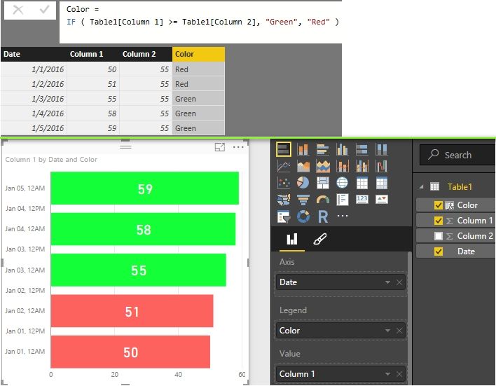
The bar graph needs to be Column 1 as bars and column 2 determines the colour saturation. If Column 1 is more than or equal to Column 2 then the colour is green otherwise it is red. No matter what I try I cant seem to get it to work. Hope someone can help.
Thanks,
Giles
Solved! Go to Solution.
- Mark as New
- Bookmark
- Subscribe
- Mute
- Subscribe to RSS Feed
- Permalink
- Report Inappropriate Content
You can also create a column with DAX formula.
Best Regards,
Herbert
- Mark as New
- Bookmark
- Subscribe
- Mute
- Subscribe to RSS Feed
- Permalink
- Report Inappropriate Content
- Mark as New
- Bookmark
- Subscribe
- Mute
- Subscribe to RSS Feed
- Permalink
- Report Inappropriate Content
Hi Herbert,
I´ve been trying with the option of color saturation of some visualization (diverging option), but it does not satisfy my expectations, so when I saw your answer to this matter, decided i need to try it your way.
My report acctually has 5 different fields/tables (Leading, Managing, Onboarding, PAC, Whitebelt) each one for a specific thema.
In each Table i created a measure named KPI. For each KPI i have a specific target. Would like to give them a conditional color using your formula. If target is reach should be green, if -10% below of the target yellow, if its even lower red.
So i figured out i need to create a new table with each KPI name and the target.
KPI's Target Color
Leading 90%
Managing 90%
Onboarding 100%
PAC 90%
Whitebelt 90%
My question is, how I should write your color formula, if each KPI comes from a measure of a different table. Should be something like this? How should I do the part of -10% of target = Yellow, -20% or less of target= red???
Color = IF ( NewTable[KPI´s] >= TableLeading[LeadingKPI]
TableManaging[ManagingKPI]
TableOnboarding[OnboardingKPI]
TablePAC[PACKPI]
TableWhitebelt[WhitebeltKPI],
¨Green¨, ¨Yellow¨, ¨Red¨)
Would appreciate your input on this.
Thanks!
- Mark as New
- Bookmark
- Subscribe
- Mute
- Subscribe to RSS Feed
- Permalink
- Report Inappropriate Content
Hi Giles
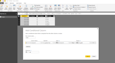
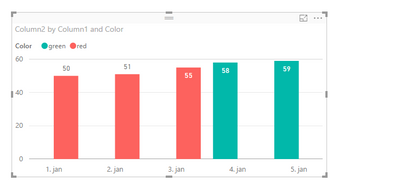
One way to do it is to add a calculated/conditional column and use that as a legend in the chart.
You can then choose too hide the legend in the chart.
br
Erik
Helpful resources

Microsoft Fabric Learn Together
Covering the world! 9:00-10:30 AM Sydney, 4:00-5:30 PM CET (Paris/Berlin), 7:00-8:30 PM Mexico City

Power BI Monthly Update - April 2024
Check out the April 2024 Power BI update to learn about new features.

| User | Count |
|---|---|
| 107 | |
| 93 | |
| 77 | |
| 65 | |
| 53 |
| User | Count |
|---|---|
| 147 | |
| 106 | |
| 104 | |
| 87 | |
| 61 |


