- Power BI forums
- Updates
- News & Announcements
- Get Help with Power BI
- Desktop
- Service
- Report Server
- Power Query
- Mobile Apps
- Developer
- DAX Commands and Tips
- Custom Visuals Development Discussion
- Health and Life Sciences
- Power BI Spanish forums
- Translated Spanish Desktop
- Power Platform Integration - Better Together!
- Power Platform Integrations (Read-only)
- Power Platform and Dynamics 365 Integrations (Read-only)
- Training and Consulting
- Instructor Led Training
- Dashboard in a Day for Women, by Women
- Galleries
- Community Connections & How-To Videos
- COVID-19 Data Stories Gallery
- Themes Gallery
- Data Stories Gallery
- R Script Showcase
- Webinars and Video Gallery
- Quick Measures Gallery
- 2021 MSBizAppsSummit Gallery
- 2020 MSBizAppsSummit Gallery
- 2019 MSBizAppsSummit Gallery
- Events
- Ideas
- Custom Visuals Ideas
- Issues
- Issues
- Events
- Upcoming Events
- Community Blog
- Power BI Community Blog
- Custom Visuals Community Blog
- Community Support
- Community Accounts & Registration
- Using the Community
- Community Feedback
Register now to learn Fabric in free live sessions led by the best Microsoft experts. From Apr 16 to May 9, in English and Spanish.
- Power BI forums
- Forums
- Get Help with Power BI
- Desktop
- Coloring percentiles with a stacked column chart
- Subscribe to RSS Feed
- Mark Topic as New
- Mark Topic as Read
- Float this Topic for Current User
- Bookmark
- Subscribe
- Printer Friendly Page
- Mark as New
- Bookmark
- Subscribe
- Mute
- Subscribe to RSS Feed
- Permalink
- Report Inappropriate Content
Coloring percentiles with a stacked column chart
Hi,
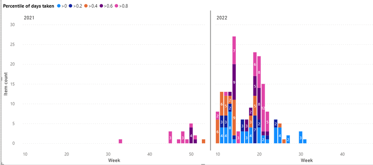
There are products, that come in weekly, and I want to visualise, how long these products are processed. I want to visualise this with a stacked column chart, where there is amount of products on the y-axis, week number on the x-axis, and bars are colored based on percentiles. Picture of the desired goal can be seen below. For example, >0.8 means, that processing of the products took more time than with 80 % of the cases.
Simplified, my data is like
ProductID, ProductArrivalDate, ProductReadyDate, ArrivalYear, ArrivalWeek
Unfortunately, I cannot include productIDs, because they are classified, and thus cannot share the data.
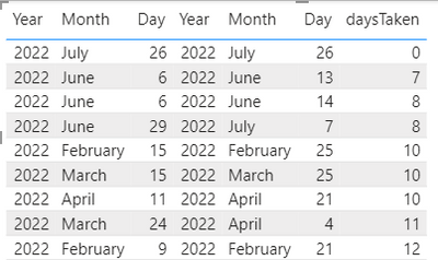
Then, I create a new column 'daysTaken', by

However, I have problems with the percentiles. I have tried few approaches:
Approach one, counting measure for each percentile, and creating SWITCH column, which classifies products based on these percentiles:
First, I created measure for each percentile (following solution of https://community.powerbi.com/t5/Desktop/Percentile-exc-Error/m-p/1927498/highlight/true), below is and example for class '>0' (below 0.2 percentile). Apologies for the formatting, I could not get HTML to work:
This also seems to give reasonable results (screenshot below). Again, data formats are 'Whole number'.
However, when I connect these measures to the products with

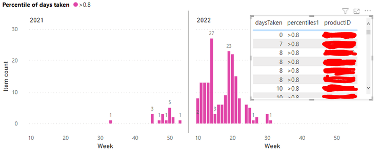
If I fix the measures to given values, I get the example picture in the beginning, and everything works fine. For example if I write Table[daysTaken]<25, ">0". However, I have many processes, and thus the percentiles change, so I cannot fix the values.
Approach two, count percentile for each product:
Next, I tried to count percentile for each product (like solution in https://community.powerbi.com/t5/Desktop/how-to-calculate-percentile-and-values-for-rows-in-a-column...
Percentiles =
VAR _ROW1 = CALCULATE(COUNTROWS(Table),Table[daysTaken]<=EARLIER(Table[daysTaken]))
VAR _ROW2 = CALCULATE(COUNTROWS(Table),ALL(Table))
RETURN
_ROW1 /_ROW2
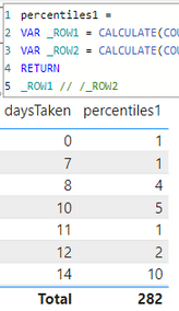
But for some reason, it gives '0' for every product. I tried to figure this out, and it seems like for some reason _ROW1 counts only amount of rows, that have the same 'daysTaken' value. If I make it to return only _ROW1, you can see how there are only 4 rows for number 8, which equals amount of 8s in the picture above.

So, any idea what am I doing wrong, or how I could easily get the percentiles? Sorry for the long post, but I'm out of potatoes.
Solved! Go to Solution.
- Mark as New
- Bookmark
- Subscribe
- Mute
- Subscribe to RSS Feed
- Permalink
- Report Inappropriate Content
If someone in the future is interested, I finally solved this with similar approach as my approach two.
First, I created a new column where I counted exact percentiles for each product with
- Mark as New
- Bookmark
- Subscribe
- Mute
- Subscribe to RSS Feed
- Permalink
- Report Inappropriate Content
Here is some test dataset, if it helps
| ArrivalTime | ResultTime | Year | ArrivalWeek | ProductID |
| 3.1.2022 11:02 | 9.2.2022 15:14 | 2022 | 2 | 1 |
| 3.1.2022 11:04 | 9.2.2022 15:28 | 2022 | 2 | 2 |
| 3.1.2022 11:05 | 9.2.2022 15:30 | 2022 | 2 | 3 |
| 3.1.2022 11:07 | 9.2.2022 15:31 | 2022 | 2 | 4 |
| 25.1.2022 7:01 | 22.2.2022 10:45 | 2022 | 5 | 5 |
| 5.1.2022 13:21 | 9.3.2022 8:08 | 2022 | 2 | 6 |
| 25.1.2022 7:01 | 15.2.2022 13:02 | 2022 | 5 | 7 |
| 13.1.2022 11:23 | 7.2.2022 14:46 | 2022 | 3 | 8 |
| 13.1.2022 11:19 | 7.2.2022 14:48 | 2022 | 3 | 9 |
| 7.12.2021 7:01 | 7.2.2022 16:00 | 2021 | 50 | 10 |
| 7.12.2021 7:01 | 7.2.2022 16:00 | 2021 | 50 | 11 |
| 30.12.2021 7:01 | 7.2.2022 12:23 | 2021 | 53 | 12 |
| 7.12.2021 11:13 | 7.2.2022 16:01 | 2021 | 50 | 13 |
| 10.1.2022 7:49 | 10.2.2022 8:31 | 2022 | 3 | 14 |
| 10.1.2022 7:50 | 21.2.2022 9:43 | 2022 | 3 | 15 |
| 7.1.2022 7:01 | 1.3.2022 10:13 | 2022 | 2 | 16 |
| 13.1.2022 11:41 | 7.2.2022 14:52 | 2022 | 3 | 17 |
| 10.1.2022 14:51 | 8.2.2022 15:11 | 2022 | 3 | 18 |
| 10.12.2021 12:31 | 8.2.2022 14:22 | 2021 | 50 | 19 |
| 25.1.2022 11:53 | 8.2.2022 9:01 | 2022 | 5 | 20 |
| 12.1.2022 11:21 | 11.3.2022 11:07 | 2022 | 3 | 21 |
| 12.1.2022 11:22 | 11.3.2022 11:08 | 2022 | 3 | 22 |
| 14.12.2021 15:00 | 8.3.2022 12:22 | 2021 | 51 | 23 |
| 12.1.2022 11:20 | 11.3.2022 11:07 | 2022 | 3 | 24 |
| 14.1.2022 12:36 | 10.2.2022 8:31 | 2022 | 3 | 25 |
| 14.1.2022 15:35 | 15.2.2022 14:48 | 2022 | 3 | 26 |
| 14.1.2022 15:37 | 15.2.2022 14:49 | 2022 | 3 | 27 |
| 14.1.2022 15:38 | 15.2.2022 14:50 | 2022 | 3 | 28 |
| 16.11.2021 14:04 | 9.2.2022 13:16 | 2021 | 47 | 29 |
| 17.1.2022 7:47 | 15.2.2022 13:46 | 2022 | 4 | 30 |
| 17.1.2022 7:49 | 15.2.2022 13:44 | 2022 | 4 | 31 |
| 17.1.2022 7:50 | 15.2.2022 13:43 | 2022 | 4 | 32 |
| 2.2.2022 7:01 | 9.3.2022 10:58 | 2022 | 6 | 33 |
| 17.1.2022 15:05 | 9.3.2022 10:58 | 2022 | 4 | 34 |
| 18.1.2022 7:52 | 11.2.2022 13:29 | 2022 | 4 | 35 |
| 19.1.2022 8:01 | 1.3.2022 12:37 | 2022 | 4 | 36 |
| 19.1.2022 8:02 | 22.2.2022 11:47 | 2022 | 4 | 37 |
| 21.1.2022 7:01 | 23.2.2022 14:47 | 2022 | 4 | 38 |
| 27.1.2022 7:01 | 23.2.2022 15:58 | 2022 | 5 | 39 |
| 24.1.2022 13:19 | 28.2.2022 14:28 | 2022 | 5 | 40 |
| 24.1.2022 13:13 | 17.2.2022 10:39 | 2022 | 5 | 41 |
| 25.1.2022 8:00 | 15.2.2022 13:00 | 2022 | 5 | 42 |
Helpful resources

Microsoft Fabric Learn Together
Covering the world! 9:00-10:30 AM Sydney, 4:00-5:30 PM CET (Paris/Berlin), 7:00-8:30 PM Mexico City

Power BI Monthly Update - April 2024
Check out the April 2024 Power BI update to learn about new features.

| User | Count |
|---|---|
| 117 | |
| 107 | |
| 70 | |
| 70 | |
| 43 |
| User | Count |
|---|---|
| 148 | |
| 106 | |
| 104 | |
| 89 | |
| 65 |


