- Power BI forums
- Updates
- News & Announcements
- Get Help with Power BI
- Desktop
- Service
- Report Server
- Power Query
- Mobile Apps
- Developer
- DAX Commands and Tips
- Custom Visuals Development Discussion
- Health and Life Sciences
- Power BI Spanish forums
- Translated Spanish Desktop
- Power Platform Integration - Better Together!
- Power Platform Integrations (Read-only)
- Power Platform and Dynamics 365 Integrations (Read-only)
- Training and Consulting
- Instructor Led Training
- Dashboard in a Day for Women, by Women
- Galleries
- Community Connections & How-To Videos
- COVID-19 Data Stories Gallery
- Themes Gallery
- Data Stories Gallery
- R Script Showcase
- Webinars and Video Gallery
- Quick Measures Gallery
- 2021 MSBizAppsSummit Gallery
- 2020 MSBizAppsSummit Gallery
- 2019 MSBizAppsSummit Gallery
- Events
- Ideas
- Custom Visuals Ideas
- Issues
- Issues
- Events
- Upcoming Events
- Community Blog
- Power BI Community Blog
- Custom Visuals Community Blog
- Community Support
- Community Accounts & Registration
- Using the Community
- Community Feedback
Register now to learn Fabric in free live sessions led by the best Microsoft experts. From Apr 16 to May 9, in English and Spanish.
- Power BI forums
- Forums
- Get Help with Power BI
- Desktop
- Re: Coloring maps
- Subscribe to RSS Feed
- Mark Topic as New
- Mark Topic as Read
- Float this Topic for Current User
- Bookmark
- Subscribe
- Printer Friendly Page
- Mark as New
- Bookmark
- Subscribe
- Mute
- Subscribe to RSS Feed
- Permalink
- Report Inappropriate Content
Coloring maps
Hello, all !
Help pls, I have a sales table by points for the Floating period. All dates are the dates of the last day of the month, except the last, that is, 2018 December - 2018/12/31 , 2019 January - 2019/01/31, 2019 February - 2019/02/15.
Like a table :
| date | tradePoint | sales |
| 31.12.19 | A | 10 |
| 31.12.19 | F | 10 |
| 31.12.19 | B | 5 |
| 31.12.19 | D | 10 |
| 31.01.19 | D | 5 |
| 31.01.19 | G | 0 |
| 31.01.19 | C | 10 |
| 31.01.19 | E | 5 |
| 15.02.19 | A | 10 |
| 15.02.19 | C | 5 |
| 15.02.19 | D | 10 |
In this case, it should be the following coloring, Green color: A,C,D ; Red Color: B,E,F ; Blank: G
Task:
1. It is necessary to paint the dots on the map green if sales were in the finish month.
2. If there were sales in the last month, excluding the last month, then red (but you need to take into account that in the first paragraph some points should already be painted in green color)
3. If the not be sales at these points, then empty
I I tried to do it like this: if 1 - red , 2- green, on the map.
Indicator = IF( CALCULATE(SUM([Sum]);
FILTER(Data_query; Data_query[period] = [MaxDate]))>0;2;
IF(CALCULATE(SUM([Sum]);
FILTER(Data_query; Data_query[period] <= EOMONTH([MaxDate];-1) && Data_query[period] >= MIN(Data_query[period])))>0;1;BLANK()))
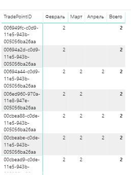
But total value , only "2"
If you have any ideas how to get: 1,2, and blank() please write measure
Thank you in advance
- Mark as New
- Bookmark
- Subscribe
- Mute
- Subscribe to RSS Feed
- Permalink
- Report Inappropriate Content
@Anonymous ,
I would suggest you to refer to conditional formatting.
https://docs.microsoft.com/en-us/power-bi/desktop-conditional-table-formatting
Community Support Team _ Jimmy Tao
If this post helps, then please consider Accept it as the solution to help the other members find it more quickly.
- Mark as New
- Bookmark
- Subscribe
- Mute
- Subscribe to RSS Feed
- Permalink
- Report Inappropriate Content
@v-yuta-msft Hi,
I know how to use formatting.
My problem is that I can not divide the pool of points into 3 parts; points of this month should be active (green), but because the report uses a filter; I do not know for what period there will be a data set, and points that were not active this month, but had sales (red), the rest, which did not have sales or were negative sales, should not be displayed. The visual element "Map" does not take into account the data for the month, which it views the total. If you look at the last picture, then everything will become clear to you. Instead of dividing for parts, the measure gives only one value for the totals, and not what I need.
Helpful resources

Microsoft Fabric Learn Together
Covering the world! 9:00-10:30 AM Sydney, 4:00-5:30 PM CET (Paris/Berlin), 7:00-8:30 PM Mexico City

Power BI Monthly Update - April 2024
Check out the April 2024 Power BI update to learn about new features.

| User | Count |
|---|---|
| 110 | |
| 94 | |
| 82 | |
| 66 | |
| 58 |
| User | Count |
|---|---|
| 151 | |
| 121 | |
| 104 | |
| 87 | |
| 67 |

