- Power BI forums
- Updates
- News & Announcements
- Get Help with Power BI
- Desktop
- Service
- Report Server
- Power Query
- Mobile Apps
- Developer
- DAX Commands and Tips
- Custom Visuals Development Discussion
- Health and Life Sciences
- Power BI Spanish forums
- Translated Spanish Desktop
- Power Platform Integration - Better Together!
- Power Platform Integrations (Read-only)
- Power Platform and Dynamics 365 Integrations (Read-only)
- Training and Consulting
- Instructor Led Training
- Dashboard in a Day for Women, by Women
- Galleries
- Community Connections & How-To Videos
- COVID-19 Data Stories Gallery
- Themes Gallery
- Data Stories Gallery
- R Script Showcase
- Webinars and Video Gallery
- Quick Measures Gallery
- 2021 MSBizAppsSummit Gallery
- 2020 MSBizAppsSummit Gallery
- 2019 MSBizAppsSummit Gallery
- Events
- Ideas
- Custom Visuals Ideas
- Issues
- Issues
- Events
- Upcoming Events
- Community Blog
- Power BI Community Blog
- Custom Visuals Community Blog
- Community Support
- Community Accounts & Registration
- Using the Community
- Community Feedback
Register now to learn Fabric in free live sessions led by the best Microsoft experts. From Apr 16 to May 9, in English and Spanish.
- Power BI forums
- Forums
- Get Help with Power BI
- Desktop
- Color in scatter plot using calculated measure as ...
- Subscribe to RSS Feed
- Mark Topic as New
- Mark Topic as Read
- Float this Topic for Current User
- Bookmark
- Subscribe
- Printer Friendly Page
- Mark as New
- Bookmark
- Subscribe
- Mute
- Subscribe to RSS Feed
- Permalink
- Report Inappropriate Content
Color in scatter plot using calculated measure as text
Hi All,
I am trying to use a calculated measure to split a Risk Score value in my dataset into High/Medium/Low using slicer values and then using a calculated measure to show color of each transaction as Red - High, Yellow - Medium and Green - Low.
This should be a fixed color scheme and not a divering one.
Also will it be possible to add filtering on visuals using a calculated measure created for High/Medium/Low ?
Any help would be highly appreciated.
Thanks in advance.
Solved! Go to Solution.
- Mark as New
- Bookmark
- Subscribe
- Mute
- Subscribe to RSS Feed
- Permalink
- Report Inappropriate Content
Hi @manissethi
Assuming that we have a sample with [Forename] [Score] and [Curriculum], not sure if you’d like to show the value as below. If not, please help provide more details about your request.
Please note that create the slice using measure is not accessible, thus I use calculated column instead:
Slicer column = IF([Score]>3,"High",IF([Score]=3,"Medium",IF([Score]<3,"Low")))
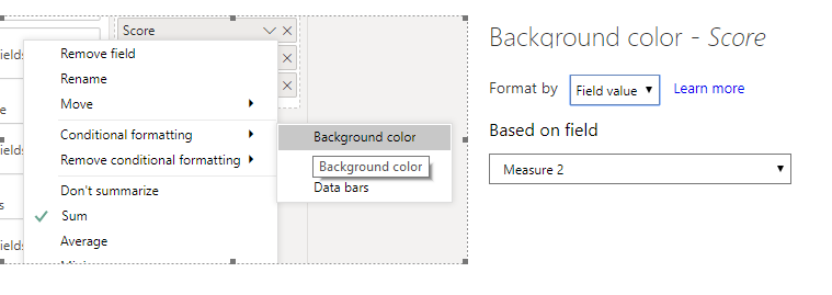
Then use measure to set the conditional format :
Measure 2 = IF(MAX(Table1[Slicer column])="High","#FF0A18",IF(MAX(Table1[Slicer column])="Medium","#F0FF9A",IF(MAX(Table1[Slicer column])="Low","#00FF37")))
You can find the color code under Format pane.
Then
Finally:
Pbix attached here for your reference: https://wicren-my.sharepoint.com/:u:/g/personal/dinaye_wicren_onmicrosoft_com/EUBO626SMOpDoUWe-jgbZq...
Best regards,
Dina Ye
If this post helps, then please consider Accept it as the solution to help the other members find it more
quickly.
- Mark as New
- Bookmark
- Subscribe
- Mute
- Subscribe to RSS Feed
- Permalink
- Report Inappropriate Content
Hi @manissethi
If my above post helps, could you please consider Accept it as the solution to help the other members find it more quickly. thanks!
Best regards,
Dina Ye
If this post helps, then please consider Accept it as the solution to help the other members find it more
quickly.
Helpful resources

Microsoft Fabric Learn Together
Covering the world! 9:00-10:30 AM Sydney, 4:00-5:30 PM CET (Paris/Berlin), 7:00-8:30 PM Mexico City

Power BI Monthly Update - April 2024
Check out the April 2024 Power BI update to learn about new features.

| User | Count |
|---|---|
| 110 | |
| 100 | |
| 80 | |
| 64 | |
| 58 |
| User | Count |
|---|---|
| 148 | |
| 111 | |
| 94 | |
| 84 | |
| 67 |


