- Power BI forums
- Updates
- News & Announcements
- Get Help with Power BI
- Desktop
- Service
- Report Server
- Power Query
- Mobile Apps
- Developer
- DAX Commands and Tips
- Custom Visuals Development Discussion
- Health and Life Sciences
- Power BI Spanish forums
- Translated Spanish Desktop
- Power Platform Integration - Better Together!
- Power Platform Integrations (Read-only)
- Power Platform and Dynamics 365 Integrations (Read-only)
- Training and Consulting
- Instructor Led Training
- Dashboard in a Day for Women, by Women
- Galleries
- Community Connections & How-To Videos
- COVID-19 Data Stories Gallery
- Themes Gallery
- Data Stories Gallery
- R Script Showcase
- Webinars and Video Gallery
- Quick Measures Gallery
- 2021 MSBizAppsSummit Gallery
- 2020 MSBizAppsSummit Gallery
- 2019 MSBizAppsSummit Gallery
- Events
- Ideas
- Custom Visuals Ideas
- Issues
- Issues
- Events
- Upcoming Events
- Community Blog
- Power BI Community Blog
- Custom Visuals Community Blog
- Community Support
- Community Accounts & Registration
- Using the Community
- Community Feedback
Register now to learn Fabric in free live sessions led by the best Microsoft experts. From Apr 16 to May 9, in English and Spanish.
- Power BI forums
- Forums
- Get Help with Power BI
- Desktop
- Color My World
- Subscribe to RSS Feed
- Mark Topic as New
- Mark Topic as Read
- Float this Topic for Current User
- Bookmark
- Subscribe
- Printer Friendly Page
- Mark as New
- Bookmark
- Subscribe
- Mute
- Subscribe to RSS Feed
- Permalink
- Report Inappropriate Content
Color My World
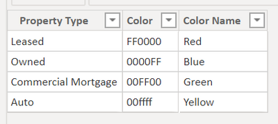
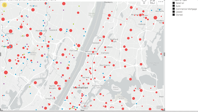
I have made this table to color the dots on the map I have created.
However, the colors that are shown on the maps are not the same ones that are specified in the hex codes:
| Property Type | Color code | Color I am Exoectubg | Color on Map |
| Leased | FF0000 | Red | Green |
| Owned | 0000FF | Blue | Purple |
| Commercial Morgtage | 00FF00 | Green | Blue |
| Auto | 00FFFF | Cyan | Red |
Please help me fix this problem.
- Mark as New
- Bookmark
- Subscribe
- Mute
- Subscribe to RSS Feed
- Permalink
- Report Inappropriate Content
Hi !
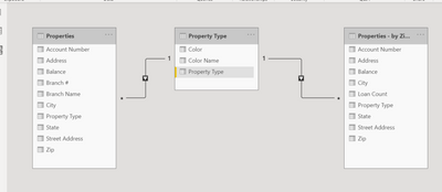
Please share the Data Model diagram, seem you are using another table which has fact information & that is mapped to status table.
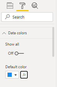
In Power BI - Map chart, go to format, expand Data colors -> press (fx) and use format by [field vaue] to provide data fill colors.

Regards,
Hasham
- Mark as New
- Bookmark
- Subscribe
- Mute
- Subscribe to RSS Feed
- Permalink
- Report Inappropriate Content
Here you go. I don't see a problem with the data model, though...
- Mark as New
- Bookmark
- Subscribe
- Mute
- Subscribe to RSS Feed
- Permalink
- Report Inappropriate Content
Hi !
Thanks, the model diagram will help us understand how you are plotting the map chart.
You can create a measure lie below;
Property Color = SWITCH( TRUE(),
                MAX(Property Type[Property Type]) = "Leased", 1,
                MAX(Property Type[Property Type]) = "Owned", 2,
                MAX(Property Type[Property Type]) = "Commercial Mortgage", 3,
                MAX(Property Type[Property Type]) = "Auto", 4,
                5
)
Now, in the Data Color option, choose format by Rules as shown below;
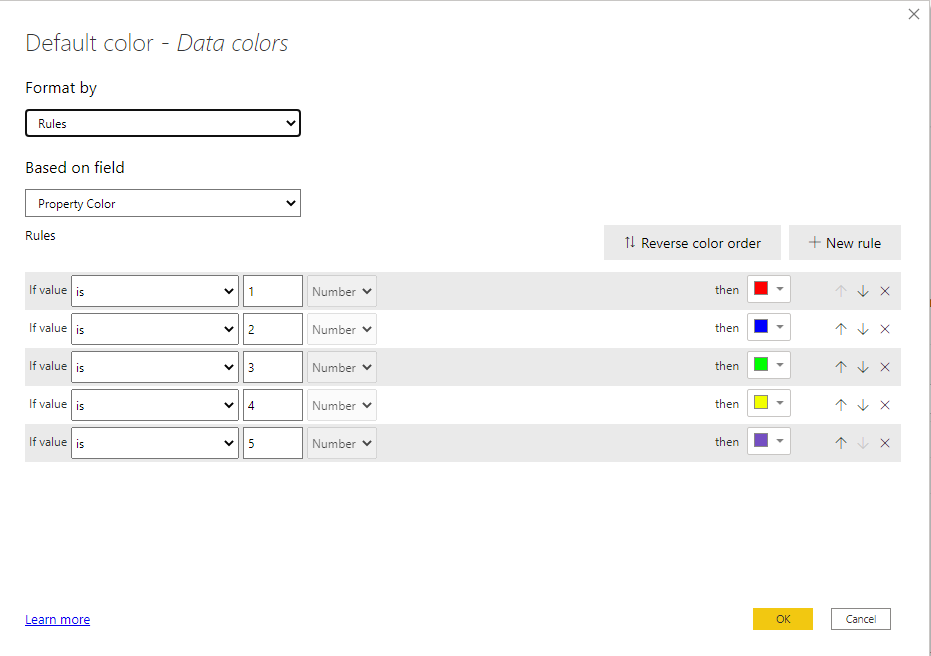
Hope this will work for you.
Regards,
Hasham
- Mark as New
- Bookmark
- Subscribe
- Mute
- Subscribe to RSS Feed
- Permalink
- Report Inappropriate Content
@Anonymous , are you able to show dots for each Property Type.
If so either with the measure of column ((hex code need to with #)
Example measure you create one and use that in conditional formatting with the field value option. But that option will not be there with a legend
Brand Color = Switch( true(),
max('Item'[brand]) = "Brand 1" , "red",
max('Item'[brand]) = "Brand 2" , "blue",
max('Item'[brand]) = "Brand 3" , "green",
max('Item'[brand]) = "Brand 4" , "gray",
max('Item'[brand]) = "Brand 5" , "yellow",
max('Item'[brand]) = "Brand 6" , "orange",
max('Item'[brand]) = "Brand 7" , "brown",
max('Item'[brand]) = "Brand 8" , "Cyan",
max('Item'[brand]) = "Brand 9" , "Tan",
max('Item'[brand]) = "Brand 10" , "Violet",
max('Item'[brand]) = "Brand 11" , "Gold",
"silver"
)Microsoft Power BI Learning Resources, 2023 !!
Learn Power BI - Full Course with Dec-2022, with Window, Index, Offset, 100+ Topics !!
Did I answer your question? Mark my post as a solution! Appreciate your Kudos !! Proud to be a Super User! !!
Helpful resources

Microsoft Fabric Learn Together
Covering the world! 9:00-10:30 AM Sydney, 4:00-5:30 PM CET (Paris/Berlin), 7:00-8:30 PM Mexico City

Power BI Monthly Update - April 2024
Check out the April 2024 Power BI update to learn about new features.

| User | Count |
|---|---|
| 114 | |
| 97 | |
| 86 | |
| 70 | |
| 62 |
| User | Count |
|---|---|
| 151 | |
| 120 | |
| 103 | |
| 87 | |
| 68 |
