- Power BI forums
- Updates
- News & Announcements
- Get Help with Power BI
- Desktop
- Service
- Report Server
- Power Query
- Mobile Apps
- Developer
- DAX Commands and Tips
- Custom Visuals Development Discussion
- Health and Life Sciences
- Power BI Spanish forums
- Translated Spanish Desktop
- Power Platform Integration - Better Together!
- Power Platform Integrations (Read-only)
- Power Platform and Dynamics 365 Integrations (Read-only)
- Training and Consulting
- Instructor Led Training
- Dashboard in a Day for Women, by Women
- Galleries
- Community Connections & How-To Videos
- COVID-19 Data Stories Gallery
- Themes Gallery
- Data Stories Gallery
- R Script Showcase
- Webinars and Video Gallery
- Quick Measures Gallery
- 2021 MSBizAppsSummit Gallery
- 2020 MSBizAppsSummit Gallery
- 2019 MSBizAppsSummit Gallery
- Events
- Ideas
- Custom Visuals Ideas
- Issues
- Issues
- Events
- Upcoming Events
- Community Blog
- Power BI Community Blog
- Custom Visuals Community Blog
- Community Support
- Community Accounts & Registration
- Using the Community
- Community Feedback
Register now to learn Fabric in free live sessions led by the best Microsoft experts. From Apr 16 to May 9, in English and Spanish.
- Power BI forums
- Forums
- Get Help with Power BI
- Desktop
- Re: Color Change in Line Chart based on Slicer Val...
- Subscribe to RSS Feed
- Mark Topic as New
- Mark Topic as Read
- Float this Topic for Current User
- Bookmark
- Subscribe
- Printer Friendly Page
- Mark as New
- Bookmark
- Subscribe
- Mute
- Subscribe to RSS Feed
- Permalink
- Report Inappropriate Content
Color Change in Line Chart based on Slicer Value
Hi Team,
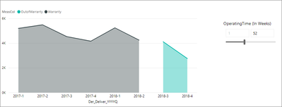
Here, the requirement is to change the color of line or somehow we need to differentiate in color in line chart by using the numeric slicer value.
Expecting an output like below.
Now, I achieved above by hard coding the dax value instead of dynamic selection based on week number n above slicer.
Dax formula ( calculated column ) =
- Mark as New
- Bookmark
- Subscribe
- Mute
- Subscribe to RSS Feed
- Permalink
- Report Inappropriate Content
Hi Peter_Jeyaraj_l
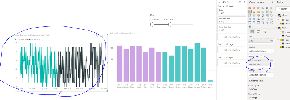
As I know, for line chart, you need to use static legend value to change the line color, so workaround are like below
You could create two meausres for line chart based on slicer value like below
more than max = var maxselcet=CALCULATE(MAX(slicer[Date]), ALLSELECTED(slicer[Date])) return if(MIN('table'[Date])>maxselcet, BLANK(),SUM('table'[Column 2]))
less than max = var maxselcet=CALCULATE(MAX(slicer[Date]), ALLSELECTED(slicer[Date])) return if(MIN('table'[Date])>maxselcet, SUM('table'[Column 2]), BLANK())
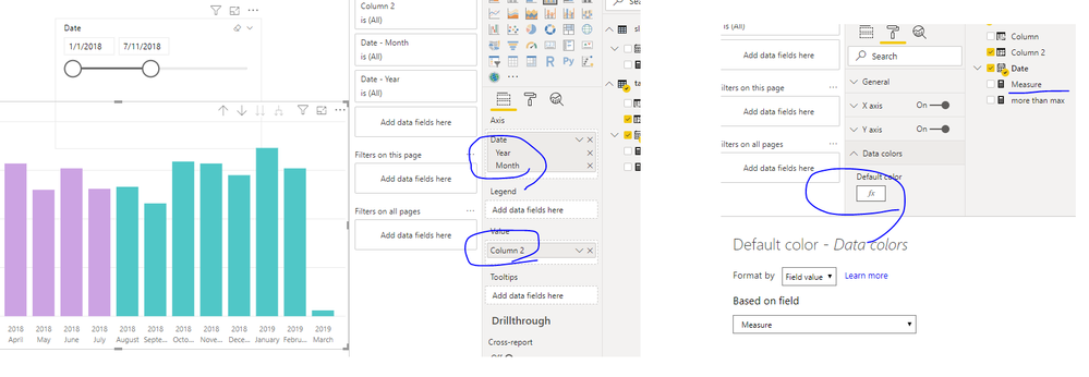
Or you could create a clustered column chart, then create a measure like below
Measure = var maxselcet=CALCULATE(MAX(slicer[Date]), ALLSELECTED(slicer[Date])) return if(MIN('table'[Date])>maxselcet, "#50C7C7","#CCA3E3")
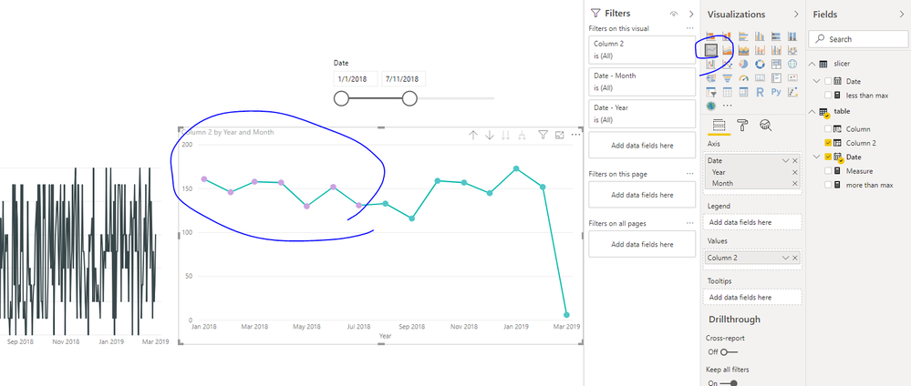
use this in column chart's colditional format like below, then click line chart, it will change like below
Best Regards,
Zoe Zhi
If this post helps, then please consider Accept it as the solution to help the other members find it more quickly.
- Mark as New
- Bookmark
- Subscribe
- Mute
- Subscribe to RSS Feed
- Permalink
- Report Inappropriate Content
Hi,
Thanks for your response.
I tried and still see some challenges as i have all the info in same table. like below
Do i need to create any reference table to achieve the above
| Deliver Quarter | Operating Weeks | Measure |
| 2018-3 | 7 | 100 |
| 2018-4 | 8 | 120 |
Regards,
Peter I
Helpful resources

Microsoft Fabric Learn Together
Covering the world! 9:00-10:30 AM Sydney, 4:00-5:30 PM CET (Paris/Berlin), 7:00-8:30 PM Mexico City

Power BI Monthly Update - April 2024
Check out the April 2024 Power BI update to learn about new features.

| User | Count |
|---|---|
| 109 | |
| 98 | |
| 77 | |
| 66 | |
| 54 |
| User | Count |
|---|---|
| 144 | |
| 104 | |
| 102 | |
| 88 | |
| 63 |


