- Power BI forums
- Updates
- News & Announcements
- Get Help with Power BI
- Desktop
- Service
- Report Server
- Power Query
- Mobile Apps
- Developer
- DAX Commands and Tips
- Custom Visuals Development Discussion
- Health and Life Sciences
- Power BI Spanish forums
- Translated Spanish Desktop
- Power Platform Integration - Better Together!
- Power Platform Integrations (Read-only)
- Power Platform and Dynamics 365 Integrations (Read-only)
- Training and Consulting
- Instructor Led Training
- Dashboard in a Day for Women, by Women
- Galleries
- Community Connections & How-To Videos
- COVID-19 Data Stories Gallery
- Themes Gallery
- Data Stories Gallery
- R Script Showcase
- Webinars and Video Gallery
- Quick Measures Gallery
- 2021 MSBizAppsSummit Gallery
- 2020 MSBizAppsSummit Gallery
- 2019 MSBizAppsSummit Gallery
- Events
- Ideas
- Custom Visuals Ideas
- Issues
- Issues
- Events
- Upcoming Events
- Community Blog
- Power BI Community Blog
- Custom Visuals Community Blog
- Community Support
- Community Accounts & Registration
- Using the Community
- Community Feedback
Register now to learn Fabric in free live sessions led by the best Microsoft experts. From Apr 16 to May 9, in English and Spanish.
- Power BI forums
- Forums
- Get Help with Power BI
- Desktop
- Clustered bar chart with generic Y-axis
- Subscribe to RSS Feed
- Mark Topic as New
- Mark Topic as Read
- Float this Topic for Current User
- Bookmark
- Subscribe
- Printer Friendly Page
- Mark as New
- Bookmark
- Subscribe
- Mute
- Subscribe to RSS Feed
- Permalink
- Report Inappropriate Content
Clustered bar chart with generic Y-axis
Hi all,
I hope one of you can help me with the following question:
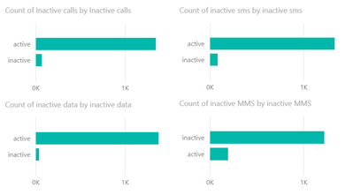
I want to put the following 4 graphs in 1 clustered bar chart:
When I try to do this, however, I end up having a clustered bar chart that shows me the same numbers 4 times:
The problem might be in my x-axis definition, since I only put in 'inactive calls' there, but I don't know how to fix it and show me different numbers.
Can anyone help?
Cheers,
Sander
- Mark as New
- Bookmark
- Subscribe
- Mute
- Subscribe to RSS Feed
- Permalink
- Report Inappropriate Content
Liang
If this post helps, then please consider Accept it as the solution to help the other members find it more quickly.
- Mark as New
- Bookmark
- Subscribe
- Mute
- Subscribe to RSS Feed
- Permalink
- Report Inappropriate Content
hi @Anonymous
Is it possible to demonstrate what you are expecting, essentially you are counting the rows, what are you wanting to measure?
do you want all active to be clustered on top of each other rather than side by side?
You will probably have to create a field that you can place on the legend with an IF statement. If you can provide a little bit of dummy date and give a clear idea of what you are expecting i can put it togther for you.
If I took the time to answer your question and I came up with a solution, please mark my post as a solution and /or give kudos freely for the effort 🙂 Thank you!
Proud to be a Super User!
- Mark as New
- Bookmark
- Subscribe
- Mute
- Subscribe to RSS Feed
- Permalink
- Report Inappropriate Content
Hi both,
Thanks for the replies. You can see some dummy data here:
I will simplify my problem with two categories, calls and data. I want to know, how many users (out of 1412) have not used their calls or data bundles (e.g. user 101 in the dataset above). So I defined two extra columns, "Call user types" and "Data user types", stating if a customer is 'active' or 'inactive' for respectively the call and data bundles. In this example, the customer would be marked as 'inactive' caller if the sum of columns B, C, D, E and F is "0". Otherwise, he would be "active".
I want to show the total active vs total inactive users over the two categories in one clustered bar chart. So for this, I think I need to set up a generic y-axis, stating 'Active' and 'Inactive'. And then I want to show the total active call users and total active data users in the 'active' part of the Y-axis. Analogue to the inactive customers.
Is this possible?
Helpful resources

Microsoft Fabric Learn Together
Covering the world! 9:00-10:30 AM Sydney, 4:00-5:30 PM CET (Paris/Berlin), 7:00-8:30 PM Mexico City

Power BI Monthly Update - April 2024
Check out the April 2024 Power BI update to learn about new features.

| User | Count |
|---|---|
| 111 | |
| 100 | |
| 80 | |
| 64 | |
| 58 |
| User | Count |
|---|---|
| 148 | |
| 111 | |
| 93 | |
| 84 | |
| 66 |


