- Power BI forums
- Updates
- News & Announcements
- Get Help with Power BI
- Desktop
- Service
- Report Server
- Power Query
- Mobile Apps
- Developer
- DAX Commands and Tips
- Custom Visuals Development Discussion
- Health and Life Sciences
- Power BI Spanish forums
- Translated Spanish Desktop
- Power Platform Integration - Better Together!
- Power Platform Integrations (Read-only)
- Power Platform and Dynamics 365 Integrations (Read-only)
- Training and Consulting
- Instructor Led Training
- Dashboard in a Day for Women, by Women
- Galleries
- Community Connections & How-To Videos
- COVID-19 Data Stories Gallery
- Themes Gallery
- Data Stories Gallery
- R Script Showcase
- Webinars and Video Gallery
- Quick Measures Gallery
- 2021 MSBizAppsSummit Gallery
- 2020 MSBizAppsSummit Gallery
- 2019 MSBizAppsSummit Gallery
- Events
- Ideas
- Custom Visuals Ideas
- Issues
- Issues
- Events
- Upcoming Events
- Community Blog
- Power BI Community Blog
- Custom Visuals Community Blog
- Community Support
- Community Accounts & Registration
- Using the Community
- Community Feedback
Register now to learn Fabric in free live sessions led by the best Microsoft experts. From Apr 16 to May 9, in English and Spanish.
- Power BI forums
- Forums
- Get Help with Power BI
- Desktop
- Clustered bar chart grouping by label and showing ...
- Subscribe to RSS Feed
- Mark Topic as New
- Mark Topic as Read
- Float this Topic for Current User
- Bookmark
- Subscribe
- Printer Friendly Page
- Mark as New
- Bookmark
- Subscribe
- Mute
- Subscribe to RSS Feed
- Permalink
- Report Inappropriate Content
Clustered bar chart grouping by label and showing unique (non-aggregated) cases
Hello,
I would like to create a clustered bar chart that shows non-aggregated data in three different groups. A simplified version of my table is shown below:
| ID | Label | Duration | Date |
| 2 | A | 15 | 2/8/2019 |
| 4 | B | 25 | 4/8/2019 |
| 7 | B | 40 | 5/8/2019 |
| 9 | C | 55 | 6/8/2019 |
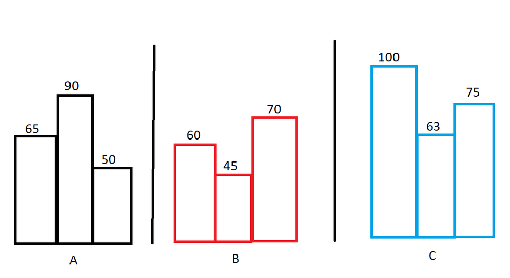
I would like to create a bar chart that shows data on a weekly basis where each row is an unique bar and the data is grouped by label. Currently my graph looks like this:
The tall bars are aggregated which is something that I do not want, furthermore I would like to group the bars by label (three groups one for each color).
While in an ideal situation it looks like this:
The columns that I am using for the visualization are already set to "Don't summarize" but because of the nature of the visualization PowerBI aggregates automatically. Would there be a work around to fix the described problem and to get the desired output?
Thanks in advance,
Davo
Solved! Go to Solution.
- Mark as New
- Bookmark
- Subscribe
- Mute
- Subscribe to RSS Feed
- Permalink
- Report Inappropriate Content
@Anonymous
You may take advantage of the Legend field.
https://community.powerbi.com/t5/Desktop/graph-trouble-summing/m-p/564094#M266151
If this post helps, then please consider Accept it as the solution to help the other members find it more quickly.
- Mark as New
- Bookmark
- Subscribe
- Mute
- Subscribe to RSS Feed
- Permalink
- Report Inappropriate Content
A working (but not very elegant) solution that I found is creating three bar charts where each bar charts filters one of the three options. By using either an ID or a date with timestamp I could show non aggregated values (the sum of 1 value).
Helpful resources

Microsoft Fabric Learn Together
Covering the world! 9:00-10:30 AM Sydney, 4:00-5:30 PM CET (Paris/Berlin), 7:00-8:30 PM Mexico City

Power BI Monthly Update - April 2024
Check out the April 2024 Power BI update to learn about new features.

| User | Count |
|---|---|
| 115 | |
| 100 | |
| 90 | |
| 68 | |
| 61 |
| User | Count |
|---|---|
| 150 | |
| 120 | |
| 100 | |
| 87 | |
| 68 |

