- Power BI forums
- Updates
- News & Announcements
- Get Help with Power BI
- Desktop
- Service
- Report Server
- Power Query
- Mobile Apps
- Developer
- DAX Commands and Tips
- Custom Visuals Development Discussion
- Health and Life Sciences
- Power BI Spanish forums
- Translated Spanish Desktop
- Power Platform Integration - Better Together!
- Power Platform Integrations (Read-only)
- Power Platform and Dynamics 365 Integrations (Read-only)
- Training and Consulting
- Instructor Led Training
- Dashboard in a Day for Women, by Women
- Galleries
- Community Connections & How-To Videos
- COVID-19 Data Stories Gallery
- Themes Gallery
- Data Stories Gallery
- R Script Showcase
- Webinars and Video Gallery
- Quick Measures Gallery
- 2021 MSBizAppsSummit Gallery
- 2020 MSBizAppsSummit Gallery
- 2019 MSBizAppsSummit Gallery
- Events
- Ideas
- Custom Visuals Ideas
- Issues
- Issues
- Events
- Upcoming Events
- Community Blog
- Power BI Community Blog
- Custom Visuals Community Blog
- Community Support
- Community Accounts & Registration
- Using the Community
- Community Feedback
Register now to learn Fabric in free live sessions led by the best Microsoft experts. From Apr 16 to May 9, in English and Spanish.
- Power BI forums
- Forums
- Get Help with Power BI
- Desktop
- Clustered bar chart X-axis with time
- Subscribe to RSS Feed
- Mark Topic as New
- Mark Topic as Read
- Float this Topic for Current User
- Bookmark
- Subscribe
- Printer Friendly Page
- Mark as New
- Bookmark
- Subscribe
- Mute
- Subscribe to RSS Feed
- Permalink
- Report Inappropriate Content
Clustered bar chart X-axis with time
Hi all,
I have a clustered bar chart where the X-axis is a time series and the Y-axis is a quantity value for product count comparisons between two systems. I doubt that is important to any of you as the only thing I am having a problem with is the X-axis time series. Basically, if I use a date slicer and restrict the date to a few days, I start getting the following:
October 10, 12:00PM
October 11, 12:00AM
October 11, 12:00PM
October 12, 12:00AM
Et cetera...
Is there a way to remove the 12-hour ticks from the clustered bar chart and have it display only the day? This only happens when the chart has such a little amount of data that it seems that the visual tries to include half-day increments even though there's no time data really. If anything, my time data is as follows: '2017-10-10 00:00:00.000'
My data never has time--to my knowledge--apart from the general zero hour. Even if it did, I just want to show a whole date.
Any help is appreciated and let me know if I need to give you more information!
Regards,
Derek
- Mark as New
- Bookmark
- Subscribe
- Mute
- Subscribe to RSS Feed
- Permalink
- Report Inappropriate Content
You should be able to just change the format of your column to Date instead of Date Time.
@ me in replies or I'll lose your thread!!!
Instead of a Kudo, please vote for this idea
Become an expert!: Enterprise DNA
External Tools: MSHGQM
YouTube Channel!: Microsoft Hates Greg
Latest book!: The Definitive Guide to Power Query (M)
DAX is easy, CALCULATE makes DAX hard...
- Mark as New
- Bookmark
- Subscribe
- Mute
- Subscribe to RSS Feed
- Permalink
- Report Inappropriate Content
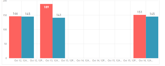
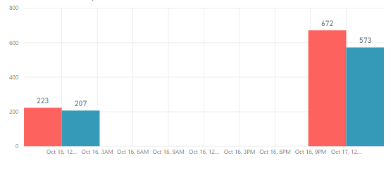
Hi there, smoupre! Thanks for responding. My column data types are now "Date" but the issue persisted. Previously the column data types were date/time, but I chose the M/dd/yyyy format. Please see the included screenshots for what it looks like when I select only a few days versus what it looks like when I select more days:


- Mark as New
- Bookmark
- Subscribe
- Mute
- Subscribe to RSS Feed
- Permalink
- Report Inappropriate Content
Hmm, that's odd. Well, you could create a new column and use FORMAT to ensure that it strips out the time information and then just use that column instead.
Alternatively, go into your query in Query Editor and switch the data type of your column there so that it comes into your data model without the time information.
@ me in replies or I'll lose your thread!!!
Instead of a Kudo, please vote for this idea
Become an expert!: Enterprise DNA
External Tools: MSHGQM
YouTube Channel!: Microsoft Hates Greg
Latest book!: The Definitive Guide to Power Query (M)
DAX is easy, CALCULATE makes DAX hard...
- Mark as New
- Bookmark
- Subscribe
- Mute
- Subscribe to RSS Feed
- Permalink
- Report Inappropriate Content
Tried both but got same results. The initial time I used the FORMAT function in DAX, I thought I had it working but what happened was the X-axis was no longer categorized/continuous. I would get data such as the following:
Oct 04: 900/1000
Oct 06: 100/300
Oct 07: 50/70
Oct 10: 125/160
I want the grid to be like so:
Oct 04: 900/1000
Oct 05: (blank)
Oct 06: 100/300
Oct 07: 50/70
Oct 08: (blank)
Oct 09: (blank)
Oct 10: 125/160
Ultimately changing data type in query editor or via direct modeling in the designer or using the DAX function, I was unable to get it to work.
- Mark as New
- Bookmark
- Subscribe
- Mute
- Subscribe to RSS Feed
- Permalink
- Report Inappropriate Content
Hi @jderekc,
After you use FORMAT function in DAX to get a date column, you can create a calendar table(=CALENDAR("2017-1-1",TODAY())), change date column in calendar table as date data type. Then create a relationship between those two tables based on date column. Then you can drag the date column from calendar table to the X-axis of the chart. The X-axis value should be continuous now.
Best Regards,
Qiuyun Yu
If this post helps, then please consider Accept it as the solution to help the other members find it more quickly.
- Mark as New
- Bookmark
- Subscribe
- Mute
- Subscribe to RSS Feed
- Permalink
- Report Inappropriate Content
Hi @v-qiuyu-msft,
Thanks. This works only if I use the date hierarchy and select "Day" from the drop-down. If I keep the date continuous, doing this prevents the hour-ticks from showing. If I don't do this and instead choose the date as a whole, I get the hour-ticks. I created the calendar table as you suggested using dates from the beginning of 2017 until the end of 2027. The column is formatted as a date column with no time associated with it. I then established a relationship with the table that has the "posted date" column. I checked and this column is also a date column with no time. The relationship created successfully.
But, like I said, this only works with the "continuous" selection if you break out the date hierarchy. It won't work if you keep the date "whole".


- Mark as New
- Bookmark
- Subscribe
- Mute
- Subscribe to RSS Feed
- Permalink
- Report Inappropriate Content
Funny you used the word continuous. If you click on the visualization and go to the Formatting section, and to the X-Axis dropdown, change the Type from Continuous to Categorical and the issue will go away.
- Mark as New
- Bookmark
- Subscribe
- Mute
- Subscribe to RSS Feed
- Permalink
- Report Inappropriate Content
If you do this, you lose the ability to create a trend line 😕
- Mark as New
- Bookmark
- Subscribe
- Mute
- Subscribe to RSS Feed
- Permalink
- Report Inappropriate Content
@HansTheEnforcer THANK YOU, I was experiencing this issue and this trick with the X-Axis worked like a charm!
- Mark as New
- Bookmark
- Subscribe
- Mute
- Subscribe to RSS Feed
- Permalink
- Report Inappropriate Content
I have the same issue and what you are proposing is an awful lot of effect for one report, when it is a basic bug in Desktop. I have several of these in my first reporting solution using Power BI and frankly, I am getting tired of having to code workarounds, when the visuals and the integration between Desktop and Dashboard should be better. Please can Microsoft work on all of the bugs rather than giving us workarounds? (I acknowledge that this ticket is 3 days old but really, this must be a long standing bug.) It's such a shame as so much effort has gone into the data engines that the visuals but this and the other smaller issues that I have found, in just one week of using Power BI, just let it all down. This issue is indicative of all bar charts.
Helpful resources

Microsoft Fabric Learn Together
Covering the world! 9:00-10:30 AM Sydney, 4:00-5:30 PM CET (Paris/Berlin), 7:00-8:30 PM Mexico City

Power BI Monthly Update - April 2024
Check out the April 2024 Power BI update to learn about new features.

| User | Count |
|---|---|
| 106 | |
| 94 | |
| 77 | |
| 65 | |
| 53 |
| User | Count |
|---|---|
| 145 | |
| 105 | |
| 104 | |
| 90 | |
| 63 |
