- Power BI forums
- Updates
- News & Announcements
- Get Help with Power BI
- Desktop
- Service
- Report Server
- Power Query
- Mobile Apps
- Developer
- DAX Commands and Tips
- Custom Visuals Development Discussion
- Health and Life Sciences
- Power BI Spanish forums
- Translated Spanish Desktop
- Power Platform Integration - Better Together!
- Power Platform Integrations (Read-only)
- Power Platform and Dynamics 365 Integrations (Read-only)
- Training and Consulting
- Instructor Led Training
- Dashboard in a Day for Women, by Women
- Galleries
- Community Connections & How-To Videos
- COVID-19 Data Stories Gallery
- Themes Gallery
- Data Stories Gallery
- R Script Showcase
- Webinars and Video Gallery
- Quick Measures Gallery
- 2021 MSBizAppsSummit Gallery
- 2020 MSBizAppsSummit Gallery
- 2019 MSBizAppsSummit Gallery
- Events
- Ideas
- Custom Visuals Ideas
- Issues
- Issues
- Events
- Upcoming Events
- Community Blog
- Power BI Community Blog
- Custom Visuals Community Blog
- Community Support
- Community Accounts & Registration
- Using the Community
- Community Feedback
Register now to learn Fabric in free live sessions led by the best Microsoft experts. From Apr 16 to May 9, in English and Spanish.
- Power BI forums
- Forums
- Get Help with Power BI
- Desktop
- Clustered Stacked Chart with Subcounts on one tabl...
- Subscribe to RSS Feed
- Mark Topic as New
- Mark Topic as Read
- Float this Topic for Current User
- Bookmark
- Subscribe
- Printer Friendly Page
- Mark as New
- Bookmark
- Subscribe
- Mute
- Subscribe to RSS Feed
- Permalink
- Report Inappropriate Content
Clustered Stacked Chart with Subcounts on one table
I have a single table that I want to graph on a clustered stacked chart. The table looks something like the following:
Owners Location SuperGroup OtherGroup
Joe Atlanta Y
Joe Atlanta Y
Joe Atlanta
Joe New York Y
Joe Pittsburgh
Mary Kansas City Y
Mary Kansas City
Mary Denver Y
I would like to have Owners on the X axis. Each Location would be a column within each owner. The column stack would represent the total amount of records for a giving Owner/Location combo, while the a portion of that stack would represent a count of all records for a given Owner/Location combo where either SuperGroup OR OtherGroup = Y.
I have been playing around with measures with distinct but can't figure it out.
Thanks in advance.
-Scott_J
Solved! Go to Solution.
- Mark as New
- Bookmark
- Subscribe
- Mute
- Subscribe to RSS Feed
- Permalink
- Report Inappropriate Content
Hey,
first I would create a calculated column like so
Either SuperGroup or OtherGroup =
IF(OR('Table1'[SuperGroup] = "Y", 'Table1'[OtherGroup] = "Y"),1,0)
then a measure like so
Sum of Either SuperGroup or OtherGroup =
SUM('Table1'[Either SuperGroup or OtherGroup])
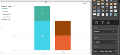
this leads to chart like this
Hopefully this is what you are looking for
Regards
Tom
Did I answer your question? Mark my post as a solution, this will help others!
Proud to be a Super User!
I accept Kudos 😉
Hamburg, Germany
- Mark as New
- Bookmark
- Subscribe
- Mute
- Subscribe to RSS Feed
- Permalink
- Report Inappropriate Content
Hi,
I'd suggest you select the first 2 columns and "Unpivot the other columns" to convert your dataset into a 4 column one (the third and fouth columns being Groups and Response) using the Query Editor. Then create your chart.
Regards,
Ashish Mathur
http://www.ashishmathur.com
https://www.linkedin.com/in/excelenthusiasts/
- Mark as New
- Bookmark
- Subscribe
- Mute
- Subscribe to RSS Feed
- Permalink
- Report Inappropriate Content
Hey,
first I would create a calculated column like so
Either SuperGroup or OtherGroup =
IF(OR('Table1'[SuperGroup] = "Y", 'Table1'[OtherGroup] = "Y"),1,0)
then a measure like so
Sum of Either SuperGroup or OtherGroup =
SUM('Table1'[Either SuperGroup or OtherGroup])
this leads to chart like this
Hopefully this is what you are looking for
Regards
Tom
Did I answer your question? Mark my post as a solution, this will help others!
Proud to be a Super User!
I accept Kudos 😉
Hamburg, Germany
Helpful resources

Microsoft Fabric Learn Together
Covering the world! 9:00-10:30 AM Sydney, 4:00-5:30 PM CET (Paris/Berlin), 7:00-8:30 PM Mexico City

Power BI Monthly Update - April 2024
Check out the April 2024 Power BI update to learn about new features.

| User | Count |
|---|---|
| 109 | |
| 98 | |
| 77 | |
| 66 | |
| 54 |
| User | Count |
|---|---|
| 144 | |
| 104 | |
| 101 | |
| 86 | |
| 64 |

