- Power BI forums
- Updates
- News & Announcements
- Get Help with Power BI
- Desktop
- Service
- Report Server
- Power Query
- Mobile Apps
- Developer
- DAX Commands and Tips
- Custom Visuals Development Discussion
- Health and Life Sciences
- Power BI Spanish forums
- Translated Spanish Desktop
- Power Platform Integration - Better Together!
- Power Platform Integrations (Read-only)
- Power Platform and Dynamics 365 Integrations (Read-only)
- Training and Consulting
- Instructor Led Training
- Dashboard in a Day for Women, by Women
- Galleries
- Community Connections & How-To Videos
- COVID-19 Data Stories Gallery
- Themes Gallery
- Data Stories Gallery
- R Script Showcase
- Webinars and Video Gallery
- Quick Measures Gallery
- 2021 MSBizAppsSummit Gallery
- 2020 MSBizAppsSummit Gallery
- 2019 MSBizAppsSummit Gallery
- Events
- Ideas
- Custom Visuals Ideas
- Issues
- Issues
- Events
- Upcoming Events
- Community Blog
- Power BI Community Blog
- Custom Visuals Community Blog
- Community Support
- Community Accounts & Registration
- Using the Community
- Community Feedback
Register now to learn Fabric in free live sessions led by the best Microsoft experts. From Apr 16 to May 9, in English and Spanish.
- Power BI forums
- Forums
- Get Help with Power BI
- Desktop
- Clustered Column Chart - More than one value for t...
- Subscribe to RSS Feed
- Mark Topic as New
- Mark Topic as Read
- Float this Topic for Current User
- Bookmark
- Subscribe
- Printer Friendly Page
- Mark as New
- Bookmark
- Subscribe
- Mute
- Subscribe to RSS Feed
- Permalink
- Report Inappropriate Content
Clustered Column Chart - More than one value for the same Legend
Hi everyone!
I'm trying to display 2 values (cost, monetarily updated cost) for 2 different kinds of matterial (paper type 1, paper type 2) along time.
I'd like to display these values using a clustered column chart, with time on x-axis and values on y-axis. That would give me 4 bars for each x-axis element (each month):
- Cost for paper type 1
- Updated cost for paper type 1
- Cost for paper type 2
- Updated cost for paper type 2
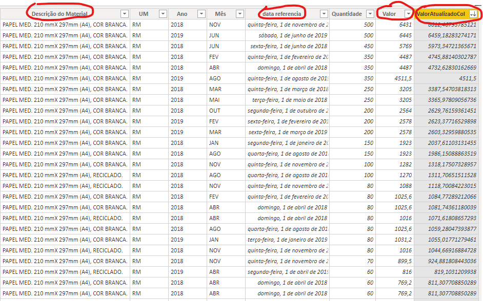
All the information needed is stored in a single table (ConsolidadoGeral), as seen bellow:

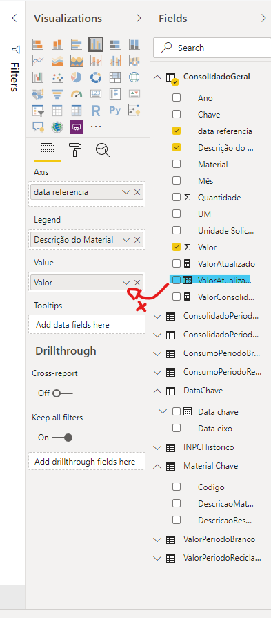
I've tried to set the clustered bar graph with these configuration:
- Axis: the date field
- Legend: the paper type field "Descrição do material" field
- Value: The cost field ("Valor") and the updated cost field ("ValorAtualizadoCol")
The problem: Power BI only allows me to drag two fields into value attribute if there is no legend field, in such a way that I can only display the information for cost or updated cost, as shown bellow:


Can I show the cost AND updated cost in the same graph, divided by paper type ("Descrição do material" field), i.e., 4 bars for each x-axis point?
Any help is welcome!
Thanks in advance.
Solved! Go to Solution.
- Mark as New
- Bookmark
- Subscribe
- Mute
- Subscribe to RSS Feed
- Permalink
- Report Inappropriate Content
Hi @Anonymous ,
If you want to show 4 bars, you have to need 2 new legends "Descrição do material".
You could copy your original table in the query editor and edit the "Descrição do material" column in the copy table. Then append these two tables as a new table.
If this post helps, then please consider Accept it as the solution to help the other members find it.
Helpful resources

Microsoft Fabric Learn Together
Covering the world! 9:00-10:30 AM Sydney, 4:00-5:30 PM CET (Paris/Berlin), 7:00-8:30 PM Mexico City

Power BI Monthly Update - April 2024
Check out the April 2024 Power BI update to learn about new features.

| User | Count |
|---|---|
| 114 | |
| 99 | |
| 83 | |
| 70 | |
| 60 |
| User | Count |
|---|---|
| 150 | |
| 115 | |
| 104 | |
| 89 | |
| 65 |
