- Power BI forums
- Updates
- News & Announcements
- Get Help with Power BI
- Desktop
- Service
- Report Server
- Power Query
- Mobile Apps
- Developer
- DAX Commands and Tips
- Custom Visuals Development Discussion
- Health and Life Sciences
- Power BI Spanish forums
- Translated Spanish Desktop
- Power Platform Integration - Better Together!
- Power Platform Integrations (Read-only)
- Power Platform and Dynamics 365 Integrations (Read-only)
- Training and Consulting
- Instructor Led Training
- Dashboard in a Day for Women, by Women
- Galleries
- Community Connections & How-To Videos
- COVID-19 Data Stories Gallery
- Themes Gallery
- Data Stories Gallery
- R Script Showcase
- Webinars and Video Gallery
- Quick Measures Gallery
- 2021 MSBizAppsSummit Gallery
- 2020 MSBizAppsSummit Gallery
- 2019 MSBizAppsSummit Gallery
- Events
- Ideas
- Custom Visuals Ideas
- Issues
- Issues
- Events
- Upcoming Events
- Community Blog
- Power BI Community Blog
- Custom Visuals Community Blog
- Community Support
- Community Accounts & Registration
- Using the Community
- Community Feedback
Register now to learn Fabric in free live sessions led by the best Microsoft experts. From Apr 16 to May 9, in English and Spanish.
- Power BI forums
- Forums
- Get Help with Power BI
- Desktop
- Clustered Column Chart Help
- Subscribe to RSS Feed
- Mark Topic as New
- Mark Topic as Read
- Float this Topic for Current User
- Bookmark
- Subscribe
- Printer Friendly Page
- Mark as New
- Bookmark
- Subscribe
- Mute
- Subscribe to RSS Feed
- Permalink
- Report Inappropriate Content
Clustered Column Chart Help
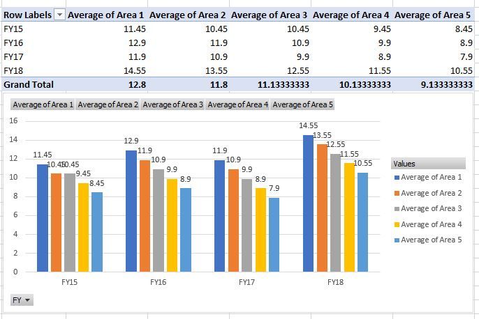
Hello Experts, I have a situation, and was hoping if you could help me. I have a table with FY, and a few area columns with the score. I then pivot it to have Area Avg by FY. Below is the screen shot of the table. I am trying to visualize this information using a "Clustered Column Chart" visual in powerBI, but then FY goes onto X Axis, where as I want FY as Legend. As you can see below, it is relatively easy to get this in MS Excel.
If you can guide me to any custom visual or way to achieve this in PowerBI, it would be very helpful to us. Please note that, I have already tried transforming the data by transposing Area Columns on Rows, but with that I am loosing so many other filter criterias. Its a part of a big fact table with multiple touchpoints/datasets. Having it as Columns is required.
- Mark as New
- Bookmark
- Subscribe
- Mute
- Subscribe to RSS Feed
- Permalink
- Report Inappropriate Content
Hi @Anonymous,
Can you share the original data please?
How about adding a calculated table as bellow?
middle_table =
SUMMARIZE (
    'table1',
    'table1'[FY],
    'table1'[area],
    "average_value", AVERAGE ( 'table1'[value] )
)
Best Regards,
Dale
If this post helps, then please consider Accept it as the solution to help the other members find it more quickly.
- Mark as New
- Bookmark
- Subscribe
- Mute
- Subscribe to RSS Feed
- Permalink
- Report Inappropriate Content
Hi Dale, thanks for your response, and sorry for the delayed reply. Creating a calculated table is not helpful. if we go with a calculated table, we loose the granular level filtering capabilites. This is the reason, why I could not go for transpose option. I will try to create a mockup dataset and share with you.
Thanks
- Mark as New
- Bookmark
- Subscribe
- Mute
- Subscribe to RSS Feed
- Permalink
- Report Inappropriate Content
Hello Experts, I have a situation, and was hoping if you could help me. I have a table with FY, and a few area columns with the score. I then pivot it to have Area Avg by FY. Below is the screen shot of the table. I am trying to visualize this information using a "Clustered Column Chart" visual in powerBI, but then FY goes onto X Axis, where as I want FY as Legend. As you can see below, it is relatively easy to get this in MS Excel.
If you can guide me to any custom visual or way to achieve this in PowerBI, it would be very helpful to us. Please note that, I have already tried transforming the data by transposing Area Columns on Rows, but with that I am loosing so many other filter criterias. Its a part of a big fact table with multiple touchpoints/datasets. Having it as Columns is required.
Helpful resources

Microsoft Fabric Learn Together
Covering the world! 9:00-10:30 AM Sydney, 4:00-5:30 PM CET (Paris/Berlin), 7:00-8:30 PM Mexico City

Power BI Monthly Update - April 2024
Check out the April 2024 Power BI update to learn about new features.

| User | Count |
|---|---|
| 112 | |
| 97 | |
| 85 | |
| 67 | |
| 59 |
| User | Count |
|---|---|
| 150 | |
| 120 | |
| 100 | |
| 87 | |
| 68 |

