- Power BI forums
- Updates
- News & Announcements
- Get Help with Power BI
- Desktop
- Service
- Report Server
- Power Query
- Mobile Apps
- Developer
- DAX Commands and Tips
- Custom Visuals Development Discussion
- Health and Life Sciences
- Power BI Spanish forums
- Translated Spanish Desktop
- Power Platform Integration - Better Together!
- Power Platform Integrations (Read-only)
- Power Platform and Dynamics 365 Integrations (Read-only)
- Training and Consulting
- Instructor Led Training
- Dashboard in a Day for Women, by Women
- Galleries
- Community Connections & How-To Videos
- COVID-19 Data Stories Gallery
- Themes Gallery
- Data Stories Gallery
- R Script Showcase
- Webinars and Video Gallery
- Quick Measures Gallery
- 2021 MSBizAppsSummit Gallery
- 2020 MSBizAppsSummit Gallery
- 2019 MSBizAppsSummit Gallery
- Events
- Ideas
- Custom Visuals Ideas
- Issues
- Issues
- Events
- Upcoming Events
- Community Blog
- Power BI Community Blog
- Custom Visuals Community Blog
- Community Support
- Community Accounts & Registration
- Using the Community
- Community Feedback
Register now to learn Fabric in free live sessions led by the best Microsoft experts. From Apr 16 to May 9, in English and Spanish.
- Power BI forums
- Forums
- Get Help with Power BI
- Desktop
- Clustered Column Chart Dynamic Y-Axis Scale or Add...
- Subscribe to RSS Feed
- Mark Topic as New
- Mark Topic as Read
- Float this Topic for Current User
- Bookmark
- Subscribe
- Printer Friendly Page
- Mark as New
- Bookmark
- Subscribe
- Mute
- Subscribe to RSS Feed
- Permalink
- Report Inappropriate Content
Clustered Column Chart Dynamic Y-Axis Scale or Adding Space Between Bars
Hi all,
I have a clustered column chart with four bars showing the following measures that I calculated within Power BI:
Prior QTR EPS = Last Quarter reported - 12 months, return the value of EPS
Current QTR EPS = Last Quarter reported, return the value of EPS
Prior YTD = Last Year reported - 1 & quarters in that year <= last quarter reported, return the sum of EPS values
Current YTD = All quarters reported of current year, return the sum of EPS values
*Again, these are measures that I created within Power BI. These measures have dependencies on at least 10 other columns created in Power BI (not Power Query).*
Originally, I have all four of these measures listed under values in one clustered column chart. (I am not allowed by the application to place these values under axis or legend.) However, I need there to be space between each bar. I found that this would not be possible with what I currently have. I found a potential solution that would require me to redo a lot of my work in Power Query which is a language I do not understand. So, I thought that I would create a separate clustered column chart for each bar. This way, I could choose how much space is between each bar. Seemed like a good enough solution for me, and the viewer would not notice the difference. But, of course I ran into a problem.
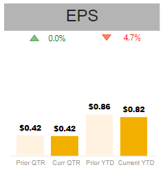
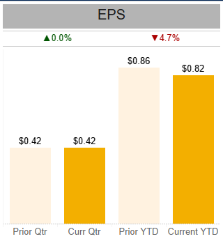
Within this dashboard, I have a slicer to filter for company. In the first photo, I am looking at Company A. The highest value listed is $2.10, so I made the end of each y-axis $2.30 so that the bars would be proportional to one another. However, in the second photo when Company B is in view, this same axis range obviously remains in place... and there is too much white space. The values are much smaller, so it is more difficult to see the differences. Is there a way to create a dynamic axis range that would find the maximum value of the four measures in the visuals and adjust the y-axis end accordingly? Or perhaps you know a solution to the original problem I had and know of a way for me to fix that and avoid this second issue?
Any and all help is appreciated. Please see the photos below with their descriptions showing beneath each photo.
Photo 1: (The Prior QTR and YTD bars may not be visible as the color is naturally pretty light.) Company A, Y-Axis end for the individual charts is $2.30 to account for the max value which is the Current YTD bar in this case.
Photo 2: (The Prior QTR and YTD bars may not be visible as the color is naturally pretty light.) Company B, Y-Axis end for the individual charts is still $2.30, because this is how I edited each viz when creating them while looking at Company A. In this case, I would want the y-axis end to rely on the Prior YTD bar as this is the max value.
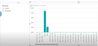
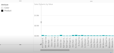
Photo 3: (The Prior QTR and YTD bars may not be visible as the color is naturally pretty light.) This is the original visual that I am attempting to recreate. This visual shows Company B.
Solved! Go to Solution.
- Mark as New
- Bookmark
- Subscribe
- Mute
- Subscribe to RSS Feed
- Permalink
- Report Inappropriate Content
This definitely would have been great help for another project I did! I was unfamiliar with unpivoting at the time and ended up using bookmarks and buttons to create something dynamic like this. I may go back during some free time and try this solution as it may be a bit more visually appealing. This could potentially work with this project... but I worry with there being too much data and more than one kind of data... I found a solution that seems functional enough.
My Solution: I have kept the format of having a separate clustered column chart for each bar, so I have four visuals. I added all four measures to each, but I made the three I'm not wanting to show in that specific visual the same color as the background (white). So for the first bar (Prior QTR), I have the other three measures included, but colored white. For the second bar, I have Prior QTR, Prior YTD, and Current YTD listed after Curr QTR and colors white so that only Curr QTR shows. And so on... This way, all of the axes are the same, the bars appear proportional, and the axes can be set to an auto range that changes according to the slicer.
My solution would be a pain if I needed to go in and select and edit these visuals in the future, but luckily I won't have to. I appreciate the help! Excited to try this in my other project when I get the chance.
Best.
- Mark as New
- Bookmark
- Subscribe
- Mute
- Subscribe to RSS Feed
- Permalink
- Report Inappropriate Content
Hi @amconnel ,
Refer to the teaching provided by the following video link, which can help you.
If the problem is still not resolved, please provide detailed error information and let me know immediately. Looking forward to your reply.
Best Regards,
Henry
If this post helps, then please consider Accept it as the solution to help the other members find it more quickly.
- Mark as New
- Bookmark
- Subscribe
- Mute
- Subscribe to RSS Feed
- Permalink
- Report Inappropriate Content
This definitely would have been great help for another project I did! I was unfamiliar with unpivoting at the time and ended up using bookmarks and buttons to create something dynamic like this. I may go back during some free time and try this solution as it may be a bit more visually appealing. This could potentially work with this project... but I worry with there being too much data and more than one kind of data... I found a solution that seems functional enough.
My Solution: I have kept the format of having a separate clustered column chart for each bar, so I have four visuals. I added all four measures to each, but I made the three I'm not wanting to show in that specific visual the same color as the background (white). So for the first bar (Prior QTR), I have the other three measures included, but colored white. For the second bar, I have Prior QTR, Prior YTD, and Current YTD listed after Curr QTR and colors white so that only Curr QTR shows. And so on... This way, all of the axes are the same, the bars appear proportional, and the axes can be set to an auto range that changes according to the slicer.
My solution would be a pain if I needed to go in and select and edit these visuals in the future, but luckily I won't have to. I appreciate the help! Excited to try this in my other project when I get the chance.
Best.
Helpful resources

Microsoft Fabric Learn Together
Covering the world! 9:00-10:30 AM Sydney, 4:00-5:30 PM CET (Paris/Berlin), 7:00-8:30 PM Mexico City

Power BI Monthly Update - April 2024
Check out the April 2024 Power BI update to learn about new features.

| User | Count |
|---|---|
| 114 | |
| 100 | |
| 78 | |
| 75 | |
| 52 |
| User | Count |
|---|---|
| 144 | |
| 109 | |
| 108 | |
| 88 | |
| 61 |

