- Power BI forums
- Updates
- News & Announcements
- Get Help with Power BI
- Desktop
- Service
- Report Server
- Power Query
- Mobile Apps
- Developer
- DAX Commands and Tips
- Custom Visuals Development Discussion
- Health and Life Sciences
- Power BI Spanish forums
- Translated Spanish Desktop
- Power Platform Integration - Better Together!
- Power Platform Integrations (Read-only)
- Power Platform and Dynamics 365 Integrations (Read-only)
- Training and Consulting
- Instructor Led Training
- Dashboard in a Day for Women, by Women
- Galleries
- Community Connections & How-To Videos
- COVID-19 Data Stories Gallery
- Themes Gallery
- Data Stories Gallery
- R Script Showcase
- Webinars and Video Gallery
- Quick Measures Gallery
- 2021 MSBizAppsSummit Gallery
- 2020 MSBizAppsSummit Gallery
- 2019 MSBizAppsSummit Gallery
- Events
- Ideas
- Custom Visuals Ideas
- Issues
- Issues
- Events
- Upcoming Events
- Community Blog
- Power BI Community Blog
- Custom Visuals Community Blog
- Community Support
- Community Accounts & Registration
- Using the Community
- Community Feedback
Register now to learn Fabric in free live sessions led by the best Microsoft experts. From Apr 16 to May 9, in English and Spanish.
- Power BI forums
- Forums
- Get Help with Power BI
- Desktop
- Clustered Bar Chart - Bar Colour Depends on Positi...
- Subscribe to RSS Feed
- Mark Topic as New
- Mark Topic as Read
- Float this Topic for Current User
- Bookmark
- Subscribe
- Printer Friendly Page
- Mark as New
- Bookmark
- Subscribe
- Mute
- Subscribe to RSS Feed
- Permalink
- Report Inappropriate Content
Clustered Bar Chart - Bar Colour Depends on Position of Bar
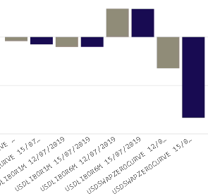
I have a slicer of dates where a user can choose 1 or more dates (multiple selection). The expected scenario is for the user to choose 2 dates, where the intention is to show values on a clustered column chart comparing values as at the 2 selected dates for each of a number of scenarios. I have configured the chart such that the chart legend shows the 2 selected dates, and the bar colours are chosen (eg date 1 bar colour is grey and date 2 bar colour is blue for all scenarios).
All good and well. The problem comes when the date selection is changed by the user. I need my bars to all stay the same colour as originally chosen ie whichever 2 dates the user selects, the earlier date bars must always be grey, and the later date bars must always be blue. In many searches and trials so far, I have not been able to achieve this - the bars always change colour as the dates are changed to different dates because the bar colour is associated with the date and not with the position of the bar in the chart. I would like to know if anyone has either achieved this before or has some ideas on how to achieve this.
Solved! Go to Solution.
- Mark as New
- Bookmark
- Subscribe
- Mute
- Subscribe to RSS Feed
- Permalink
- Report Inappropriate Content
Drag [Date] to Axis instead of Legend and try Color formatting by field value from the Data colors card in the formatting pane.
Measure =
IF (
    SELECTEDVALUE ( 'Table'[Date] )
        = CALCULATE ( MIN ( 'Table'[Date] ), ALLSELECTED ( 'Table'[Date] ) ),
    "#808080",
    "#0000FF"
)
If this post helps, then please consider Accept it as the solution to help the other members find it more quickly.
- Mark as New
- Bookmark
- Subscribe
- Mute
- Subscribe to RSS Feed
- Permalink
- Report Inappropriate Content
Thank you very much for your suggestion. This achieves what I need in terms of the colour consistency. Unfortunately moving the date to the Axis instead of the Legend means that the bars no longer group together neatly as before, and also the axis labels become crowded...


There isn't an option to apply the conditional colour formatting when the date is in the legend, so I may not be able to get any closer to the target view for now. But this is definitely a step in the right direction. My thanks, once again.
Helpful resources

Microsoft Fabric Learn Together
Covering the world! 9:00-10:30 AM Sydney, 4:00-5:30 PM CET (Paris/Berlin), 7:00-8:30 PM Mexico City

Power BI Monthly Update - April 2024
Check out the April 2024 Power BI update to learn about new features.

| User | Count |
|---|---|
| 112 | |
| 100 | |
| 80 | |
| 64 | |
| 57 |
| User | Count |
|---|---|
| 145 | |
| 111 | |
| 92 | |
| 84 | |
| 66 |
