- Power BI forums
- Updates
- News & Announcements
- Get Help with Power BI
- Desktop
- Service
- Report Server
- Power Query
- Mobile Apps
- Developer
- DAX Commands and Tips
- Custom Visuals Development Discussion
- Health and Life Sciences
- Power BI Spanish forums
- Translated Spanish Desktop
- Power Platform Integration - Better Together!
- Power Platform Integrations (Read-only)
- Power Platform and Dynamics 365 Integrations (Read-only)
- Training and Consulting
- Instructor Led Training
- Dashboard in a Day for Women, by Women
- Galleries
- Community Connections & How-To Videos
- COVID-19 Data Stories Gallery
- Themes Gallery
- Data Stories Gallery
- R Script Showcase
- Webinars and Video Gallery
- Quick Measures Gallery
- 2021 MSBizAppsSummit Gallery
- 2020 MSBizAppsSummit Gallery
- 2019 MSBizAppsSummit Gallery
- Events
- Ideas
- Custom Visuals Ideas
- Issues
- Issues
- Events
- Upcoming Events
- Community Blog
- Power BI Community Blog
- Custom Visuals Community Blog
- Community Support
- Community Accounts & Registration
- Using the Community
- Community Feedback
Register now to learn Fabric in free live sessions led by the best Microsoft experts. From Apr 16 to May 9, in English and Spanish.
- Power BI forums
- Forums
- Get Help with Power BI
- Desktop
- Re: Cluster Bar Chart and Hierarchy
- Subscribe to RSS Feed
- Mark Topic as New
- Mark Topic as Read
- Float this Topic for Current User
- Bookmark
- Subscribe
- Printer Friendly Page
- Mark as New
- Bookmark
- Subscribe
- Mute
- Subscribe to RSS Feed
- Permalink
- Report Inappropriate Content
Cluster Bar Chart and Hierarchy
Hello all,
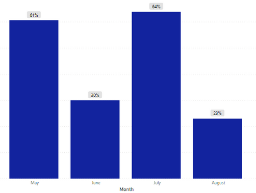
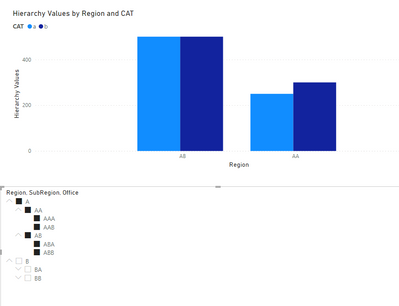
I have built a clustered bar chart that looks great. The different columns are regions in a data set I am working with. I am having an issue with the slicer I am using.
I am using a hierarchy in the slicer. I'd like to drill down into the different levels of the hierarchy . But when I do so, I do not get the clusters of the next level of the hierarchy.
When I enter the hierarchy into the 'Legend' section, only the top level of the hierarchy is entered. And it goves me one bar as pictured below, instead of the cluster I am looking for.
Any ideas on how I could correct this?
Thank you!
Solved! Go to Solution.
- Mark as New
- Bookmark
- Subscribe
- Mute
- Subscribe to RSS Feed
- Permalink
- Report Inappropriate Content
Hi @chrisx ,
You need to make a unrelated table and a measure to make this work.
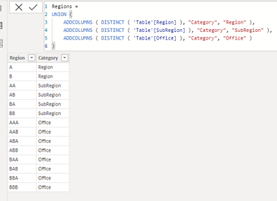
Create the following table:
Regions =
UNION (
    ADDCOLUMNS ( DISTINCT ( 'Table'[Region] ), "Category", "Region" ),
    ADDCOLUMNS ( DISTINCT ( 'Table'[SubRegion] ), "Category", "SubRegion" ),
    ADDCOLUMNS ( DISTINCT ( 'Table'[Office] ), "Category", "Office" )
)
Add the following measure to your model:
Hierarchy Values =
SWITCH (
    TRUE (),
    HASONEVALUE ( 'Table'[SubRegion] ),
        CALCULATE (
            SUM ( 'Table'[Values] ),
            'Table'[Office] = MAX ( 'Regions'[Region] )
        ),
    HASONEVALUE ( 'Table'[Region] ),
        CALCULATE (
            SUM ( 'Table'[Values] ),
            'Table'[SubRegion] = MAX ( 'Regions'[Region] )
        ),
    CALCULATE (
        SUM ( 'Table'[Values] ),
        'Table'[Region] = MAX ( 'Regions'[Region] )
    )
)
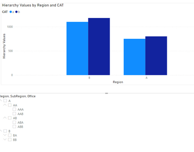
Now setup your chart in the following way:
- Axis: Regions[Region]
- Legend: Table[Cat]
- Values: [Hierarchy Values]
Check PBIX file attach.
Regards
Miguel Félix
Did I answer your question? Mark my post as a solution!
Proud to be a Super User!
Check out my blog: Power BI em Português- Mark as New
- Bookmark
- Subscribe
- Mute
- Subscribe to RSS Feed
- Permalink
- Report Inappropriate Content
Great work! @MFelix . Using the same technique and bit changes in measure we can use dynamic legend as well like Parker have shared the technique in his YouTube channel @Bielite and blog post. However, your perception is also applicable. Keep doing some extraordinary job like this.
- Mark as New
- Bookmark
- Subscribe
- Mute
- Subscribe to RSS Feed
- Permalink
- Report Inappropriate Content
Hi @Susanta91 ,
Currently with the Field parameters, this is even easier to do without the need of disconnected tables. but appreciate your words.
Regards
Miguel Félix
Did I answer your question? Mark my post as a solution!
Proud to be a Super User!
Check out my blog: Power BI em Português- Mark as New
- Bookmark
- Subscribe
- Mute
- Subscribe to RSS Feed
- Permalink
- Report Inappropriate Content
Hi @chrisx ,
You need to click the following icon to drill down and then select the slicer.
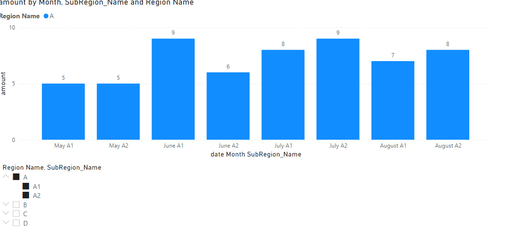
Then you can get the visual object of the hierarchical structure:
Best Regards,
Liu Yang
If this post helps, then please consider Accept it as the solution to help the other members find it more quickly.
- Mark as New
- Bookmark
- Subscribe
- Mute
- Subscribe to RSS Feed
- Permalink
- Report Inappropriate Content
Hi @chrisx ,
If your cluster in the bar chart is the region then when you use the slicer you get only a single column because the slicer and the bar chart have the same level of granularity, if you want to show the details of the Subregion then you need to do that on the bar chart.
One question do you want to have a dinamic change of the bar chart according to the level of the hierarchy slicer you select, so when selecting region you get the bar chart divided by Subregion?
Regards
Miguel Félix
Did I answer your question? Mark my post as a solution!
Proud to be a Super User!
Check out my blog: Power BI em Português- Mark as New
- Bookmark
- Subscribe
- Mute
- Subscribe to RSS Feed
- Permalink
- Report Inappropriate Content
Thanks, Miguel.
Yes, I would ike the dynamic change in the bar chart according to the level of hierarchy.
- Mark as New
- Bookmark
- Subscribe
- Mute
- Subscribe to RSS Feed
- Permalink
- Report Inappropriate Content
Hi @chrisx ,
You need to make a unrelated table and a measure to make this work.
Create the following table:
Regions =
UNION (
    ADDCOLUMNS ( DISTINCT ( 'Table'[Region] ), "Category", "Region" ),
    ADDCOLUMNS ( DISTINCT ( 'Table'[SubRegion] ), "Category", "SubRegion" ),
    ADDCOLUMNS ( DISTINCT ( 'Table'[Office] ), "Category", "Office" )
)
Add the following measure to your model:
Hierarchy Values =
SWITCH (
    TRUE (),
    HASONEVALUE ( 'Table'[SubRegion] ),
        CALCULATE (
            SUM ( 'Table'[Values] ),
            'Table'[Office] = MAX ( 'Regions'[Region] )
        ),
    HASONEVALUE ( 'Table'[Region] ),
        CALCULATE (
            SUM ( 'Table'[Values] ),
            'Table'[SubRegion] = MAX ( 'Regions'[Region] )
        ),
    CALCULATE (
        SUM ( 'Table'[Values] ),
        'Table'[Region] = MAX ( 'Regions'[Region] )
    )
)
Now setup your chart in the following way:
- Axis: Regions[Region]
- Legend: Table[Cat]
- Values: [Hierarchy Values]
Check PBIX file attach.
Regards
Miguel Félix
Did I answer your question? Mark my post as a solution!
Proud to be a Super User!
Check out my blog: Power BI em PortuguêsHelpful resources

Microsoft Fabric Learn Together
Covering the world! 9:00-10:30 AM Sydney, 4:00-5:30 PM CET (Paris/Berlin), 7:00-8:30 PM Mexico City

Power BI Monthly Update - April 2024
Check out the April 2024 Power BI update to learn about new features.

| User | Count |
|---|---|
| 116 | |
| 105 | |
| 69 | |
| 67 | |
| 43 |
| User | Count |
|---|---|
| 148 | |
| 103 | |
| 103 | |
| 88 | |
| 66 |
