- Power BI forums
- Updates
- News & Announcements
- Get Help with Power BI
- Desktop
- Service
- Report Server
- Power Query
- Mobile Apps
- Developer
- DAX Commands and Tips
- Custom Visuals Development Discussion
- Health and Life Sciences
- Power BI Spanish forums
- Translated Spanish Desktop
- Power Platform Integration - Better Together!
- Power Platform Integrations (Read-only)
- Power Platform and Dynamics 365 Integrations (Read-only)
- Training and Consulting
- Instructor Led Training
- Dashboard in a Day for Women, by Women
- Galleries
- Community Connections & How-To Videos
- COVID-19 Data Stories Gallery
- Themes Gallery
- Data Stories Gallery
- R Script Showcase
- Webinars and Video Gallery
- Quick Measures Gallery
- 2021 MSBizAppsSummit Gallery
- 2020 MSBizAppsSummit Gallery
- 2019 MSBizAppsSummit Gallery
- Events
- Ideas
- Custom Visuals Ideas
- Issues
- Issues
- Events
- Upcoming Events
- Community Blog
- Power BI Community Blog
- Custom Visuals Community Blog
- Community Support
- Community Accounts & Registration
- Using the Community
- Community Feedback
Register now to learn Fabric in free live sessions led by the best Microsoft experts. From Apr 16 to May 9, in English and Spanish.
- Power BI forums
- Forums
- Get Help with Power BI
- Desktop
- Choose which line (line = column on my table) appe...
- Subscribe to RSS Feed
- Mark Topic as New
- Mark Topic as Read
- Float this Topic for Current User
- Bookmark
- Subscribe
- Printer Friendly Page
- Mark as New
- Bookmark
- Subscribe
- Mute
- Subscribe to RSS Feed
- Permalink
- Report Inappropriate Content
Choose which line (line = column on my table) appears on the chart
Hello there,
I have this line chart where the X axis is a date column and on the Y axis I have three different lines, each one representing one calculated column from my table. I want to be able to choose which ones appear on the chart, because they are very similar and the data labels don't help much being so close to each other.
Is there any way to dynamically select one, two, n lines to show in the line chart?
Thank you for your time and patience.
Solved! Go to Solution.
- Mark as New
- Bookmark
- Subscribe
- Mute
- Subscribe to RSS Feed
- Permalink
- Report Inappropriate Content
Hi, @Anonymous
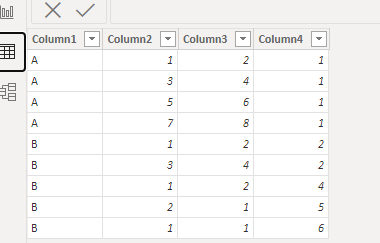
This is my test data:
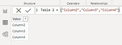
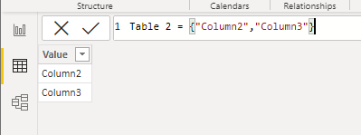
We need create a table to put the field in slice:
Here are the steps you can follow:
(1)We can create three measures:
Measure = IF("Column2" in SELECTCOLUMNS('Table 2',"1",'Table 2'[Value]),SUM('Table'[Column2]),BLANK())Measure 2 = IF("Column3" in SELECTCOLUMNS('Table 2',"1",'Table 2'[Value]),SUM('Table'[Column3]),BLANK())Measure 3 = IF("Column4" in SELECTCOLUMNS('Table 2',"1",'Table 2'[Value]),SUM('Table'[Column4]),BLANK())
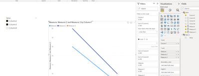
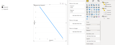
(2)Then we can put the measures in the line chart and we can meet your need:
If this method does not meet your needs, you can provide us with your special sample data and the desired output sample data in the form of tables, so that we can better help you solve the problem.
Best Regards,
Aniya Zhang
If this post helps, then please consider Accept it as the solution to help the other members find it more quickly
- Mark as New
- Bookmark
- Subscribe
- Mute
- Subscribe to RSS Feed
- Permalink
- Report Inappropriate Content
Hi , @Anonymous
According to your description , you want to show different Y-axis depending on the options. Right?
Here are the steps you can refer to :
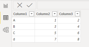
(1)This is my test data:
(2)We can create a Table which includes the Y-axis fields in the visual:
(3)We can create a measure which will put in the Y-axis of the line chart:
Measure = IF( SELECTEDVALUE('Table 2'[Value]) ="Column2" , SUM('Table'[Column2]) , SUM('Table'[Column3]))(4)Then we can put the field in the line chart and put the 'Table2'[value] in the slice and then we can meet your need:
Best Regards,
Aniya Zhang
If this post helps, then please consider Accept it as the solution to help the other members find it more quickly
- Mark as New
- Bookmark
- Subscribe
- Mute
- Subscribe to RSS Feed
- Permalink
- Report Inappropriate Content
Thank you so much for your solution! I created a Switch clause because there were a lot of options. I can now see the chosen line in a chart.
Is there a way to re-formulate it in order to be able to select more than one value?
Thank you,
- Mark as New
- Bookmark
- Subscribe
- Mute
- Subscribe to RSS Feed
- Permalink
- Report Inappropriate Content
Hi, @Anonymous
This is my test data:
We need create a table to put the field in slice:
Here are the steps you can follow:
(1)We can create three measures:
Measure = IF("Column2" in SELECTCOLUMNS('Table 2',"1",'Table 2'[Value]),SUM('Table'[Column2]),BLANK())Measure 2 = IF("Column3" in SELECTCOLUMNS('Table 2',"1",'Table 2'[Value]),SUM('Table'[Column3]),BLANK())Measure 3 = IF("Column4" in SELECTCOLUMNS('Table 2',"1",'Table 2'[Value]),SUM('Table'[Column4]),BLANK())
(2)Then we can put the measures in the line chart and we can meet your need:
If this method does not meet your needs, you can provide us with your special sample data and the desired output sample data in the form of tables, so that we can better help you solve the problem.
Best Regards,
Aniya Zhang
If this post helps, then please consider Accept it as the solution to help the other members find it more quickly
- Mark as New
- Bookmark
- Subscribe
- Mute
- Subscribe to RSS Feed
- Permalink
- Report Inappropriate Content
Thank you very much, this was definitely what I was looking for!
It's so useful that I will save this post for future reports where I need something like it.
Again, thank you!
- Mark as New
- Bookmark
- Subscribe
- Mute
- Subscribe to RSS Feed
- Permalink
- Report Inappropriate Content
Yes, read about Field Parameters. They are ideal for such a scenario. Or - enable Personalize visuals and teach your users how to use that awesome feature.
Helpful resources

Microsoft Fabric Learn Together
Covering the world! 9:00-10:30 AM Sydney, 4:00-5:30 PM CET (Paris/Berlin), 7:00-8:30 PM Mexico City

Power BI Monthly Update - April 2024
Check out the April 2024 Power BI update to learn about new features.

| User | Count |
|---|---|
| 113 | |
| 99 | |
| 80 | |
| 70 | |
| 59 |
| User | Count |
|---|---|
| 149 | |
| 114 | |
| 107 | |
| 89 | |
| 67 |
