- Power BI forums
- Updates
- News & Announcements
- Get Help with Power BI
- Desktop
- Service
- Report Server
- Power Query
- Mobile Apps
- Developer
- DAX Commands and Tips
- Custom Visuals Development Discussion
- Health and Life Sciences
- Power BI Spanish forums
- Translated Spanish Desktop
- Power Platform Integration - Better Together!
- Power Platform Integrations (Read-only)
- Power Platform and Dynamics 365 Integrations (Read-only)
- Training and Consulting
- Instructor Led Training
- Dashboard in a Day for Women, by Women
- Galleries
- Community Connections & How-To Videos
- COVID-19 Data Stories Gallery
- Themes Gallery
- Data Stories Gallery
- R Script Showcase
- Webinars and Video Gallery
- Quick Measures Gallery
- 2021 MSBizAppsSummit Gallery
- 2020 MSBizAppsSummit Gallery
- 2019 MSBizAppsSummit Gallery
- Events
- Ideas
- Custom Visuals Ideas
- Issues
- Issues
- Events
- Upcoming Events
- Community Blog
- Power BI Community Blog
- Custom Visuals Community Blog
- Community Support
- Community Accounts & Registration
- Using the Community
- Community Feedback
Register now to learn Fabric in free live sessions led by the best Microsoft experts. From Apr 16 to May 9, in English and Spanish.
- Power BI forums
- Forums
- Get Help with Power BI
- Desktop
- Charting Current Year vs Avg
- Subscribe to RSS Feed
- Mark Topic as New
- Mark Topic as Read
- Float this Topic for Current User
- Bookmark
- Subscribe
- Printer Friendly Page
- Mark as New
- Bookmark
- Subscribe
- Mute
- Subscribe to RSS Feed
- Permalink
- Report Inappropriate Content
Charting Current Year vs Avg
I am trying to compare units sold by month for this year (or the currently selected year) to last year and also the 5 yr average.
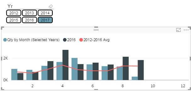
I've managed to get the correct averages and filters set up, but I'm stuck on one thing. When I select 2017 on my slicer, it only displays up to the current months on the chart for all three measures. I'm sure there is an easy way to get the last year and avg measures to display all months, but I can't figure it out. I could always create a table with some dummy data, but maybe there is a better solution?
Thanks,
jw
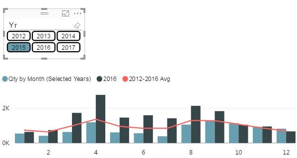
When I switch to a previous year where all 12 months are in the past, all 12 months appear
Solved! Go to Solution.
- Mark as New
- Bookmark
- Subscribe
- Mute
- Subscribe to RSS Feed
- Permalink
- Report Inappropriate Content
Hi @jwjwjwjwjw,
Based on my understanding, you need to add the month from the 'data' table rather than 'dates' table.
Best Regards,
Angelia
- Mark as New
- Bookmark
- Subscribe
- Mute
- Subscribe to RSS Feed
- Permalink
- Report Inappropriate Content
Hi @jwjwjwjwjw,
From your first screenshot, it shows the month from Jan to September rather than correct month, right? In your resource table, please check there are data of October, November and December? Do you mind share your .pbix with dummy data for further analysis?
Best Regards,
Angelia
- Mark as New
- Bookmark
- Subscribe
- Mute
- Subscribe to RSS Feed
- Permalink
- Report Inappropriate Content
Thanks for the reply, I attached an example pbix, it is simplified from the original but the issue still exists.
The data appears properly in all cases except for when 2017 is selected on the slicer. The months that haven't taken place yet in the current year (oct/nov/dec) don't show up because there is no data yet for those months, and for 2017 that is correct.
The problem when 2017 is selected, is that it also removes the oct/nov/dec from the two historical measures, which have a full year of data, in addition to the "selected period" measure.
When the year is switched to 2016 or before, everything works fine and all 12 months for all 3 measures display as intended.
What I would like to end up with is the ability for the user to change the selected period measure as they see fit and compare that to the historical average. As this is an attempt to view the seasonality of sales, the user will want to see what the trend for the rest of the year is like as well.
Let me know if this doesn't make sense, I will try to explain it further.
Thanks for the help,
jw
- Mark as New
- Bookmark
- Subscribe
- Mute
- Subscribe to RSS Feed
- Permalink
- Report Inappropriate Content
Hi @jwjwjwjwjw,
Based on my understanding, you need to add the month from the 'data' table rather than 'dates' table.
Best Regards,
Angelia
- Mark as New
- Bookmark
- Subscribe
- Mute
- Subscribe to RSS Feed
- Permalink
- Report Inappropriate Content
This worked! Thanks so much for taking the time to figure it out, I knew I had to be overlooking something!
Anywho, one interesting thing I noticed was that the first time I used the data table month instead of the date month, the table didn't update properly. I had to completely remove the original chart and create a new one, then it worked. I have noticed this every once in a while in multiple slicer scenarios, though it could be my preferred slicer of choice, the custom visual Chiclet Slicer.
Helpful resources

Microsoft Fabric Learn Together
Covering the world! 9:00-10:30 AM Sydney, 4:00-5:30 PM CET (Paris/Berlin), 7:00-8:30 PM Mexico City

Power BI Monthly Update - April 2024
Check out the April 2024 Power BI update to learn about new features.

| User | Count |
|---|---|
| 113 | |
| 97 | |
| 85 | |
| 70 | |
| 61 |
| User | Count |
|---|---|
| 151 | |
| 121 | |
| 104 | |
| 87 | |
| 67 |


