- Power BI forums
- Updates
- News & Announcements
- Get Help with Power BI
- Desktop
- Service
- Report Server
- Power Query
- Mobile Apps
- Developer
- DAX Commands and Tips
- Custom Visuals Development Discussion
- Health and Life Sciences
- Power BI Spanish forums
- Translated Spanish Desktop
- Power Platform Integration - Better Together!
- Power Platform Integrations (Read-only)
- Power Platform and Dynamics 365 Integrations (Read-only)
- Training and Consulting
- Instructor Led Training
- Dashboard in a Day for Women, by Women
- Galleries
- Community Connections & How-To Videos
- COVID-19 Data Stories Gallery
- Themes Gallery
- Data Stories Gallery
- R Script Showcase
- Webinars and Video Gallery
- Quick Measures Gallery
- 2021 MSBizAppsSummit Gallery
- 2020 MSBizAppsSummit Gallery
- 2019 MSBizAppsSummit Gallery
- Events
- Ideas
- Custom Visuals Ideas
- Issues
- Issues
- Events
- Upcoming Events
- Community Blog
- Power BI Community Blog
- Custom Visuals Community Blog
- Community Support
- Community Accounts & Registration
- Using the Community
- Community Feedback
Register now to learn Fabric in free live sessions led by the best Microsoft experts. From Apr 16 to May 9, in English and Spanish.
- Power BI forums
- Forums
- Get Help with Power BI
- Desktop
- Re: Chart shows more years than in data
- Subscribe to RSS Feed
- Mark Topic as New
- Mark Topic as Read
- Float this Topic for Current User
- Bookmark
- Subscribe
- Printer Friendly Page
- Mark as New
- Bookmark
- Subscribe
- Mute
- Subscribe to RSS Feed
- Permalink
- Report Inappropriate Content
Chart shows more years than in data
Hi everybody!
I'm having a regular LINE AND STACKED COLUMN CHART, populated with data from the years 2008 to 2019. The years are on the x-axis of the chart. The problem is that one the chart I see the range from 2005 to 2022 on the x-axis with the years 2005 to 2007 and 2019 to 2022 empty, i.e., without values. How can I tell PowerBI to show only the years I have data for?
Thank you
Christoph
Solved! Go to Solution.
- Mark as New
- Bookmark
- Subscribe
- Mute
- Subscribe to RSS Feed
- Permalink
- Report Inappropriate Content
Hi,
Try this:
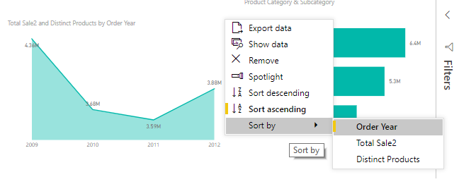
Go to the visual option> Sort by > Order Year
You need to convert the X axis to Categorical.
Rgds,
Vivek
If this post helps, then please consider Accept it as the solution to help the other members find it more quickly.
- Mark as New
- Bookmark
- Subscribe
- Mute
- Subscribe to RSS Feed
- Permalink
- Report Inappropriate Content
Hi Christoph,
There are two graph settings which could help:
Under Fields > Axis > Do not select the Date Hierarchy/Select the date instead
Under Format > X Axis > Type > Categorical (by default it is continuous)
Hope this should solve the purpose.
Thanks,
Vivek
If this post helps, then please consider Accept it as the solution to help the other members find it more quickly.
- Mark as New
- Bookmark
- Subscribe
- Mute
- Subscribe to RSS Feed
- Permalink
- Report Inappropriate Content
Thank you for the quick response.
Under Fields > Axis > Do not select the Date Hierarchy/Select the date instead
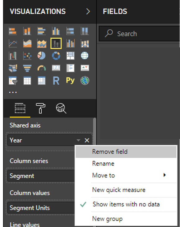
I don't find this in the visualization. You will find what I see in PowerBI in the attached picture. I should add that I have the "Year" as a whole number, not a date.
Under Format > X Axis > Type > Categorical (by default it is continuous)
If I do this, the empty years disappear but the sorting of the year reverses, i.e., 2019 is on the left of the axis and 2008 is on the right. Can I reverse this somehow?
- Mark as New
- Bookmark
- Subscribe
- Mute
- Subscribe to RSS Feed
- Permalink
- Report Inappropriate Content
Hi @ChristophEmrich ,
Have you solved your problem?
If you have solved, please always accept the replies making sense as solution to your question so that people who may have the same question can get the solution directly.
If you still need help, please share some data sample and your desired output. Or, ideally, share the pbix (beware of confidential data).
Best Regards,
Cherry
If this post helps, then please consider Accept it as the solution to help the other members find it more quickly.
- Mark as New
- Bookmark
- Subscribe
- Mute
- Subscribe to RSS Feed
- Permalink
- Report Inappropriate Content
Sorry for not replying sooner. I was on vacation. The problem unfortunately still persists (they somehow never go away during vacation...).
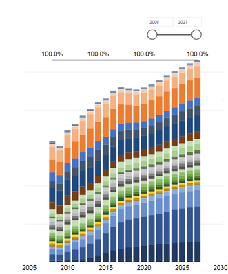
Anyway, I cannot post any sample files but I made a screenshot so maybe that helps. I have a slicer on the "Year" value and it correctly displays 2008 to 2027 because that's the full range of the data that I have. It's an integer field. The x-axis on the chart however shows 2005 to 2030. I'd like the chart to show only what's set in the slicer.
- Mark as New
- Bookmark
- Subscribe
- Mute
- Subscribe to RSS Feed
- Permalink
- Report Inappropriate Content
Hi,
Try this:
Go to the visual option> Sort by > Order Year
You need to convert the X axis to Categorical.
Rgds,
Vivek
If this post helps, then please consider Accept it as the solution to help the other members find it more quickly.
- Mark as New
- Bookmark
- Subscribe
- Mute
- Subscribe to RSS Feed
- Permalink
- Report Inappropriate Content
@vivran22 wrote:
Hi,
Try this:
Go to the visual option> Sort by > Order Year
You need to convert the X axis to Categorical.
Rgds,
Vivek
If this post helps, then please consider Accept it as the solution to help the other members find it more quickly.
That did the trick, thank you very much!
- Mark as New
- Bookmark
- Subscribe
- Mute
- Subscribe to RSS Feed
- Permalink
- Report Inappropriate Content
Hi,
Can you please check and confirm the X axis setting of the chart - is it set to Categorical or Continuos?
If Continuous, then please change it to Categorical.
Rgds,
Vivek
- Mark as New
- Bookmark
- Subscribe
- Mute
- Subscribe to RSS Feed
- Permalink
- Report Inappropriate Content
Rgds,
Vivek
- Mark as New
- Bookmark
- Subscribe
- Mute
- Subscribe to RSS Feed
- Permalink
- Report Inappropriate Content
Thanks,
Vivek
Helpful resources

Microsoft Fabric Learn Together
Covering the world! 9:00-10:30 AM Sydney, 4:00-5:30 PM CET (Paris/Berlin), 7:00-8:30 PM Mexico City

Power BI Monthly Update - April 2024
Check out the April 2024 Power BI update to learn about new features.

| User | Count |
|---|---|
| 114 | |
| 97 | |
| 86 | |
| 70 | |
| 62 |
| User | Count |
|---|---|
| 151 | |
| 120 | |
| 103 | |
| 87 | |
| 68 |


