- Power BI forums
- Updates
- News & Announcements
- Get Help with Power BI
- Desktop
- Service
- Report Server
- Power Query
- Mobile Apps
- Developer
- DAX Commands and Tips
- Custom Visuals Development Discussion
- Health and Life Sciences
- Power BI Spanish forums
- Translated Spanish Desktop
- Power Platform Integration - Better Together!
- Power Platform Integrations (Read-only)
- Power Platform and Dynamics 365 Integrations (Read-only)
- Training and Consulting
- Instructor Led Training
- Dashboard in a Day for Women, by Women
- Galleries
- Community Connections & How-To Videos
- COVID-19 Data Stories Gallery
- Themes Gallery
- Data Stories Gallery
- R Script Showcase
- Webinars and Video Gallery
- Quick Measures Gallery
- 2021 MSBizAppsSummit Gallery
- 2020 MSBizAppsSummit Gallery
- 2019 MSBizAppsSummit Gallery
- Events
- Ideas
- Custom Visuals Ideas
- Issues
- Issues
- Events
- Upcoming Events
- Community Blog
- Power BI Community Blog
- Custom Visuals Community Blog
- Community Support
- Community Accounts & Registration
- Using the Community
- Community Feedback
Register now to learn Fabric in free live sessions led by the best Microsoft experts. From Apr 16 to May 9, in English and Spanish.
- Power BI forums
- Forums
- Get Help with Power BI
- Desktop
- Chart legend to match conditional formatted column
- Subscribe to RSS Feed
- Mark Topic as New
- Mark Topic as Read
- Float this Topic for Current User
- Bookmark
- Subscribe
- Printer Friendly Page
- Mark as New
- Bookmark
- Subscribe
- Mute
- Subscribe to RSS Feed
- Permalink
- Report Inappropriate Content
Chart legend to match conditional formatted column
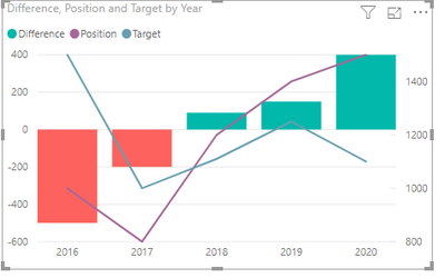
I have a chart that has conditional formatted columns based on a value (positive green, negative red). This causes the legend to show incorrectly. I guess because there is a posibility that a series could have more than 1 colour due to conditional formatting and from my understanding the legend can only show one colour per series. Is it either possible to remove just 1series from the legend or for the legend to show muliple colours?
Solved! Go to Solution.
- Mark as New
- Bookmark
- Subscribe
- Mute
- Subscribe to RSS Feed
- Permalink
- Report Inappropriate Content
There is a visual that provides an answer to this that was realised in August 2019 called 'xviz multiple axis chart', see screen shot below:
- Mark as New
- Bookmark
- Subscribe
- Mute
- Subscribe to RSS Feed
- Permalink
- Report Inappropriate Content
Hi @Anonymous ,
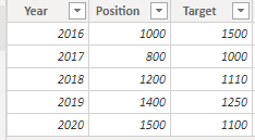
Here is my sample data.
If you want to show multiple colors, you can put the “Difference” field into column series.
When you used the "Conditional formatting", the label color of "Difference" has nothing to do with the displayed column color.
Best Regards,
Eads
If this post helps, then please consider Accept it as the solution to help the other members find it more quickly.
If this post helps, then please consider Accept it as the solution to help the other members find it.
- Mark as New
- Bookmark
- Subscribe
- Mute
- Subscribe to RSS Feed
- Permalink
- Report Inappropriate Content
Hi @v-eachen-msft,
Thanks for your reply. I agree when you say that 'the label color of "Difference" has nothing to do with the displayed column color'. But thats the problem, difference is shown as green but really doesn't relate to anything. The user will look at the chart and struggle to understand what the colour green and "Difference" relates to. Ideally "Difference" wouldn't show in the legend once conditional formatting has been put in place, is there a way of removing "Difference" from the legend?
- Mark as New
- Bookmark
- Subscribe
- Mute
- Subscribe to RSS Feed
- Permalink
- Report Inappropriate Content
Hi @Anonymous ,
By my test, I'm afraid that we cannot achieve your requirement in Power BI currently.
You could submit your idea in Power BI ideas Forum and add your comments there to improve Power BI and make this feature coming sooner.
Best Regards,
Eads
If this post helps, then please consider Accept it as the solution to help the other members find it more quickly.
If this post helps, then please consider Accept it as the solution to help the other members find it.
- Mark as New
- Bookmark
- Subscribe
- Mute
- Subscribe to RSS Feed
- Permalink
- Report Inappropriate Content
Hi @v-eachen-msft,
thank you for the quick reply, seems strange that its not somthing that would of been developed alongside the conditional formatting of colours within visuals.
I see somebody has already posted the idea: https://ideas.powerbi.com/forums/265200-power-bi-ideas/suggestions/38335789-legend-color-in-conditio... - @jesús please vote.
- Mark as New
- Bookmark
- Subscribe
- Mute
- Subscribe to RSS Feed
- Permalink
- Report Inappropriate Content
There is a visual that provides an answer to this that was realised in August 2019 called 'xviz multiple axis chart', see screen shot below:
Helpful resources

Microsoft Fabric Learn Together
Covering the world! 9:00-10:30 AM Sydney, 4:00-5:30 PM CET (Paris/Berlin), 7:00-8:30 PM Mexico City

Power BI Monthly Update - April 2024
Check out the April 2024 Power BI update to learn about new features.

| User | Count |
|---|---|
| 111 | |
| 100 | |
| 80 | |
| 64 | |
| 58 |
| User | Count |
|---|---|
| 146 | |
| 110 | |
| 93 | |
| 84 | |
| 67 |


