- Power BI forums
- Updates
- News & Announcements
- Get Help with Power BI
- Desktop
- Service
- Report Server
- Power Query
- Mobile Apps
- Developer
- DAX Commands and Tips
- Custom Visuals Development Discussion
- Health and Life Sciences
- Power BI Spanish forums
- Translated Spanish Desktop
- Power Platform Integration - Better Together!
- Power Platform Integrations (Read-only)
- Power Platform and Dynamics 365 Integrations (Read-only)
- Training and Consulting
- Instructor Led Training
- Dashboard in a Day for Women, by Women
- Galleries
- Community Connections & How-To Videos
- COVID-19 Data Stories Gallery
- Themes Gallery
- Data Stories Gallery
- R Script Showcase
- Webinars and Video Gallery
- Quick Measures Gallery
- 2021 MSBizAppsSummit Gallery
- 2020 MSBizAppsSummit Gallery
- 2019 MSBizAppsSummit Gallery
- Events
- Ideas
- Custom Visuals Ideas
- Issues
- Issues
- Events
- Upcoming Events
- Community Blog
- Power BI Community Blog
- Custom Visuals Community Blog
- Community Support
- Community Accounts & Registration
- Using the Community
- Community Feedback
Register now to learn Fabric in free live sessions led by the best Microsoft experts. From Apr 16 to May 9, in English and Spanish.
- Power BI forums
- Forums
- Get Help with Power BI
- Desktop
- Chart Help
- Subscribe to RSS Feed
- Mark Topic as New
- Mark Topic as Read
- Float this Topic for Current User
- Bookmark
- Subscribe
- Printer Friendly Page
- Mark as New
- Bookmark
- Subscribe
- Mute
- Subscribe to RSS Feed
- Permalink
- Report Inappropriate Content
Chart Help
Hi there ,
I have a data as below ;
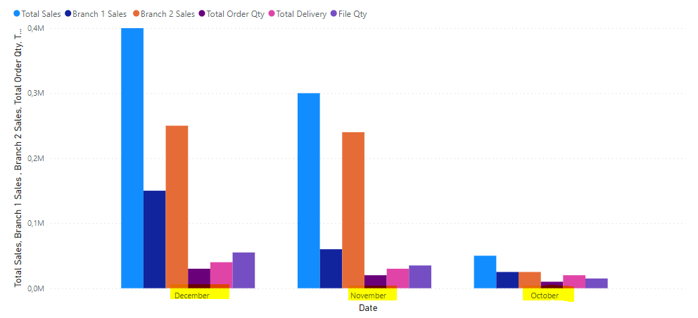
When i create a chart on power bi , datas are showed together based on months as below
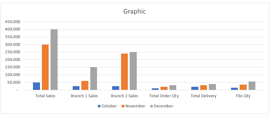
But i want to show datas as below based on their names groupped first then based on month , could you pls telll me how can i manage below seem on power bi ... thanks in advance
Solved! Go to Solution.
- Mark as New
- Bookmark
- Subscribe
- Mute
- Subscribe to RSS Feed
- Permalink
- Report Inappropriate Content
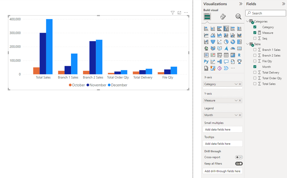
I was hoping Field Parameters could be used to quickly solve this but the result wasn't quite what you requested. Instead I put your Categories into a table and added a measure to extract the values from your table.
1. Category table (DAX), Seq should be used as sorting column:
Categories = DATATABLE(
    "Category", STRING,
    "Seq", INTEGER,
    {
        {"Total Sales", 1},
        {"Branch 1 Sales", 2},
        {"Branch 2 Sales", 3},
        {"Total Order Qty", 4},
        {"Total Delivery", 5},
        {"File Qty", 6}
    }
)
2. Measure (DAX):
Measure = SWITCH(SELECTEDVALUE(Categories[Category]),
    "Total Sales", SUM('Table'[Total Sales]),
    "Branch 1 Sales", SUM('Table'[Branch 1 Sales]),
    "Branch 2 Sales", SUM('Table'[Branch 2 Sales]),
    "Total Order Qty", SUM('Table'[Total Order Qty]),
    "Total Delivery", SUM('Table'[Total Delivery]),
    "File Qty", SUM('Table'[File Qty])
)
3. Use Clustered Column Chart visual with 'Categories'[Category] as x-axis, 'Categories'[Measure] as y-axis and 'Table'[Month] as legend.
- Mark as New
- Bookmark
- Subscribe
- Mute
- Subscribe to RSS Feed
- Permalink
- Report Inappropriate Content
In Power Query, if you select the first column (Date?) and choose Unpivot other columns, you will get 3 columns that can be pulled on to a column chart to get what you want
Helpful resources

Microsoft Fabric Learn Together
Covering the world! 9:00-10:30 AM Sydney, 4:00-5:30 PM CET (Paris/Berlin), 7:00-8:30 PM Mexico City

Power BI Monthly Update - April 2024
Check out the April 2024 Power BI update to learn about new features.

| User | Count |
|---|---|
| 112 | |
| 97 | |
| 85 | |
| 67 | |
| 59 |
| User | Count |
|---|---|
| 150 | |
| 120 | |
| 100 | |
| 87 | |
| 68 |


