- Power BI forums
- Updates
- News & Announcements
- Get Help with Power BI
- Desktop
- Service
- Report Server
- Power Query
- Mobile Apps
- Developer
- DAX Commands and Tips
- Custom Visuals Development Discussion
- Health and Life Sciences
- Power BI Spanish forums
- Translated Spanish Desktop
- Power Platform Integration - Better Together!
- Power Platform Integrations (Read-only)
- Power Platform and Dynamics 365 Integrations (Read-only)
- Training and Consulting
- Instructor Led Training
- Dashboard in a Day for Women, by Women
- Galleries
- Community Connections & How-To Videos
- COVID-19 Data Stories Gallery
- Themes Gallery
- Data Stories Gallery
- R Script Showcase
- Webinars and Video Gallery
- Quick Measures Gallery
- 2021 MSBizAppsSummit Gallery
- 2020 MSBizAppsSummit Gallery
- 2019 MSBizAppsSummit Gallery
- Events
- Ideas
- Custom Visuals Ideas
- Issues
- Issues
- Events
- Upcoming Events
- Community Blog
- Power BI Community Blog
- Custom Visuals Community Blog
- Community Support
- Community Accounts & Registration
- Using the Community
- Community Feedback
Register now to learn Fabric in free live sessions led by the best Microsoft experts. From Apr 16 to May 9, in English and Spanish.
- Power BI forums
- Forums
- Get Help with Power BI
- Desktop
- Changing Dax formula from Daily to Mothly
- Subscribe to RSS Feed
- Mark Topic as New
- Mark Topic as Read
- Float this Topic for Current User
- Bookmark
- Subscribe
- Printer Friendly Page
- Mark as New
- Bookmark
- Subscribe
- Mute
- Subscribe to RSS Feed
- Permalink
- Report Inappropriate Content
Changing Dax formula from Daily to Mothly
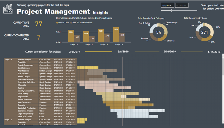
I am following a Sam Mckay video that allows you to create a dynamic Gantt chart using a matrix visual.
https://www.youtube.com/watch?v=SO4mk1H94OA
I am trying to replicate the video. The visual shows days between start date and end date. But I would like my visual to instead show months between start date and end date. The DAX below is based on days. How can I get the equivalent of what he is doing but view it from a monthly perspective? I understand VAR CurrentDay but I don’t know how to manipulate the other formulas so I can view the data from a monthly perspective.
DAX FORMULA BELOW
Step 1 =
VAR CurrentDay = MAX( Days[Days] )
VAR ProjectDays = MAX( 'Project Data'[End Date] ) - MAX( 'Project Data'[Start Date] )
VAR DaysFromStartDate = MAX( 'Project Data'[Start Date] ) - VALUE( [Selected Date] )
VAR DaysFromEndDate = DaysFromStartDate + ProjectDays
RETURN
IF(
AND( CurrentDay >= DaysFromStartDate , CurrentDay <= DaysFromEndDate ),
1,
0 )
According to the video the logic behind the formula is
Var CurrentDay = work out what day we are actually in
VAR ProjectDays = How many days the project lasts, calculates the difference between end date and start date
Value([Selected Date}) = Retrieves Minimum Date on date slicer
VAR DaysFromStartDate = Work out the starting point and how many days until the start of that project
VAR DaysFromEndDate = Days from start date + how many days the project lasted
How can I Change the DAX to view monthly data instead of daily
https://drive.google.com/file/d/11ZjcN2t8ps910iflDfGHmuWNBXjgevcf/view?usp=sharing
^^^^ Power BI Dashboard
https://drive.google.com/file/d/1q1C0mYHN2ms8XfOqzVVCjR7IYf13EJ0t/view?usp=sharing
^^^Data set
Solved! Go to Solution.
- Mark as New
- Bookmark
- Subscribe
- Mute
- Subscribe to RSS Feed
- Permalink
- Report Inappropriate Content
Hi @dw700d - I don't have an answer for your specific question, but there is a pretty good Gantt chart visual in AppSource that lets you set the granularity (day, week, month, etc). It's Gantt chart by MAQ Software.
For your specific question, try using DATEDIFF and DATEADD instead of simple arithmetic to get the data values in months.
Hope this helps
David
Helpful resources

Microsoft Fabric Learn Together
Covering the world! 9:00-10:30 AM Sydney, 4:00-5:30 PM CET (Paris/Berlin), 7:00-8:30 PM Mexico City

Power BI Monthly Update - April 2024
Check out the April 2024 Power BI update to learn about new features.

| User | Count |
|---|---|
| 111 | |
| 95 | |
| 77 | |
| 68 | |
| 54 |
| User | Count |
|---|---|
| 144 | |
| 105 | |
| 102 | |
| 89 | |
| 63 |


