- Power BI forums
- Updates
- News & Announcements
- Get Help with Power BI
- Desktop
- Service
- Report Server
- Power Query
- Mobile Apps
- Developer
- DAX Commands and Tips
- Custom Visuals Development Discussion
- Health and Life Sciences
- Power BI Spanish forums
- Translated Spanish Desktop
- Power Platform Integration - Better Together!
- Power Platform Integrations (Read-only)
- Power Platform and Dynamics 365 Integrations (Read-only)
- Training and Consulting
- Instructor Led Training
- Dashboard in a Day for Women, by Women
- Galleries
- Community Connections & How-To Videos
- COVID-19 Data Stories Gallery
- Themes Gallery
- Data Stories Gallery
- R Script Showcase
- Webinars and Video Gallery
- Quick Measures Gallery
- 2021 MSBizAppsSummit Gallery
- 2020 MSBizAppsSummit Gallery
- 2019 MSBizAppsSummit Gallery
- Events
- Ideas
- Custom Visuals Ideas
- Issues
- Issues
- Events
- Upcoming Events
- Community Blog
- Power BI Community Blog
- Custom Visuals Community Blog
- Community Support
- Community Accounts & Registration
- Using the Community
- Community Feedback
Register now to learn Fabric in free live sessions led by the best Microsoft experts. From Apr 16 to May 9, in English and Spanish.
- Power BI forums
- Forums
- Get Help with Power BI
- Desktop
- Change sort order on Y axis in Scatter chart
- Subscribe to RSS Feed
- Mark Topic as New
- Mark Topic as Read
- Float this Topic for Current User
- Bookmark
- Subscribe
- Printer Friendly Page
- Mark as New
- Bookmark
- Subscribe
- Mute
- Subscribe to RSS Feed
- Permalink
- Report Inappropriate Content
Change sort order on Y axis in Scatter chart
I've created a simple scatter chart to compare Rank with Prioritization Score. Rank is manually determined by our users, where Prioritization score is calculated based on some other field settings. Rank is set as 1, 2, 3,... with 1 being the highest; Prioritization Score is from 1 to 100 with 100 being the highest (the opposite sorting of Rank).
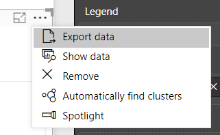
When I set Rank as the Y Axis, it automatically sorts with the highest values at the top, but I want the lowest values at the top, since the lowest value represents the highest rank. Is this possible? When I click the ellipse in the upper right of the visual, there is no Sort option.
Also, every item in the list has a Prioritization Score value since it's calculated, but not every item has a Rank; those without a Rank are omitted from the visual. Is it possible to have them appear in the visual with an assumed Rank value?
Solved! Go to Solution.
- Mark as New
- Bookmark
- Subscribe
- Mute
- Subscribe to RSS Feed
- Permalink
- Report Inappropriate Content
I tried that and it worked (actual calculation would be 1/[Rank]*100), but I think that would be too confusing for the users reviewing the report, since the numbers shown on the chart axis aren't the Rank values they assigned to each item.
I'll stick with the basic Rank value on the chart and just make sure they know which quadrant to look in.
- Mark as New
- Bookmark
- Subscribe
- Mute
- Subscribe to RSS Feed
- Permalink
- Report Inappropriate Content
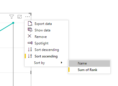
Based on the description, the rank column is in value field. right? You can click ellipse on the top-right of the the scatter chart, select "Sort bu sum of rank", then click "Sort ascending" like below:

Community Support Team _ Jimmy Tao
If this post helps, then please consider Accept it as the solution to help the other members find it more quickly.
- Mark as New
- Bookmark
- Subscribe
- Mute
- Subscribe to RSS Feed
- Permalink
- Report Inappropriate Content
There is no "Sort" option when clicking the ellipse in the top right corner of the scatter chart.
- Mark as New
- Bookmark
- Subscribe
- Mute
- Subscribe to RSS Feed
- Permalink
- Report Inappropriate Content
Is your scatter chart using Direct Query? I have one that uses this data method and it also does not have the Sort option on the visual.
What you might be able to do get around the chart naturally sorting smallest to largest was to create a calculated column that takes your Rank, multiply it by 100 then divided it by the original Rank. This would turn 1 to 100, 2 to 50, etc then use that as your Y axis and show your actual Rank in the tooltip.
- Mark as New
- Bookmark
- Subscribe
- Mute
- Subscribe to RSS Feed
- Permalink
- Report Inappropriate Content
I tried that and it worked (actual calculation would be 1/[Rank]*100), but I think that would be too confusing for the users reviewing the report, since the numbers shown on the chart axis aren't the Rank values they assigned to each item.
I'll stick with the basic Rank value on the chart and just make sure they know which quadrant to look in.
Helpful resources

Microsoft Fabric Learn Together
Covering the world! 9:00-10:30 AM Sydney, 4:00-5:30 PM CET (Paris/Berlin), 7:00-8:30 PM Mexico City

Power BI Monthly Update - April 2024
Check out the April 2024 Power BI update to learn about new features.

| User | Count |
|---|---|
| 114 | |
| 99 | |
| 83 | |
| 70 | |
| 61 |
| User | Count |
|---|---|
| 149 | |
| 114 | |
| 107 | |
| 89 | |
| 67 |

