- Power BI forums
- Updates
- News & Announcements
- Get Help with Power BI
- Desktop
- Service
- Report Server
- Power Query
- Mobile Apps
- Developer
- DAX Commands and Tips
- Custom Visuals Development Discussion
- Health and Life Sciences
- Power BI Spanish forums
- Translated Spanish Desktop
- Power Platform Integration - Better Together!
- Power Platform Integrations (Read-only)
- Power Platform and Dynamics 365 Integrations (Read-only)
- Training and Consulting
- Instructor Led Training
- Dashboard in a Day for Women, by Women
- Galleries
- Community Connections & How-To Videos
- COVID-19 Data Stories Gallery
- Themes Gallery
- Data Stories Gallery
- R Script Showcase
- Webinars and Video Gallery
- Quick Measures Gallery
- 2021 MSBizAppsSummit Gallery
- 2020 MSBizAppsSummit Gallery
- 2019 MSBizAppsSummit Gallery
- Events
- Ideas
- Custom Visuals Ideas
- Issues
- Issues
- Events
- Upcoming Events
- Community Blog
- Power BI Community Blog
- Custom Visuals Community Blog
- Community Support
- Community Accounts & Registration
- Using the Community
- Community Feedback
Register now to learn Fabric in free live sessions led by the best Microsoft experts. From Apr 16 to May 9, in English and Spanish.
- Power BI forums
- Forums
- Get Help with Power BI
- Desktop
- Change order within groups of a grouped bar chart.
- Subscribe to RSS Feed
- Mark Topic as New
- Mark Topic as Read
- Float this Topic for Current User
- Bookmark
- Subscribe
- Printer Friendly Page
- Mark as New
- Bookmark
- Subscribe
- Mute
- Subscribe to RSS Feed
- Permalink
- Report Inappropriate Content
Change order within groups of a grouped bar chart.
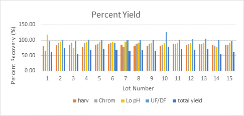
I have a bar chart, on the x-axis I have Lots, on the y-axis percentages. Each lot is divided into different steps within a process. I want to sort the steps within the Lots in the order they come within the process. I have created a sort order column but for some reason I can't sort the legend by this sort order. Here is a picture of the desired outcome:

But at the moment my chart only sorts the legend in alphabetical order (and the order of the bars within each Lot). Is this something that is possible to do?
Any help would be appreciated.
Regards,
Steven
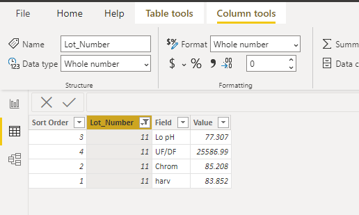
Here is an example of the data I currently have:
Lot_NumberFieldValueSort Order
| 1 | harv | 85.675 | 1 |
| 2 | harv | 82.25 | 1 |
| 3 | harv | 80.729 | 1 |
| 4 | harv | 82.178 | 1 |
| 5 | harv | 81.411 | 1 |
| 6 | harv | 82.098 | 1 |
| 7 | harv | 85.552 | 1 |
| 8 | harv | 83.671 | 1 |
| 9 | harv | 78.337 | 1 |
| 10 | harv | 80.357 | 1 |
| 11 | harv | 83.852 | 1 |
| 12 | harv | 81.959 | 1 |
| 13 | harv | 50.05 | 1 |
| 14 | harv | 82.063 | 1 |
| 15 | harv | 81.178 | 1 |
| 16 | harv | 82.022 | 1 |
| 17 | Chrom | 80.909 | 2 |
| 18 | Chrom | 107.176 | 2 |
| 19 | Chrom | 82.284 | 2 |
| 20 | Chrom | 133.346 | 2 |
| 21 | Chrom | 80.32 | 2 |
| 1 | Chrom | 69.492 | 2 |
| 2 | Chrom | 79.036 | 2 |
| 3 | Chrom | 80.301 | 2 |
| 4 | Chrom | 71.147 | 2 |
| 5 | Chrom | 74.14 | 2 |
| 22 | Chrom | 122.434 | 2 |
| 8 | Chrom | 84.445 | 2 |
| 6 | Chrom | 69.288 | 2 |
| 7 | Chrom | 77.704 | 2 |
| 9 | Chrom | 82.435 | 2 |
| 10 | Chrom | 64.255 | 2 |
| 11 | Chrom | 85.208 | 2 |
| 12 | Chrom | 92.955 | 2 |
| 23 | Lo pH | 84.385 | 3 |
| 24 | Lo pH | 97.548 | 3 |
| 17 | Lo pH | 71.686 | 3 |
| 18 | Lo pH | 79.804 | 3 |
| 19 | Lo pH | 72.261 | 3 |
| 20 | Lo pH | 73.465 | 3 |
| 21 | Lo pH | 79.45 | 3 |
| 1 | Lo pH | 76.976 | 3 |
| 2 | Lo pH | 72.027 | 3 |
| 3 | Lo pH | 84.166 | 3 |
| 4 | Lo pH | 79.639 | 3 |
| 5 | Lo pH | 85.659 | 3 |
| 6 | Lo pH | 76.442 | 3 |
| 22 | Lo pH | 73.938 | 3 |
| 7 | Lo pH | 71.475 | 3 |
| 8 | Lo pH | 69.043 | 3 |
| 9 | Lo pH | 70.253 | 3 |
| 10 | Lo pH | 77.173 | 3 |
| 11 | UF/DF | 25586.99 | 4 |
| 11 | Lo pH | 77.307 | 3 |
| 12 | UF/DF | 78.005 | 4 |
| 12 | Lo pH | 66.94 | 3 |
| 13 | Chrom | 81.489 | 2 |
| 13 | Lo pH | 61.993 | 3 |
| 13 | UF/DF | 78.028 | 4 |
| 14 | Chrom | 77.989 | 2 |
| 14 | Lo pH | 65.499 | 3 |
| 15 | Chrom | 82.657 | 2 |
| 15 | Lo pH | 66.79 | 3 |
| 14 | UF/DF | 76.562 | 4 |
| 16 | Chrom | 71.109 | 2 |
| 16 | Lo pH | 69.149 | 3 |
| 16 | UF/DF | 80.198 | 4 |
Solved! Go to Solution.
- Mark as New
- Bookmark
- Subscribe
- Mute
- Subscribe to RSS Feed
- Permalink
- Report Inappropriate Content
Hi @stevenmcginnis ,
Do you want the visual like the following?
Because there's a particularly large value in your data, the visual is a bit exaggerated.
You could check more details from my attachment.
Best Regards,
Stephen Tao
If this post helps, then please consider Accept it as the solution to help the other members find it more quickly.
Helpful resources

Microsoft Fabric Learn Together
Covering the world! 9:00-10:30 AM Sydney, 4:00-5:30 PM CET (Paris/Berlin), 7:00-8:30 PM Mexico City

Power BI Monthly Update - April 2024
Check out the April 2024 Power BI update to learn about new features.

| User | Count |
|---|---|
| 110 | |
| 94 | |
| 80 | |
| 67 | |
| 59 |
| User | Count |
|---|---|
| 150 | |
| 119 | |
| 104 | |
| 87 | |
| 67 |


