- Power BI forums
- Updates
- News & Announcements
- Get Help with Power BI
- Desktop
- Service
- Report Server
- Power Query
- Mobile Apps
- Developer
- DAX Commands and Tips
- Custom Visuals Development Discussion
- Health and Life Sciences
- Power BI Spanish forums
- Translated Spanish Desktop
- Power Platform Integration - Better Together!
- Power Platform Integrations (Read-only)
- Power Platform and Dynamics 365 Integrations (Read-only)
- Training and Consulting
- Instructor Led Training
- Dashboard in a Day for Women, by Women
- Galleries
- Community Connections & How-To Videos
- COVID-19 Data Stories Gallery
- Themes Gallery
- Data Stories Gallery
- R Script Showcase
- Webinars and Video Gallery
- Quick Measures Gallery
- 2021 MSBizAppsSummit Gallery
- 2020 MSBizAppsSummit Gallery
- 2019 MSBizAppsSummit Gallery
- Events
- Ideas
- Custom Visuals Ideas
- Issues
- Issues
- Events
- Upcoming Events
- Community Blog
- Power BI Community Blog
- Custom Visuals Community Blog
- Community Support
- Community Accounts & Registration
- Using the Community
- Community Feedback
Register now to learn Fabric in free live sessions led by the best Microsoft experts. From Apr 16 to May 9, in English and Spanish.
- Power BI forums
- Forums
- Get Help with Power BI
- Desktop
- Categorization of data and background color
- Subscribe to RSS Feed
- Mark Topic as New
- Mark Topic as Read
- Float this Topic for Current User
- Bookmark
- Subscribe
- Printer Friendly Page
- Mark as New
- Bookmark
- Subscribe
- Mute
- Subscribe to RSS Feed
- Permalink
- Report Inappropriate Content
Categorization of data and background color
Hi,
I want to use a visual that shows salary vs. performance. I have the Result table:
| ID | Performance | Salary |
| A12 | 40 | 15000 |
| A23 | 45 | 15000 |
| A22 | 55 | 18000 |
| A14 | 60 | 16000 |
| A16 | 65 | 15000 |
| A31 | 100 | 20000 |
| A32 | 90 | 18000 |
| A33 | 90 | 16500 |
| A34 | 95 | 17000 |
| A35 | 70 | 16000 |
| A36 | 75 | 17000 |
| A37 | 80 | 15000 |
I want to group them:
| Salary | <10000 | Low |
| 10001-14000 | Normal | |
| 14001-18000 | High | |
| >18001 | Very High | |
| Performance | <50 | Low |
| 51-65 | Normal | |
| 66-85 | Good | |
| >86 | Very Good |
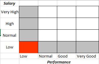
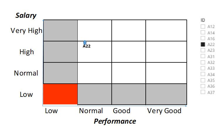
And I want to show them in power bi:
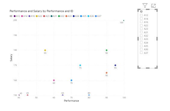
I tried with scatter chart and used a background image but it didn't work. Do you have any opinion how I could do it?
All the best,
Solved! Go to Solution.
- Mark as New
- Bookmark
- Subscribe
- Mute
- Subscribe to RSS Feed
- Permalink
- Report Inappropriate Content
@IF
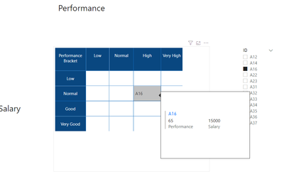
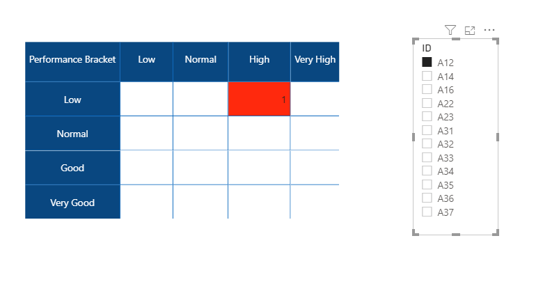
There are no visuals that can show the layout you need as far as I checked. The matrix solution I provided should work well enough for you. I have added the tooltip using a tooltip page and you can include other information as well. Hope you can accept this for your solution.
You can download the file: HERE
________________________
If my answer was helpful, please mark this post as a solution, this will also help others!.
Click on the Thumbs-Up icon if you like this reply 🙂
⭕ Subscribe and learn Power BI from these videos
⚪ Website ⚪ LinkedIn ⚪ PBI User Group
- Mark as New
- Bookmark
- Subscribe
- Mute
- Subscribe to RSS Feed
- Permalink
- Report Inappropriate Content
@IF
What do you need to show on the chart? is the count of employees who fall into each corresponding category or anything else?
________________________
Did I answer your question? Mark this post as a solution, this will help others!.
Click on the Thumbs-Up icon if you like this reply 🙂
⭕ Subscribe and learn Power BI from these videos
⚪ Website ⚪ LinkedIn ⚪ PBI User Group
- Mark as New
- Bookmark
- Subscribe
- Mute
- Subscribe to RSS Feed
- Permalink
- Report Inappropriate Content
Thanks for the answer. I want to show the values for salary and performance for each person.
However I want have a background colour at the graph. If performance and salary is in the category, then it is red. Similarly if one of them is low than it is gray colour.
- Mark as New
- Bookmark
- Subscribe
- Mute
- Subscribe to RSS Feed
- Permalink
- Report Inappropriate Content
You can download the file: HERE
________________________
Did I answer your question? Mark this post as a solution, this will help others!.
Click on the Thumbs-Up icon if you like this reply 🙂
⭕ Subscribe and learn Power BI from these videos
⚪ Website ⚪ LinkedIn ⚪ PBI User Group
- Mark as New
- Bookmark
- Subscribe
- Mute
- Subscribe to RSS Feed
- Permalink
- Report Inappropriate Content
Hi,
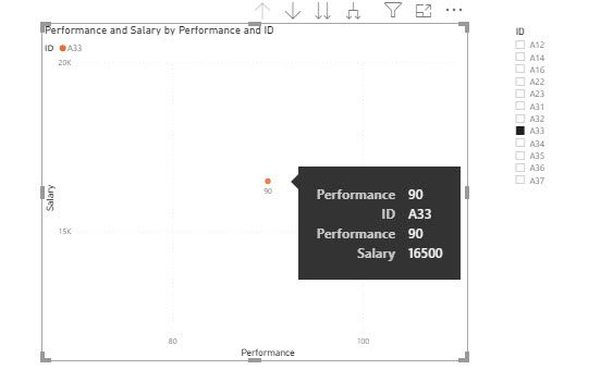
Thanks. would it be possible to show it in a chart. I want to show the values (salary and performance) in X and Y axis. Also when I hover on the ID, I want to see the salary and performance values in tooltip.
Regards,
- Mark as New
- Bookmark
- Subscribe
- Mute
- Subscribe to RSS Feed
- Permalink
- Report Inappropriate Content
@IF
Not quite clear about your requirement.
________________________
Did I answer your question? Mark this post as a solution, this will help others!.
Click on the Thumbs-Up icon if you like this reply 🙂
⭕ Subscribe and learn Power BI from these videos
⚪ Website ⚪ LinkedIn ⚪ PBI User Group
- Mark as New
- Bookmark
- Subscribe
- Mute
- Subscribe to RSS Feed
- Permalink
- Report Inappropriate Content
Hi,
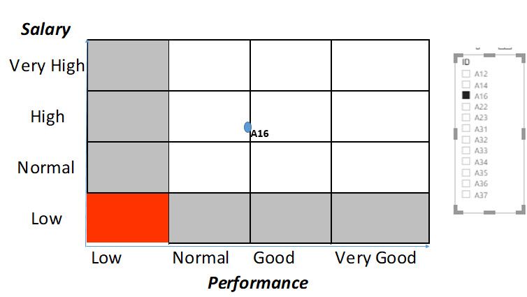
Instead of showing the values in the relevant categories, I want to show the ID numbers in a graph. For example;
It is more X and Y axis. I want to show the ID numbers under the relevant categories. When I use scatter chart, it doesn't categorize the salary or performance scale or I don't know how to do it. I hope it is clear now.
Regards,
- Mark as New
- Bookmark
- Subscribe
- Mute
- Subscribe to RSS Feed
- Permalink
- Report Inappropriate Content
@IF
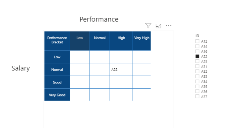
Hope you get the desired result as below:
You can download the file: HERE
________________________
If my answer was helpful, please mark this post as a solution, this will also help others!.
Click on the Thumbs-Up icon if you like this reply 🙂
⭕ Subscribe and learn Power BI from these videos
⚪ Website ⚪ LinkedIn ⚪ PBI User Group
- Mark as New
- Bookmark
- Subscribe
- Mute
- Subscribe to RSS Feed
- Permalink
- Report Inappropriate Content
Hi,
It is exactly like that 🙂 , but I want to show it in a chart. Would it be possible? The only reason that I want it in chart is that when I hover on the ID, I want to see the name, surname, etc. information. It is easy to add it with chart, but maybe possible with matrix as well.
All the best
- Mark as New
- Bookmark
- Subscribe
- Mute
- Subscribe to RSS Feed
- Permalink
- Report Inappropriate Content
@IF
There are no visuals that can show the layout you need as far as I checked. The matrix solution I provided should work well enough for you. I have added the tooltip using a tooltip page and you can include other information as well. Hope you can accept this for your solution.
You can download the file: HERE
________________________
If my answer was helpful, please mark this post as a solution, this will also help others!.
Click on the Thumbs-Up icon if you like this reply 🙂
⭕ Subscribe and learn Power BI from these videos
⚪ Website ⚪ LinkedIn ⚪ PBI User Group
- Mark as New
- Bookmark
- Subscribe
- Mute
- Subscribe to RSS Feed
- Permalink
- Report Inappropriate Content
Hi,
Thanks a lot. It is good to know the limits. btw, the tooltip doesn't show correctly when nothing is selected.
- Mark as New
- Bookmark
- Subscribe
- Mute
- Subscribe to RSS Feed
- Permalink
- Report Inappropriate Content
@IF , Not very clear . Try segmentation
https://www.daxpatterns.com/dynamic-segmentation/
https://www.daxpatterns.com/static-segmentation/
https://www.poweredsolutions.co/2020/01/11/dax-vs-power-query-static-segmentation-in-power-bi-dax-po...
https://radacad.com/grouping-and-binning-step-towards-better-data-visualization
and color measure with
https://radacad.com/dax-and-conditional-formatting-better-together-find-the-biggest-and-smallest-num...
https://docs.microsoft.com/en-us/power-bi/desktop-conditional-table-formatting#color-by-color-values
Colour =
SWITCH(TRUE(),
Table[Date] < TODAY(), "red",
Table[Date] = TODAY(), "orange",
"green")

Color sales = if(AVERAGE(Sales[Sales Amount])<170,"green","red")
Color Year = if(FIRSTNONBLANK(Table[Year],2014) <=2016,"lightgreen",if(FIRSTNONBLANK(Table[Year],2014)>2018,"red","yellow"))

Color  = if(FIRSTNONBLANK(Table[Year],2014) <=2016 && AVERAGE(Sales[Sales Amount])<170
,"lightgreen",if(FIRSTNONBLANK(Table[Year],2014)>2018,"red","yellow"))
Color sales = if([Sales Today] -[sales yesterday]>0,"green","red")

color =
switch ( true(),
FIRSTNONBLANK(Table[commodity],"NA") ="commodity1" && sum(Table[Value]) >500,"lightgreen",
FIRSTNONBLANK(Table[commodity],"NA") ="commodity2" && sum(Table[Value]) >1000,"lightgreen",
/// Add more conditions
"red"
)Microsoft Power BI Learning Resources, 2023 !!
Learn Power BI - Full Course with Dec-2022, with Window, Index, Offset, 100+ Topics !!
Did I answer your question? Mark my post as a solution! Appreciate your Kudos !! Proud to be a Super User! !!
Helpful resources

Microsoft Fabric Learn Together
Covering the world! 9:00-10:30 AM Sydney, 4:00-5:30 PM CET (Paris/Berlin), 7:00-8:30 PM Mexico City

Power BI Monthly Update - April 2024
Check out the April 2024 Power BI update to learn about new features.

| User | Count |
|---|---|
| 110 | |
| 94 | |
| 81 | |
| 66 | |
| 58 |
| User | Count |
|---|---|
| 150 | |
| 119 | |
| 104 | |
| 87 | |
| 67 |

