- Power BI forums
- Updates
- News & Announcements
- Get Help with Power BI
- Desktop
- Service
- Report Server
- Power Query
- Mobile Apps
- Developer
- DAX Commands and Tips
- Custom Visuals Development Discussion
- Health and Life Sciences
- Power BI Spanish forums
- Translated Spanish Desktop
- Power Platform Integration - Better Together!
- Power Platform Integrations (Read-only)
- Power Platform and Dynamics 365 Integrations (Read-only)
- Training and Consulting
- Instructor Led Training
- Dashboard in a Day for Women, by Women
- Galleries
- Community Connections & How-To Videos
- COVID-19 Data Stories Gallery
- Themes Gallery
- Data Stories Gallery
- R Script Showcase
- Webinars and Video Gallery
- Quick Measures Gallery
- 2021 MSBizAppsSummit Gallery
- 2020 MSBizAppsSummit Gallery
- 2019 MSBizAppsSummit Gallery
- Events
- Ideas
- Custom Visuals Ideas
- Issues
- Issues
- Events
- Upcoming Events
- Community Blog
- Power BI Community Blog
- Custom Visuals Community Blog
- Community Support
- Community Accounts & Registration
- Using the Community
- Community Feedback
Register now to learn Fabric in free live sessions led by the best Microsoft experts. From Apr 16 to May 9, in English and Spanish.
- Power BI forums
- Forums
- Get Help with Power BI
- Desktop
- Capacity chart analysis
- Subscribe to RSS Feed
- Mark Topic as New
- Mark Topic as Read
- Float this Topic for Current User
- Bookmark
- Subscribe
- Printer Friendly Page
- Mark as New
- Bookmark
- Subscribe
- Mute
- Subscribe to RSS Feed
- Permalink
- Report Inappropriate Content
Capacity chart analysis
Hi
I want to run capacity chart analysis for my machine. So i have two machines
Instrument A: Runs "CC" test type and has throughput of 1000 tests/hour and
Instrument B: Runs "IA" test type and has throughput of 200 tests/hour
So i have a column in my data that is receive hour which basically tell me the number of tests received in the lab on an hourly basis.
I want to make a capacity chart where user will have the ability to pick the number of instruments and i want that when the user pick "CC" test type automatically it should select Instrument A and take throughput as 1000 tests/hour and likewise for "IA" select Instrument B and take throughput 200 tests/hour
So i have managed to do it but by creating multiple measures separate for IA and separate for CC
IA calculated throughput = 200*PRODUCT('Number of Instrument Selected'[Number of Instruments Selected])
Capacity utilized = DIVIDE([Total Tests],[IA calculated throughput],0)
Can i do this in a combined way?
Link to the file:
https://1drv.ms/u/s!AlMqyIwZH-2Xa09KFmTpnfsggNs
Also i want to do scenario analysis i,e if my incoming test volume increases by 5%,10%,15% etc how would my capacity chart change?
Solved! Go to Solution.
- Mark as New
- Bookmark
- Subscribe
- Mute
- Subscribe to RSS Feed
- Permalink
- Report Inappropriate Content
Hi @SINGHTX9,
See my solution attached, page 3
https://1drv.ms/u/s!As5oZCclkGkWgSUKbcIgvNE_f5Qd
I have created a new column [Type] in 'Selected Throughput' and created a relationship with [Test Type] in 'Actual Data' (I have noticed one row says 1200 instead of 1000 as in your post, beware of that)
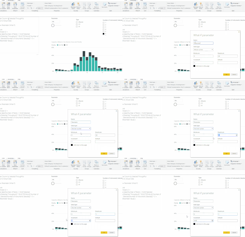
I have created a what if parameter like this
The new measure is as follow:
Capacity Utilized v2 =
SUM('Actual data'[Number of Tests]) / ( SUM('Selected Throughput'[Selected Throughput]) * SELECTEDVALUE('Number of Instrument Selected'[Number of Instruments Selected]) * (1 + Parameter[Parameter Value]) )
No need for separated measures for IA/CC and you have a parameter to increase the throughput.
Hopes this helps
- Mark as New
- Bookmark
- Subscribe
- Mute
- Subscribe to RSS Feed
- Permalink
- Report Inappropriate Content
Thanks a lot for your help @Arentir. This was exactly what i was looking for
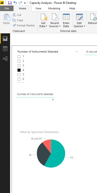
Can i ask you for another favor? In my file there is another pie chart (Attach pic below), I want to filter it also by priority but since the table for which i created this pie chart is a calculated table based on the actual data i m not able to create a realtionship between
the calculated table and my actual data table.
(In this particular data set the accession id has both Routine and STAT but ideally each accession id should either be routine or STAT).
Also when you made this video to show me how you generated the what-if parameter, did you use any special software to do it? I m actually looking to create a animated video for work purposes so was just curious.
- Mark as New
- Bookmark
- Subscribe
- Mute
- Subscribe to RSS Feed
- Permalink
- Report Inappropriate Content
- Mark as New
- Bookmark
- Subscribe
- Mute
- Subscribe to RSS Feed
- Permalink
- Report Inappropriate Content
Hey @SINGHTX9
Software is ScreenToGif, pretty handy for presentation indeed 🙂
I will try to have a look at your question later. Some thoughts for now:
You can have the priority added to your Final Table and Specimen distribution. Also better have a dimension table for Priority that would relate to all of the tables having priority field.
- Mark as New
- Bookmark
- Subscribe
- Mute
- Subscribe to RSS Feed
- Permalink
- Report Inappropriate Content
Perfect!! Whenever you get the time
You are suggesting to create a new table with only priority field in it and then connect it to my specimen distribution table?
I was trying to create another table to calculate the Turnaround Time. I want to know what % samples are processed within 1 hour and what % 2 hour etc, to achieve this would i have to create another table with TAT 1hr, 2hr etc and then how to write a DAX measure: SUM(COUNT OF ACCESSION) if TAT is <= value selected TAT time.
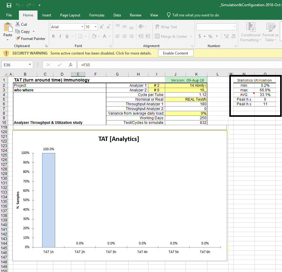
Also any ideas on how i can build the statistics utilization map as shown in the picture below.
Also are there some good tutorias where i can learn ideas how to make my dahboard look good in terms of presentation. (i didnt find any good video on enterprise DNA and youtube). Apologies if i m bothering you with too many questions, i m still new to power bi and have been the task by my manager to develop this dashboard for the team.
- Mark as New
- Bookmark
- Subscribe
- Mute
- Subscribe to RSS Feed
- Permalink
- Report Inappropriate Content
Hi @SINGHTX9
I did what I had in mind earlier. I have added Priority column to Final Table and Specimen Distribution (See dax table formula this is just slightly different).
https://1drv.ms/u/s!As5oZCclkGkWgSdnqZgrEbLo4hod
I have created a Priority Table and created a relationship to actual data, final table, specimen distribution. I find this cleaner so you just this Priority of this new table as a slicer and it will affect any of the table.
You lost me with the TaT measure. I recommend that you open a new topic and try to simplify the model so you get more ideas from the community!
For ressources not sure how much I can advertise on the forum so will send you a PM with some of my favs
Arentir
Helpful resources

Microsoft Fabric Learn Together
Covering the world! 9:00-10:30 AM Sydney, 4:00-5:30 PM CET (Paris/Berlin), 7:00-8:30 PM Mexico City

Power BI Monthly Update - April 2024
Check out the April 2024 Power BI update to learn about new features.

| User | Count |
|---|---|
| 109 | |
| 99 | |
| 77 | |
| 66 | |
| 54 |
| User | Count |
|---|---|
| 144 | |
| 104 | |
| 102 | |
| 87 | |
| 64 |


