- Power BI forums
- Updates
- News & Announcements
- Get Help with Power BI
- Desktop
- Service
- Report Server
- Power Query
- Mobile Apps
- Developer
- DAX Commands and Tips
- Custom Visuals Development Discussion
- Health and Life Sciences
- Power BI Spanish forums
- Translated Spanish Desktop
- Power Platform Integration - Better Together!
- Power Platform Integrations (Read-only)
- Power Platform and Dynamics 365 Integrations (Read-only)
- Training and Consulting
- Instructor Led Training
- Dashboard in a Day for Women, by Women
- Galleries
- Community Connections & How-To Videos
- COVID-19 Data Stories Gallery
- Themes Gallery
- Data Stories Gallery
- R Script Showcase
- Webinars and Video Gallery
- Quick Measures Gallery
- 2021 MSBizAppsSummit Gallery
- 2020 MSBizAppsSummit Gallery
- 2019 MSBizAppsSummit Gallery
- Events
- Ideas
- Custom Visuals Ideas
- Issues
- Issues
- Events
- Upcoming Events
- Community Blog
- Power BI Community Blog
- Custom Visuals Community Blog
- Community Support
- Community Accounts & Registration
- Using the Community
- Community Feedback
Register now to learn Fabric in free live sessions led by the best Microsoft experts. From Apr 16 to May 9, in English and Spanish.
- Power BI forums
- Forums
- Get Help with Power BI
- Desktop
- Re: Can we change the colors of data bars In table
- Subscribe to RSS Feed
- Mark Topic as New
- Mark Topic as Read
- Float this Topic for Current User
- Bookmark
- Subscribe
- Printer Friendly Page
- Mark as New
- Bookmark
- Subscribe
- Mute
- Subscribe to RSS Feed
- Permalink
- Report Inappropriate Content
Can we change the colors of data bars In table
Hi All,
As you all know that we got new update for table with bars. But i need to change bar colors based on my values.
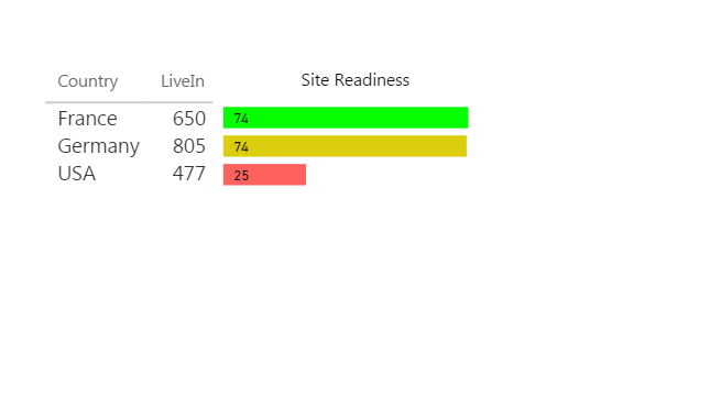
Example: I have a Column name Sites readiness i need a bar color in it such below 30 is red, 30 and 60 is yellow, and above 60 is green.
Please help community????
Solved! Go to Solution.
- Mark as New
- Bookmark
- Subscribe
- Mute
- Subscribe to RSS Feed
- Permalink
- Report Inappropriate Content
- Mark as New
- Bookmark
- Subscribe
- Mute
- Subscribe to RSS Feed
- Permalink
- Report Inappropriate Content
Glad to hear that you've solved this problem. You may share the solution here. That way, other community members may also benefit. Your contribution is highly appreciated.
If this post helps, then please consider Accept it as the solution to help the other members find it more quickly.
- Mark as New
- Bookmark
- Subscribe
- Mute
- Subscribe to RSS Feed
- Permalink
- Report Inappropriate Content
Method 1
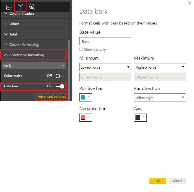
select the Table - go to the Paint Brush - Conditional Formatting - select the field - turn on data bars - click Advanced Controls
make the adjustments in the pop up window
Method 2
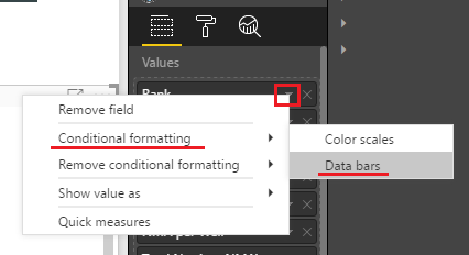
Again select the Table - In the Values area - click on the triangle to the right of the field - select Conditional Formatting - Data Bars
you'll get the same pop up where you can adjust
This should do it! ![]()
- Mark as New
- Bookmark
- Subscribe
- Mute
- Subscribe to RSS Feed
- Permalink
- Report Inappropriate Content
@Sean I know that But my project requirement is to show the different colors for bars not for the value.
- Mark as New
- Bookmark
- Subscribe
- Mute
- Subscribe to RSS Feed
- Permalink
- Report Inappropriate Content
I responded to quick - without reading your question all the way ![]()
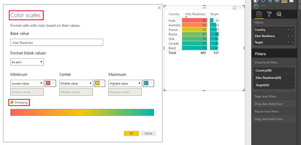
So you should actually try the Color Scales
Since the Data Bars at this time at least can't do what you are trying to achieve
Here're the results... ![]()
- Mark as New
- Bookmark
- Subscribe
- Mute
- Subscribe to RSS Feed
- Permalink
- Report Inappropriate Content
- Mark as New
- Bookmark
- Subscribe
- Mute
- Subscribe to RSS Feed
- Permalink
- Report Inappropriate Content
- Mark as New
- Bookmark
- Subscribe
- Mute
- Subscribe to RSS Feed
- Permalink
- Report Inappropriate Content
- Mark as New
- Bookmark
- Subscribe
- Mute
- Subscribe to RSS Feed
- Permalink
- Report Inappropriate Content
Glad to hear that you've solved this problem. You may share the solution here. That way, other community members may also benefit. Your contribution is highly appreciated.
If this post helps, then please consider Accept it as the solution to help the other members find it more quickly.
- Mark as New
- Bookmark
- Subscribe
- Mute
- Subscribe to RSS Feed
- Permalink
- Report Inappropriate Content
Hi
Let's rescue some like me that searched answer for this
To have 1 color
Any barchar let you have one color
Insertyour measure in the value field
Then go second pane, format pane
And finaly, Data color to change your color
To have 2 colors
At least with matrixes
Insert your value(s)
As you click on this button you can see conditional formating, and 3 choices. The last one is data bars
Use it as you want. Data bar permit only 2 colors. Background and font color permit 3 colors
To have 3 colors
To have three colors, or you have the matrix and, just said two lines up, you can have backround colors
Or you can use a column chart. Insert Measure in your value field and the measure to refer colors to on the color saturation.
then second pane, data colors, and you can have a diverging color difining 3 colors.
If a develloper read it, please enable the ability to have just three colors, not a scale going from first color to second then from second to third color. When you go on the road with green orange red, you do not have mid colors. Thanks 😉
Helpful resources

Microsoft Fabric Learn Together
Covering the world! 9:00-10:30 AM Sydney, 4:00-5:30 PM CET (Paris/Berlin), 7:00-8:30 PM Mexico City

Power BI Monthly Update - April 2024
Check out the April 2024 Power BI update to learn about new features.

| User | Count |
|---|---|
| 108 | |
| 100 | |
| 78 | |
| 64 | |
| 58 |
| User | Count |
|---|---|
| 148 | |
| 111 | |
| 94 | |
| 84 | |
| 67 |


