- Power BI forums
- Updates
- News & Announcements
- Get Help with Power BI
- Desktop
- Service
- Report Server
- Power Query
- Mobile Apps
- Developer
- DAX Commands and Tips
- Custom Visuals Development Discussion
- Health and Life Sciences
- Power BI Spanish forums
- Translated Spanish Desktop
- Power Platform Integration - Better Together!
- Power Platform Integrations (Read-only)
- Power Platform and Dynamics 365 Integrations (Read-only)
- Training and Consulting
- Instructor Led Training
- Dashboard in a Day for Women, by Women
- Galleries
- Community Connections & How-To Videos
- COVID-19 Data Stories Gallery
- Themes Gallery
- Data Stories Gallery
- R Script Showcase
- Webinars and Video Gallery
- Quick Measures Gallery
- 2021 MSBizAppsSummit Gallery
- 2020 MSBizAppsSummit Gallery
- 2019 MSBizAppsSummit Gallery
- Events
- Ideas
- Custom Visuals Ideas
- Issues
- Issues
- Events
- Upcoming Events
- Community Blog
- Power BI Community Blog
- Custom Visuals Community Blog
- Community Support
- Community Accounts & Registration
- Using the Community
- Community Feedback
Register now to learn Fabric in free live sessions led by the best Microsoft experts. From Apr 16 to May 9, in English and Spanish.
- Power BI forums
- Forums
- Get Help with Power BI
- Desktop
- Can't find much with new layout
- Subscribe to RSS Feed
- Mark Topic as New
- Mark Topic as Read
- Float this Topic for Current User
- Bookmark
- Subscribe
- Printer Friendly Page
- Mark as New
- Bookmark
- Subscribe
- Mute
- Subscribe to RSS Feed
- Permalink
- Report Inappropriate Content
Can't find much with new layout
This new update, been "a while", but I've been trying to get accustomed to the new visualisation tab, but I have difficulties finding what needs to be found.
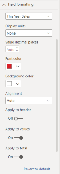
The other day I was looking for formatting the fields in a particular way. In the past you had this:
And this:
Now you get crap like "specific column", it is not a specific column, you can't choose whether "a specific column" at a certain combination like
* Column value Brand: Mercedes -> Specific column "sales" background light blue
* Column value Brand: Volkswagen -> Specific column "sales" background light green
This is not the "specific column", you change by field. Field is the term used to for a "field", or table column's data. The "sales" in categories of Mercedes and Volkswagen have the same table column's field, "Sales", which you modify.
And then you have the crap of "cell elements", is not cell element, you change:
* Columns Mercedes, Sales, Row Year 2020 background light blue
* Columns Volkwagen, field Sales, Row Year 2021, background dark blue
That's not "cell" element, that's the conditional formatting for a certain field.
"If my Grandmother had wheels she would have been a bike"
It makes no sense. It is called "Field formatting" because it relates back to the "formatting" of a "field" within a visualization. Why would someone **bleep** with that logic?
Question
Does someone have a way how I can easily find what I can't, a sense of logic within the new visualization tab's layout?
- Mark as New
- Bookmark
- Subscribe
- Mute
- Subscribe to RSS Feed
- Permalink
- Report Inappropriate Content
@DouweMeer , based on what I got. In Matrix and Table, it is under cell. In Bar visual it under Bar.
If not using a legend or more than one measure. You can use color measure (using the field value option ) to use fix color for the brand
How to do conditional formatting by measure and apply it on pie?
https://www.youtube.com/watch?v=RqBb5eBf_I4&list=PLPaNVDMhUXGYo50Ajmr4SgSV9HIQLxc8L
https://community.powerbi.com/t5/Community-Blog/Power-BI-Conditional-formatting-the-Pie-Visual/ba-p/...
Microsoft Power BI Learning Resources, 2023 !!
Learn Power BI - Full Course with Dec-2022, with Window, Index, Offset, 100+ Topics !!
Did I answer your question? Mark my post as a solution! Appreciate your Kudos !! Proud to be a Super User! !!
- Mark as New
- Bookmark
- Subscribe
- Mute
- Subscribe to RSS Feed
- Permalink
- Report Inappropriate Content
@amitchandak , it contained something that got my interest, but both links have the old format in mind.
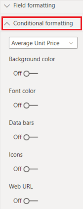
This is what I see in Power BI right now:
Which is different, which is my complain, which is why I have that question.
Helpful resources

Microsoft Fabric Learn Together
Covering the world! 9:00-10:30 AM Sydney, 4:00-5:30 PM CET (Paris/Berlin), 7:00-8:30 PM Mexico City

Power BI Monthly Update - April 2024
Check out the April 2024 Power BI update to learn about new features.

| User | Count |
|---|---|
| 114 | |
| 100 | |
| 78 | |
| 75 | |
| 52 |
| User | Count |
|---|---|
| 144 | |
| 109 | |
| 108 | |
| 88 | |
| 61 |


