- Power BI forums
- Updates
- News & Announcements
- Get Help with Power BI
- Desktop
- Service
- Report Server
- Power Query
- Mobile Apps
- Developer
- DAX Commands and Tips
- Custom Visuals Development Discussion
- Health and Life Sciences
- Power BI Spanish forums
- Translated Spanish Desktop
- Power Platform Integration - Better Together!
- Power Platform Integrations (Read-only)
- Power Platform and Dynamics 365 Integrations (Read-only)
- Training and Consulting
- Instructor Led Training
- Dashboard in a Day for Women, by Women
- Galleries
- Community Connections & How-To Videos
- COVID-19 Data Stories Gallery
- Themes Gallery
- Data Stories Gallery
- R Script Showcase
- Webinars and Video Gallery
- Quick Measures Gallery
- 2021 MSBizAppsSummit Gallery
- 2020 MSBizAppsSummit Gallery
- 2019 MSBizAppsSummit Gallery
- Events
- Ideas
- Custom Visuals Ideas
- Issues
- Issues
- Events
- Upcoming Events
- Community Blog
- Power BI Community Blog
- Custom Visuals Community Blog
- Community Support
- Community Accounts & Registration
- Using the Community
- Community Feedback
Register now to learn Fabric in free live sessions led by the best Microsoft experts. From Apr 16 to May 9, in English and Spanish.
- Power BI forums
- Forums
- Get Help with Power BI
- Desktop
- Can't find default color option
- Subscribe to RSS Feed
- Mark Topic as New
- Mark Topic as Read
- Float this Topic for Current User
- Bookmark
- Subscribe
- Printer Friendly Page
- Mark as New
- Bookmark
- Subscribe
- Mute
- Subscribe to RSS Feed
- Permalink
- Report Inappropriate Content
Can't find default color option
Hi there,
On the following page they explain how to make use of default coloring for, in this case, bar charts.
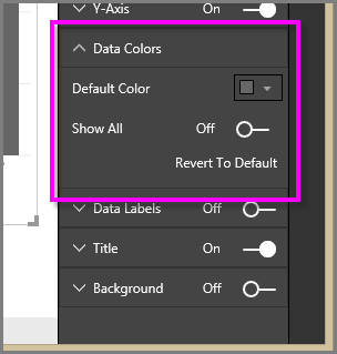
That's actually exactly what I want to do, but in the latest version of Power BI Desktop (and Online) I cannot seem to find the option they are talking about in the 4th image. Am I overlooking something here? I'm in desperate need of this option, because it's taking me ages to color each individual value.
Hope someone can point me in the right direction.
Thanks in advance.
Solved! Go to Solution.
- Mark as New
- Bookmark
- Subscribe
- Mute
- Subscribe to RSS Feed
- Permalink
- Report Inappropriate Content
Hi,
Ahh, have you added lots of measures to the values box?
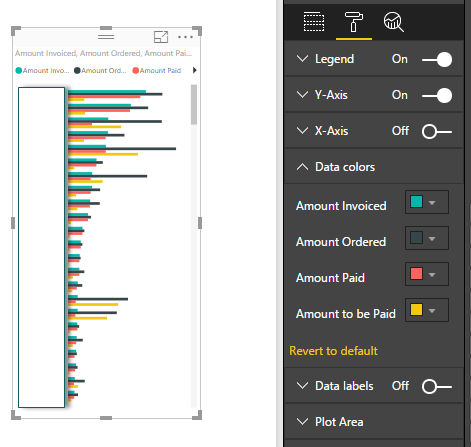
Then yes the default behaviour is to give each one a different colour.
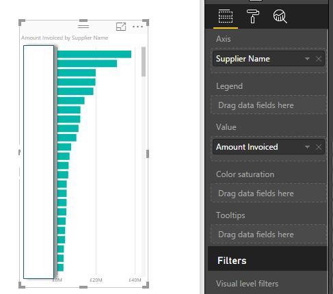
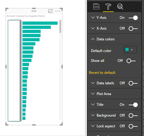
The DEFAULT COLOUR option you are looking for applies to the dimension you have put in the axis box:
Cheers
Mark
- Mark as New
- Bookmark
- Subscribe
- Mute
- Subscribe to RSS Feed
- Permalink
- Report Inappropriate Content
Hmm, that's not very intuitive, but it does work, thanks! I had the different bars set up in the Legend field.
Here's how I had it set up:
- Axis: Product Name
- Legend: Supplier
- Value: Price
This way I can edit each Supplier color, but the DEFAULT COLOR option is missing.
A workaround: By first adding the Supplier to the Axis field, then all of the sudden the DEFAULT COLOR option is there and you can change the Supplier colors as needed. Then just move it to the Legend if that's what you're looking for.
But it would be easier if the default option was there for Legend values as well.
- Mark as New
- Bookmark
- Subscribe
- Mute
- Subscribe to RSS Feed
- Permalink
- Report Inappropriate Content
Hi there
Just to confirm that you are first putting in a visualization? And also then adding data elements to your visual?
After you have done that you should get the colours by default?
- Mark as New
- Bookmark
- Subscribe
- Mute
- Subscribe to RSS Feed
- Permalink
- Report Inappropriate Content
Yes, I have an active bar chart (it's actually a "Clustered Column Chart") which is loaded with a unique color for each bar by default. In the URL I mentioned they explain that if you wanted to highlight a single bar you can easily use the DEFAULT COLOR option to make everything the same color and then use SHOW ALL to change the color of the single bar you have in mind. This way you don't have to change the color of each single value.
However, this DEFAULT COLOR option is nowhere to be found.
- Mark as New
- Bookmark
- Subscribe
- Mute
- Subscribe to RSS Feed
- Permalink
- Report Inappropriate Content
Hi,
Ahh, have you added lots of measures to the values box?
Then yes the default behaviour is to give each one a different colour.
The DEFAULT COLOUR option you are looking for applies to the dimension you have put in the axis box:
Cheers
Mark
- Mark as New
- Bookmark
- Subscribe
- Mute
- Subscribe to RSS Feed
- Permalink
- Report Inappropriate Content
Hmm, that's not very intuitive, but it does work, thanks! I had the different bars set up in the Legend field.
Here's how I had it set up:
- Axis: Product Name
- Legend: Supplier
- Value: Price
This way I can edit each Supplier color, but the DEFAULT COLOR option is missing.
A workaround: By first adding the Supplier to the Axis field, then all of the sudden the DEFAULT COLOR option is there and you can change the Supplier colors as needed. Then just move it to the Legend if that's what you're looking for.
But it would be easier if the default option was there for Legend values as well.
- Mark as New
- Bookmark
- Subscribe
- Mute
- Subscribe to RSS Feed
- Permalink
- Report Inappropriate Content
Glad that helped. Re your workaround doesn't it change all the colours back again when you move Supplier from Axis to legend?
I guess the thinking is how do you differentiate between the Suppliers if not by colour? Only the tooltip really shows you which is which.
- Mark as New
- Bookmark
- Subscribe
- Mute
- Subscribe to RSS Feed
- Permalink
- Report Inappropriate Content
Hi, I am facing exactly the same issue and no workaround is working for me.
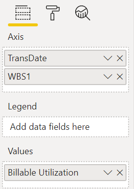
In my scenario, I am trying to show two measures using a "Line and stacked column chart:
Billable Utilization, and
Non-Billable Utilization
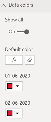
When I keep any of the one value from the above in 'Values' field
It shows me 'Data colors' option like this:
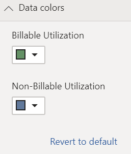
Unfortunaly when I add both of them, Data colors option is like this:
And I am not able to put any of the rules for color change on it. Please help how this could be done. I can change the chart type if needed which I already tried doing but data colors didn't work. If there, is any other way to show both th evalues in a chart and I can apply condition on colors, then please kindly let me know.
Thanks
- Mark as New
- Bookmark
- Subscribe
- Mute
- Subscribe to RSS Feed
- Permalink
- Report Inappropriate Content
Hi there
It depends on the chart type currently not all chart types are supported with conditional formatting.
Which Chart type are you using?
- Mark as New
- Bookmark
- Subscribe
- Mute
- Subscribe to RSS Feed
- Permalink
- Report Inappropriate Content
It doesn't change back, fortunately. At least not this time I tried it.. It doesn't seem very logical, but at least there's a workaround.
And yes, the tooltip does show the different names, but there's about 100 Suppliers there so that really doesn't help 🙂 the individual coloring is a great way to make (hand-picked) Suppliers stand how, but what I would really like to see is a conditial coloring option so I don't have to bother styling anything.
- Mark as New
- Bookmark
- Subscribe
- Mute
- Subscribe to RSS Feed
- Permalink
- Report Inappropriate Content
Hi,
Bit confused about which option you are actually after?
If you want to adjust individual colours, just put the measure in the Value pill and nothing in the Colour Saturation.
If you want to have the min/max diverging colours option, put your measure in both the values AND colour saturation pills, then you should get those options.
Hope that helps?
Mark
- Mark as New
- Bookmark
- Subscribe
- Mute
- Subscribe to RSS Feed
- Permalink
- Report Inappropriate Content
As mentioned I'm looking for the Default Color option, as depicted in image 4 of the tutorial URL (attached now)
Helpful resources

Microsoft Fabric Learn Together
Covering the world! 9:00-10:30 AM Sydney, 4:00-5:30 PM CET (Paris/Berlin), 7:00-8:30 PM Mexico City

Power BI Monthly Update - April 2024
Check out the April 2024 Power BI update to learn about new features.

| User | Count |
|---|---|
| 107 | |
| 100 | |
| 78 | |
| 64 | |
| 58 |
| User | Count |
|---|---|
| 148 | |
| 113 | |
| 97 | |
| 84 | |
| 67 |
