- Power BI forums
- Updates
- News & Announcements
- Get Help with Power BI
- Desktop
- Service
- Report Server
- Power Query
- Mobile Apps
- Developer
- DAX Commands and Tips
- Custom Visuals Development Discussion
- Health and Life Sciences
- Power BI Spanish forums
- Translated Spanish Desktop
- Power Platform Integration - Better Together!
- Power Platform Integrations (Read-only)
- Power Platform and Dynamics 365 Integrations (Read-only)
- Training and Consulting
- Instructor Led Training
- Dashboard in a Day for Women, by Women
- Galleries
- Community Connections & How-To Videos
- COVID-19 Data Stories Gallery
- Themes Gallery
- Data Stories Gallery
- R Script Showcase
- Webinars and Video Gallery
- Quick Measures Gallery
- 2021 MSBizAppsSummit Gallery
- 2020 MSBizAppsSummit Gallery
- 2019 MSBizAppsSummit Gallery
- Events
- Ideas
- Custom Visuals Ideas
- Issues
- Issues
- Events
- Upcoming Events
- Community Blog
- Power BI Community Blog
- Custom Visuals Community Blog
- Community Support
- Community Accounts & Registration
- Using the Community
- Community Feedback
Register now to learn Fabric in free live sessions led by the best Microsoft experts. From Apr 16 to May 9, in English and Spanish.
- Power BI forums
- Forums
- Get Help with Power BI
- Desktop
- Can't control x-axis intervals?
- Subscribe to RSS Feed
- Mark Topic as New
- Mark Topic as Read
- Float this Topic for Current User
- Bookmark
- Subscribe
- Printer Friendly Page
- Mark as New
- Bookmark
- Subscribe
- Mute
- Subscribe to RSS Feed
- Permalink
- Report Inappropriate Content
Can't control x-axis intervals?
Hi PBI community,
I can't seem to manipualte the x-axis intervals on my column chart visualization. My data is non-date data (it's just a simple count), but the X axis section of the formatting pane is throwing me the option to choose either continuous or categorical. When it's on continous, I see the columns represented the way I want them, but the x-axis labels are stuck at 2-digit intervals (2,4,6, etc.) When I change it to categorical, I see all the appropriate x-axis labels, but am not able to see the entire range I want to see (i.e. I only see x-axis labels for where data exists, as opposed to seeing the whole range represented).
Any help is appreciated 🙂
Solved! Go to Solution.
- Mark as New
- Bookmark
- Subscribe
- Mute
- Subscribe to RSS Feed
- Permalink
- Report Inappropriate Content
I think I was able to find a work around by changing the x-axis type to Categorical, then sorting by #Quotes, ascending in the visualization. I can't help but feel like my queries behind the scenes are poorly structured, but this seems to be working. Thank you for your help!
- Mark as New
- Bookmark
- Subscribe
- Mute
- Subscribe to RSS Feed
- Permalink
- Report Inappropriate Content
Hi @askjervenboyd ,
On the Axis option go to the column and select show items with no data:
Regards,
MFelix
Regards
Miguel Félix
Did I answer your question? Mark my post as a solution!
Proud to be a Super User!
Check out my blog: Power BI em Português- Mark as New
- Bookmark
- Subscribe
- Mute
- Subscribe to RSS Feed
- Permalink
- Report Inappropriate Content
Hi @MFelix ,
Thanks for the quick response. It doesn't fix my issue, which is that I'm not seeing labels for items that DO have data. It's so weird!
Best,
ASB
- Mark as New
- Bookmark
- Subscribe
- Mute
- Subscribe to RSS Feed
- Permalink
- Report Inappropriate Content
Hi @askjervenboyd ,
Check the size of the font for the axis and/or increase the size of the chart to see if the numbers appear.
Regards,
MFelix
Regards
Miguel Félix
Did I answer your question? Mark my post as a solution!
Proud to be a Super User!
Check out my blog: Power BI em Português- Mark as New
- Bookmark
- Subscribe
- Mute
- Subscribe to RSS Feed
- Permalink
- Report Inappropriate Content
Hi @MFelix ,
Thanks for the suggestion. Font size is lowest at 8pt, resizing does nothing. Show items with no data is checked under the Axis field in visualizations. The data type is whole number, as well as the format. What a mystery.
Best,
ASB
- Mark as New
- Bookmark
- Subscribe
- Mute
- Subscribe to RSS Feed
- Permalink
- Report Inappropriate Content
Hi @askjervenboyd ,
What I could test on this side (letter size, Responsive, continuous/categorical, increase decrease the size of the chart) I wasn't abble to replicate your issue.
I'm on the August 2019 version what is your version?
Regards,
MFelix
Regards
Miguel Félix
Did I answer your question? Mark my post as a solution!
Proud to be a Super User!
Check out my blog: Power BI em Português- Mark as New
- Bookmark
- Subscribe
- Mute
- Subscribe to RSS Feed
- Permalink
- Report Inappropriate Content
- Mark as New
- Bookmark
- Subscribe
- Mute
- Subscribe to RSS Feed
- Permalink
- Report Inappropriate Content
Have you tried to redo your chart from the start?
Just taking out hipothesys.
As I refered in my testing that did no happen.
Regards,
MFelix
Regards
Miguel Félix
Did I answer your question? Mark my post as a solution!
Proud to be a Super User!
Check out my blog: Power BI em Português- Mark as New
- Bookmark
- Subscribe
- Mute
- Subscribe to RSS Feed
- Permalink
- Report Inappropriate Content
Hi @MFelix ,
Still no luck. I recreated the report and the chart straight from the sources and made the visualization as large as I could.
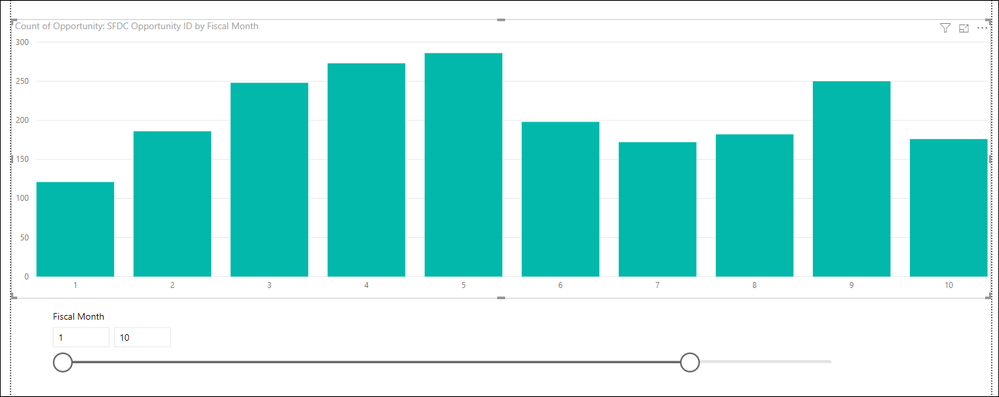
The interesting thing is, if I filter the chart 1-10, each column gets an axis label. If I do anything beyond 10, it shows axis labels only in increments of 2.
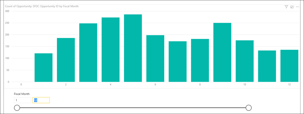
Interestingly, when you try to do 1-12, the axis label for 0 also shows up.
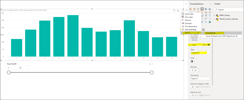
I did manage to get it to work by changing from a continuous sort to a categorical sort where it sorts ascending by fiscal month. Very strange!
Best,
ASB


- Mark as New
- Bookmark
- Subscribe
- Mute
- Subscribe to RSS Feed
- Permalink
- Report Inappropriate Content
I think I was able to find a work around by changing the x-axis type to Categorical, then sorting by #Quotes, ascending in the visualization. I can't help but feel like my queries behind the scenes are poorly structured, but this seems to be working. Thank you for your help!
- Mark as New
- Bookmark
- Subscribe
- Mute
- Subscribe to RSS Feed
- Permalink
- Report Inappropriate Content
Helpful resources

Microsoft Fabric Learn Together
Covering the world! 9:00-10:30 AM Sydney, 4:00-5:30 PM CET (Paris/Berlin), 7:00-8:30 PM Mexico City

Power BI Monthly Update - April 2024
Check out the April 2024 Power BI update to learn about new features.

| User | Count |
|---|---|
| 107 | |
| 100 | |
| 80 | |
| 63 | |
| 58 |
| User | Count |
|---|---|
| 148 | |
| 111 | |
| 94 | |
| 84 | |
| 67 |


