- Power BI forums
- Updates
- News & Announcements
- Get Help with Power BI
- Desktop
- Service
- Report Server
- Power Query
- Mobile Apps
- Developer
- DAX Commands and Tips
- Custom Visuals Development Discussion
- Health and Life Sciences
- Power BI Spanish forums
- Translated Spanish Desktop
- Power Platform Integration - Better Together!
- Power Platform Integrations (Read-only)
- Power Platform and Dynamics 365 Integrations (Read-only)
- Training and Consulting
- Instructor Led Training
- Dashboard in a Day for Women, by Women
- Galleries
- Community Connections & How-To Videos
- COVID-19 Data Stories Gallery
- Themes Gallery
- Data Stories Gallery
- R Script Showcase
- Webinars and Video Gallery
- Quick Measures Gallery
- 2021 MSBizAppsSummit Gallery
- 2020 MSBizAppsSummit Gallery
- 2019 MSBizAppsSummit Gallery
- Events
- Ideas
- Custom Visuals Ideas
- Issues
- Issues
- Events
- Upcoming Events
- Community Blog
- Power BI Community Blog
- Custom Visuals Community Blog
- Community Support
- Community Accounts & Registration
- Using the Community
- Community Feedback
Register now to learn Fabric in free live sessions led by the best Microsoft experts. From Apr 16 to May 9, in English and Spanish.
- Power BI forums
- Forums
- Get Help with Power BI
- Desktop
- Re: Can I realise this with one of the regular vi...
- Subscribe to RSS Feed
- Mark Topic as New
- Mark Topic as Read
- Float this Topic for Current User
- Bookmark
- Subscribe
- Printer Friendly Page
- Mark as New
- Bookmark
- Subscribe
- Mute
- Subscribe to RSS Feed
- Permalink
- Report Inappropriate Content
Can I realise this with one of the regular visuals?
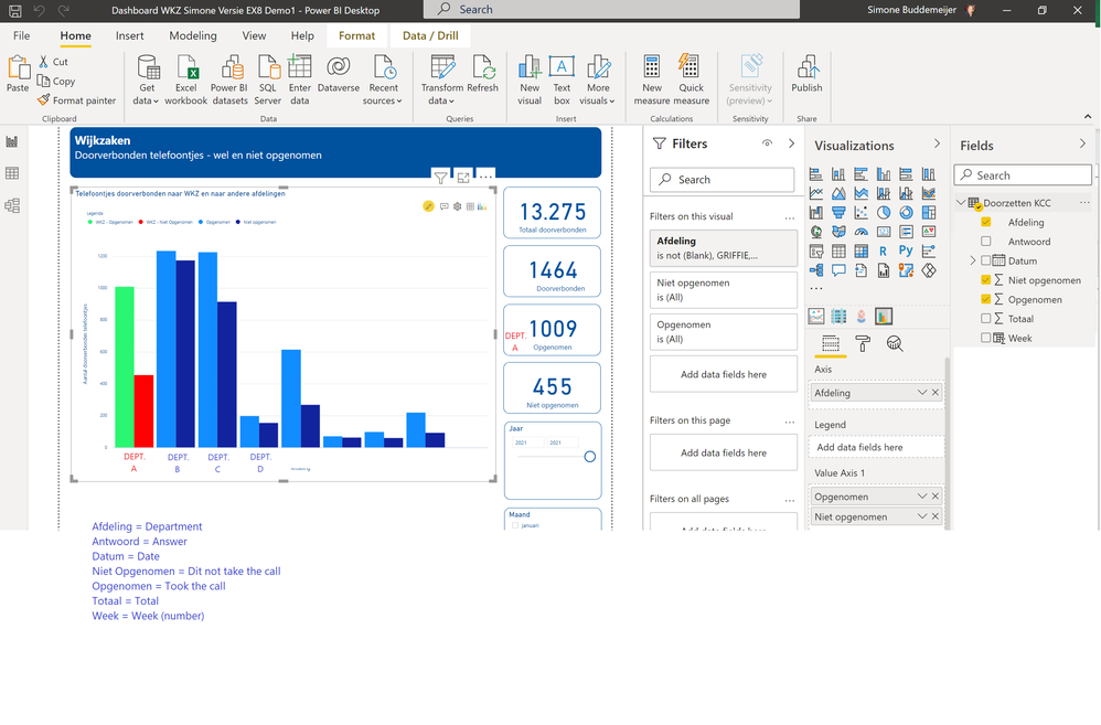
Hi! I made this visual using one of the xViz extra visuals: Multiple Axis Chart. When published to a dashboard there's a notice I need to buy the Licenced version of xViz. My company is not willing to do this. So is there another way, with one of the standard visuals, I can make this?
It shows "answered" (green) and "not answered" (red) phone calls, highlighting one department (red/green) agains the other departments (blue).
Solved! Go to Solution.
- Mark as New
- Bookmark
- Subscribe
- Mute
- Subscribe to RSS Feed
- Permalink
- Report Inappropriate Content
Hi, @cowboyracer
I fully understand your needs and test it. I'm sorry, because of the visual that comes with powerbi, after adding more than one field to the value of visual, the conditional format can't be used.
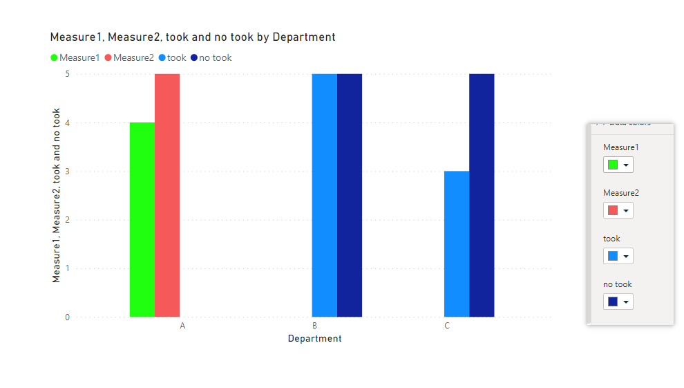
So, there is another workaround but it's not very convenient. You need to create four measures, corresponding to these four different situations. If you can accept it, I will write for you.
Best Regards
Janey Guo
If this post helps, then please consider Accept it as the solution to help the other members find it more quickly.
- Mark as New
- Bookmark
- Subscribe
- Mute
- Subscribe to RSS Feed
- Permalink
- Report Inappropriate Content
Hi, @cowboyracer
Like this, if you can accept. The sample file is below.
Best Regards
Janey Guo
If this post helps, then please consider Accept it as the solution to help the other members find it more quickly.
- Mark as New
- Bookmark
- Subscribe
- Mute
- Subscribe to RSS Feed
- Permalink
- Report Inappropriate Content
Hi, @cowboyracer
Maybe your needs can be done using conditional format. It seems that you are not good at dax. If you can share some sample data and your logic about the color, I'm happy to help you modify the measure.
Best Regards
Janey Guo
If this post helps, then please consider Accept it as the solution to help the other members find it more quickly.
- Mark as New
- Bookmark
- Subscribe
- Mute
- Subscribe to RSS Feed
- Permalink
- Report Inappropriate Content
Hello Janey,
You're absolutely right, I am not good at DAX, I am a novice and I still find DAX difficult te learn.
So if you can help me... Please!!! And Thanks already for your reaction!
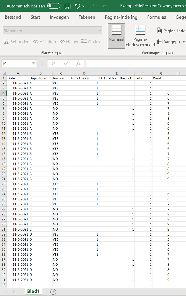
I have a screenshot of sample data (not real data but this is how it could look)
I also made a screenshot of the powerbi file.
The green = because I want to show the TAKEN calls by one specific department and green for the NOT TAKEN calls
I want to highlight one specific department to make it stand out better (meaning you see it better) against the other departments.
And later on I want to make the same report (and later dashboard) for the other departments and highlight one of the other departments.
Kind regards,
Simone
- Mark as New
- Bookmark
- Subscribe
- Mute
- Subscribe to RSS Feed
- Permalink
- Report Inappropriate Content
Hi, @cowboyracer
I fully understand your needs and test it. I'm sorry, because of the visual that comes with powerbi, after adding more than one field to the value of visual, the conditional format can't be used.
So, there is another workaround but it's not very convenient. You need to create four measures, corresponding to these four different situations. If you can accept it, I will write for you.
Best Regards
Janey Guo
If this post helps, then please consider Accept it as the solution to help the other members find it more quickly.
- Mark as New
- Bookmark
- Subscribe
- Mute
- Subscribe to RSS Feed
- Permalink
- Report Inappropriate Content
Hi Janey,
I am open to every possible solution and "ready" (willing) to try everything.
But only if you want to...
- Mark as New
- Bookmark
- Subscribe
- Mute
- Subscribe to RSS Feed
- Permalink
- Report Inappropriate Content
Hi, @cowboyracer
Like this, if you can accept. The sample file is below.
Best Regards
Janey Guo
If this post helps, then please consider Accept it as the solution to help the other members find it more quickly.
- Mark as New
- Bookmark
- Subscribe
- Mute
- Subscribe to RSS Feed
- Permalink
- Report Inappropriate Content
IT WORKED !!! 😁 Thanks for your help! 👩🎓 I now can "read" what you wrote so I've learned! Thanks!
- Mark as New
- Bookmark
- Subscribe
- Mute
- Subscribe to RSS Feed
- Permalink
- Report Inappropriate Content
Hi, @cowboyracer
This is just a workaround, because there is no visual that can meet your needs. I'm glad you can accept him, and learn something.
Best Regards
Janey Guo
- Mark as New
- Bookmark
- Subscribe
- Mute
- Subscribe to RSS Feed
- Permalink
- Report Inappropriate Content
@cowboyracer , If you are using two columns on axis, conditional formatting will work.
You can create a measure for that and use that
example
Switch( True(),
max(Table[Dep]) = "Dept1" && max(Table[Answer]) ="Yes", "Green",
max(Table[Dep]) = "Dept1" && max(Table[Answer]) ="No", "red",
"blue"
)
Use in conditional formatting using Field value option
How to do conditional formatting by measure and apply it on pie?: https://youtu.be/RqBb5eBf_I4
Microsoft Power BI Learning Resources, 2023 !!
Learn Power BI - Full Course with Dec-2022, with Window, Index, Offset, 100+ Topics !!
Did I answer your question? Mark my post as a solution! Appreciate your Kudos !! Proud to be a Super User! !!
- Mark as New
- Bookmark
- Subscribe
- Mute
- Subscribe to RSS Feed
- Permalink
- Report Inappropriate Content
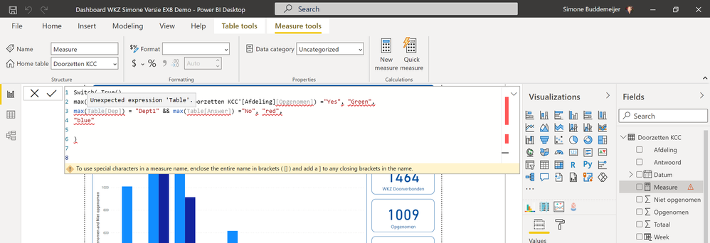
@amitchandak Thanks for your reply! But (being a novice) I don't fully understand what to do.
I clicked on the table where the data is from and selected "new measure". Then I copied your example. I tried to rebuild it to the table and columns I think I needed. But it came up with errors:
The Table the data is in, is called Doorzetten KCC
Translations: Afdeling = Department
Antwoord = Answer
Opgenomen = Call Taken
Niet opgenomen = Call Not Taken
Datum = Date
Week = Week
Totaal = Total
On the X-Axis I have put Department, with Values "Opgenomen" en "Niet opgenomen"
Helpful resources

Microsoft Fabric Learn Together
Covering the world! 9:00-10:30 AM Sydney, 4:00-5:30 PM CET (Paris/Berlin), 7:00-8:30 PM Mexico City

Power BI Monthly Update - April 2024
Check out the April 2024 Power BI update to learn about new features.

| User | Count |
|---|---|
| 113 | |
| 97 | |
| 85 | |
| 70 | |
| 61 |
| User | Count |
|---|---|
| 151 | |
| 121 | |
| 104 | |
| 87 | |
| 67 |


