- Power BI forums
- Updates
- News & Announcements
- Get Help with Power BI
- Desktop
- Service
- Report Server
- Power Query
- Mobile Apps
- Developer
- DAX Commands and Tips
- Custom Visuals Development Discussion
- Health and Life Sciences
- Power BI Spanish forums
- Translated Spanish Desktop
- Power Platform Integration - Better Together!
- Power Platform Integrations (Read-only)
- Power Platform and Dynamics 365 Integrations (Read-only)
- Training and Consulting
- Instructor Led Training
- Dashboard in a Day for Women, by Women
- Galleries
- Community Connections & How-To Videos
- COVID-19 Data Stories Gallery
- Themes Gallery
- Data Stories Gallery
- R Script Showcase
- Webinars and Video Gallery
- Quick Measures Gallery
- 2021 MSBizAppsSummit Gallery
- 2020 MSBizAppsSummit Gallery
- 2019 MSBizAppsSummit Gallery
- Events
- Ideas
- Custom Visuals Ideas
- Issues
- Issues
- Events
- Upcoming Events
- Community Blog
- Power BI Community Blog
- Custom Visuals Community Blog
- Community Support
- Community Accounts & Registration
- Using the Community
- Community Feedback
Register now to learn Fabric in free live sessions led by the best Microsoft experts. From Apr 16 to May 9, in English and Spanish.
- Power BI forums
- Forums
- Get Help with Power BI
- Desktop
- Calculating difference between percentages in a ma...
- Subscribe to RSS Feed
- Mark Topic as New
- Mark Topic as Read
- Float this Topic for Current User
- Bookmark
- Subscribe
- Printer Friendly Page
- Mark as New
- Bookmark
- Subscribe
- Mute
- Subscribe to RSS Feed
- Permalink
- Report Inappropriate Content
Calculating difference between percentages in a matrix and then showing appropriate Icon
I am trying to show the appropriate icon for these values.
- a "-" where the percents are the same rounded to 1 decimal
- an up arrow for an increase in percent when rounded to 1 decimal
- a down arrow for a decrease in percent when rounded to 1 decimal
I used the "Percent of Row Total". rather than calculating it out by hand.
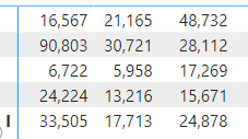
I use the visualization to calculate the row percentages. I could have a formula to do this if it's easier. Below is data as seen in the table.
Population
Regions
There are 5 regions and 3 different populations. I have the data for the current month and data for the previous month.
Solved! Go to Solution.
- Mark as New
- Bookmark
- Subscribe
- Mute
- Subscribe to RSS Feed
- Permalink
- Report Inappropriate Content
Hi @Marvhall ,
I created a sample pbix file(see attachment) for you, please check whether that is what you want.
Use conditional formatting in tables
If the above one can't help you get the desired result, please provide some sample data in your tables (exclude sensitive data) with Text format and your expected result with backend logic and special examples. It is better if you can share a simplified pbix file. You can refer the following link to upload the file to the community. Thank you.
How to upload PBI in Community
Best Regards
If this post helps, then please consider Accept it as the solution to help the other members find it more quickly.
- Mark as New
- Bookmark
- Subscribe
- Mute
- Subscribe to RSS Feed
- Permalink
- Report Inappropriate Content
So close. See image below. The arrows are correct, technically. Is there a way to have it based on the value when rounded to 1 decimal place? See second image.
Would like the same values when rounded to 1 decimal to be a dash (no change).
Thanks!
- Mark as New
- Bookmark
- Subscribe
- Mute
- Subscribe to RSS Feed
- Permalink
- Report Inappropriate Content
Hi @Marvhall ,
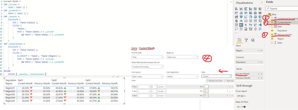
You can select the measure [Current Month] and [Previous Month] separately and set the decimal places as 1 just as screenshot below, please find the details in the attachment.
Best Regards
If this post helps, then please consider Accept it as the solution to help the other members find it more quickly.
Helpful resources

Microsoft Fabric Learn Together
Covering the world! 9:00-10:30 AM Sydney, 4:00-5:30 PM CET (Paris/Berlin), 7:00-8:30 PM Mexico City

Power BI Monthly Update - April 2024
Check out the April 2024 Power BI update to learn about new features.

| User | Count |
|---|---|
| 111 | |
| 94 | |
| 80 | |
| 68 | |
| 59 |
| User | Count |
|---|---|
| 150 | |
| 119 | |
| 104 | |
| 87 | |
| 67 |


