- Power BI forums
- Updates
- News & Announcements
- Get Help with Power BI
- Desktop
- Service
- Report Server
- Power Query
- Mobile Apps
- Developer
- DAX Commands and Tips
- Custom Visuals Development Discussion
- Health and Life Sciences
- Power BI Spanish forums
- Translated Spanish Desktop
- Power Platform Integration - Better Together!
- Power Platform Integrations (Read-only)
- Power Platform and Dynamics 365 Integrations (Read-only)
- Training and Consulting
- Instructor Led Training
- Dashboard in a Day for Women, by Women
- Galleries
- Community Connections & How-To Videos
- COVID-19 Data Stories Gallery
- Themes Gallery
- Data Stories Gallery
- R Script Showcase
- Webinars and Video Gallery
- Quick Measures Gallery
- 2021 MSBizAppsSummit Gallery
- 2020 MSBizAppsSummit Gallery
- 2019 MSBizAppsSummit Gallery
- Events
- Ideas
- Custom Visuals Ideas
- Issues
- Issues
- Events
- Upcoming Events
- Community Blog
- Power BI Community Blog
- Custom Visuals Community Blog
- Community Support
- Community Accounts & Registration
- Using the Community
- Community Feedback
Register now to learn Fabric in free live sessions led by the best Microsoft experts. From Apr 16 to May 9, in English and Spanish.
- Power BI forums
- Forums
- Get Help with Power BI
- Desktop
- Re: Calculating Monthly Percentage
- Subscribe to RSS Feed
- Mark Topic as New
- Mark Topic as Read
- Float this Topic for Current User
- Bookmark
- Subscribe
- Printer Friendly Page
- Mark as New
- Bookmark
- Subscribe
- Mute
- Subscribe to RSS Feed
- Permalink
- Report Inappropriate Content
Calculating Monthly Percentage
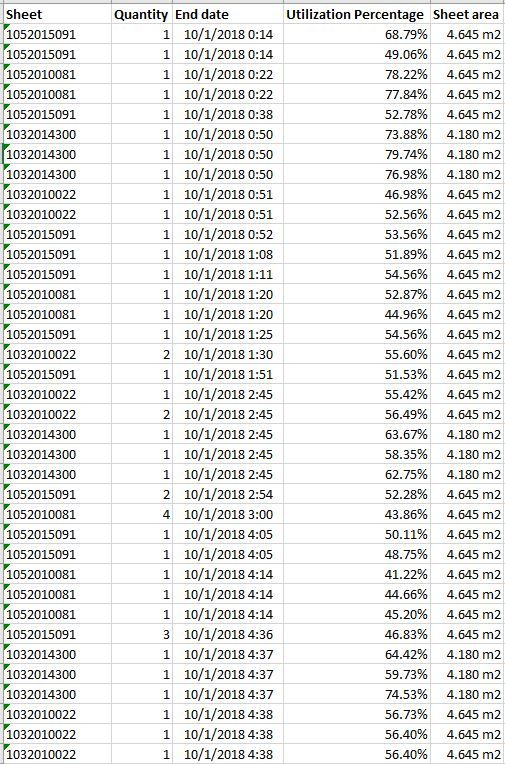
I am working on a project to track the utilization of steel at our facility. What I am looking to do is calculate the monthly utilization percentage using the following equation: Total Used Steel (m^2)/Total Steel (m^2). Total Steel is calculated by multiplying the values in the "Quantity" Column and the "Sheet area" Column. Total Used Steel is calculated by multiplying "Total Steel" values and the values in the "Utilization Percent Column. The resulting report will have twelve card visualization, one for each month. Each card will display the utilization percentage for that month. The issue I'm currently having is that the card visualization is requiring me to choose to display it as sum, average, etc.. How do I set this up so the cards only show that months utilization percentage without having to choose sum, average etc?
Solved! Go to Solution.
- Mark as New
- Bookmark
- Subscribe
- Mute
- Subscribe to RSS Feed
- Permalink
- Report Inappropriate Content
Need to use the SUM function in the measure. Essentially putting the calculation in the background as opposed to a setting on the card visual as you encountered.
- Mark as New
- Bookmark
- Subscribe
- Mute
- Subscribe to RSS Feed
- Permalink
- Report Inappropriate Content
Cammarcz,
Create other columns that calculate Total Steel and Total Used Steel. Create the measures from those columns with no calculation applied to the card. ('Show Value as')
You could do it as a single measure but I am going to guess here that you'll want to track historical trends and will want those calculations for a time based usage chart (Weekly/monthly/by Sheet #/etc.)....might as well keep the measures simple and plan for that trend analysis in the future.
You may have just changed the sample data for privacy but I am curious as to how you will work the single sheet # having multiple percentages, especially as they total over 100%.
Trent
- Mark as New
- Bookmark
- Subscribe
- Mute
- Subscribe to RSS Feed
- Permalink
- Report Inappropriate Content
@TrentS How do I create a measure that can reference those columns? I tried that earlier and it wouldn let me do that. Also, the sheet column is the code for our steel chemistry. I'll use it in a slicer so we can see the utilization of different steels.
- Mark as New
- Bookmark
- Subscribe
- Mute
- Subscribe to RSS Feed
- Permalink
- Report Inappropriate Content
Need to use the SUM function in the measure. Essentially putting the calculation in the background as opposed to a setting on the card visual as you encountered.
Helpful resources

Microsoft Fabric Learn Together
Covering the world! 9:00-10:30 AM Sydney, 4:00-5:30 PM CET (Paris/Berlin), 7:00-8:30 PM Mexico City

Power BI Monthly Update - April 2024
Check out the April 2024 Power BI update to learn about new features.

| User | Count |
|---|---|
| 112 | |
| 100 | |
| 80 | |
| 64 | |
| 57 |
| User | Count |
|---|---|
| 146 | |
| 110 | |
| 93 | |
| 84 | |
| 67 |

