- Power BI forums
- Updates
- News & Announcements
- Get Help with Power BI
- Desktop
- Service
- Report Server
- Power Query
- Mobile Apps
- Developer
- DAX Commands and Tips
- Custom Visuals Development Discussion
- Health and Life Sciences
- Power BI Spanish forums
- Translated Spanish Desktop
- Power Platform Integration - Better Together!
- Power Platform Integrations (Read-only)
- Power Platform and Dynamics 365 Integrations (Read-only)
- Training and Consulting
- Instructor Led Training
- Dashboard in a Day for Women, by Women
- Galleries
- Community Connections & How-To Videos
- COVID-19 Data Stories Gallery
- Themes Gallery
- Data Stories Gallery
- R Script Showcase
- Webinars and Video Gallery
- Quick Measures Gallery
- 2021 MSBizAppsSummit Gallery
- 2020 MSBizAppsSummit Gallery
- 2019 MSBizAppsSummit Gallery
- Events
- Ideas
- Custom Visuals Ideas
- Issues
- Issues
- Events
- Upcoming Events
- Community Blog
- Power BI Community Blog
- Custom Visuals Community Blog
- Community Support
- Community Accounts & Registration
- Using the Community
- Community Feedback
Register now to learn Fabric in free live sessions led by the best Microsoft experts. From Apr 16 to May 9, in English and Spanish.
- Power BI forums
- Forums
- Get Help with Power BI
- Desktop
- Calculate difference between slicer selected valu...
- Subscribe to RSS Feed
- Mark Topic as New
- Mark Topic as Read
- Float this Topic for Current User
- Bookmark
- Subscribe
- Printer Friendly Page
- Mark as New
- Bookmark
- Subscribe
- Mute
- Subscribe to RSS Feed
- Permalink
- Report Inappropriate Content
Calculate difference between slicer selected values based on 15 min intervals
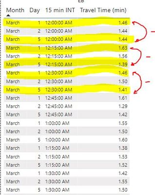
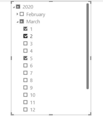
in this case, I have selected 3 days ( march 5 - 2 and 1) on the slicer, and I would like to have a measure in a new column with the subtraction of travel time column between the max and min 15 minutes interval by days ( in this case day 5 minus day 1, per 15 min interval)
for 12:30:00 am 1.41 - 1.46
for 12:15:00 am 1.39 - 1.63
for 12:00:00 am 1.44 - 1.46
thanks..
Solved! Go to Solution.
- Mark as New
- Bookmark
- Subscribe
- Mute
- Subscribe to RSS Feed
- Permalink
- Report Inappropriate Content
Hi @AlexisGonzalez ,
Please check the attached PBIX file.
1. Enter Data.
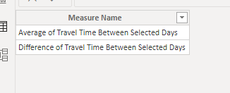
Measure Table:
2. Create "Legend Table".
Legend Table = UNION(VALUES(Data[Day]),'Measure Table')
3. Create measures.
Average of Travel Time between Selected Days = AVERAGE(Data[Travel Time (min)])Difference of Travel Time between Selected Days =
VAR MaxDay =
MAXX ( Data, Data[Day] )
VAR MinDay =
MINX ( Data, Data[Day] )
VAR MaxDayValue =
CALCULATE (
MAX ( Data[Travel Time (min)] ),
FILTER ( Data, Data[Day] = MaxDay )
)
VAR MinDayValue =
CALCULATE (
MAX ( Data[Travel Time (min)] ),
FILTER ( Data, Data[Day] = MinDay )
)
RETURN
MaxDayValue - MinDayValueMeasure =
IF (
MAX ( 'Legend Table'[Day] ) = "Average of Travel Time between Selected Days",
[Average of Travel Time between Selected Days],
IF (
MAX ( 'Legend Table'[Day] ) = "Difference of Travel Time between Selected Days",
[Difference of Travel Time between Selected Days],
IF (
VALUE ( MAX ( 'Legend Table'[Day] ) ) IN VALUES ( Data[Day] ),
CALCULATE (
AVERAGE ( Data[Travel Time (min)] ),
FILTER ( Data, Data[Day] = VALUE ( MAX ( 'Legend Table'[Day] ) ) )
)
)
)
)
4. Create visuals.
Best Regards,
Icey
If this post helps, then please consider Accept it as the solution to help the other members find it more quickly.
- Mark as New
- Bookmark
- Subscribe
- Mute
- Subscribe to RSS Feed
- Permalink
- Report Inappropriate Content
Thanks. this works perfectly...!!!!
- Mark as New
- Bookmark
- Subscribe
- Mute
- Subscribe to RSS Feed
- Permalink
- Report Inappropriate Content
Hi @AlexisGonzalez ,
Please check if this meets your initial requirements:
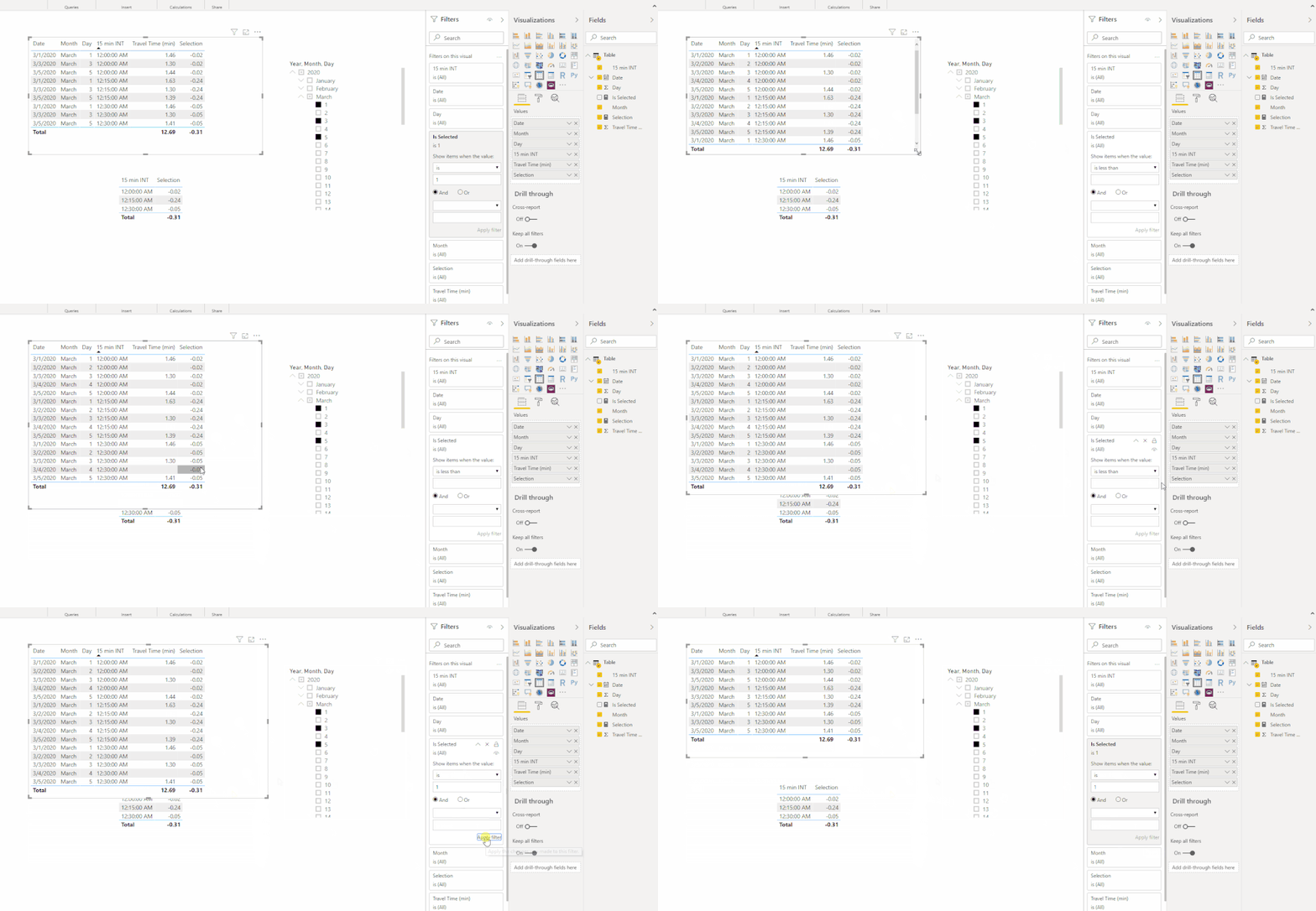
1. Create a measure 'Selection'.
Selection =
VAR Top1N =
    CALCULATE (
        TOPN ( 1, VALUES ( 'Table'[Date] ), [Date], ASC ),
        ALLSELECTED ( 'Table' )
    )
VAR Top2N =
    CALCULATE (
        TOPN ( 1, VALUES ( 'Table'[Date] ), 'Table'[Date], DESC ),
        ALLSELECTED ( 'Table' )
    )
VAR FirstSelectedValue =
    CALCULATE (
        SUM ( 'Table'[Travel Time (min)] ),
        FILTER ( ALLEXCEPT ( 'Table', 'Table'[15 min INT] ), 'Table'[Date] = Top1N )
    )
VAR SecondSelectedValue =
    CALCULATE (
        SUM ( 'Table'[Travel Time (min)] ),
        FILTER ( ALLEXCEPT ( 'Table', 'Table'[15 min INT] ), 'Table'[Date] = Top2N )
    )
RETURN
    SecondSelectedValue - FirstSelectedValue
2. Create a measure 'Is Selected'. Then put it on "Filters on this visual" of which visual needed.
Is Selected = IF ( MAX ( 'Table'[Date] ) IN VALUES ( 'Table'[Date] ), 1 )
Best Regards,
Icey
If this post helps, then please consider Accept it as the solution to help the other members find it more quickly.
- Mark as New
- Bookmark
- Subscribe
- Mute
- Subscribe to RSS Feed
- Permalink
- Report Inappropriate Content
@Icey, the measure
Is Selected = IF ( MAX ( 'Table'[Date] ) IN VALUES ( 'Table'[Date] ), 1 )
always returns 1. You can remove it from the filter, and the result will be the same. It's redundant because you're filtering always ONE TABLE via slicers.
Truth is, the MAX of any finite set belongs to the set (VALUES).
There is only one condition when it'll return BLANK: when the set of VALUES is empty. Still, you can remove it and the result will be the same.
Best
D
- Mark as New
- Bookmark
- Subscribe
- Mute
- Subscribe to RSS Feed
- Permalink
- Report Inappropriate Content
Hi @Anonymous ,
If I put 'Table'[Date] column in the table visual, [Is Selected] measure is needed. Because I used "ALLEXCEPT" in [Selection] measure.
Best Regards,
Icey
- Mark as New
- Bookmark
- Subscribe
- Mute
- Subscribe to RSS Feed
- Permalink
- Report Inappropriate Content
This is why I think the [Is ...] measure is redundant.
Best
D
- Mark as New
- Bookmark
- Subscribe
- Mute
- Subscribe to RSS Feed
- Permalink
- Report Inappropriate Content
Hi @Anonymous ,
If it is convenient, could you please check [Selection] measure for me? Maybe it can be improved. Thank you.
Best Regards,
Icey
- Mark as New
- Bookmark
- Subscribe
- Mute
- Subscribe to RSS Feed
- Permalink
- Report Inappropriate Content
hello, thanks for the answers have been very helpful, I think that I now understand a little more about how DAX works.
I was checking the file and everything works as I want, but even when the days are selected using the slicer the difference between the days is not every 15 min for the whole day, the table would give me the difference every 15 min of the selected days (96 intervals per day from 12:00 am to 11:45 pm) please check the PBix file that I will upload ("Demo. pbix" link below) on the page: "my Goal" appears a table that i created for the example where average travel time appears on day 3 and day 1 and the average travel time between them (the days that are selected in the slicer) every 15 min interval by day.
the goal is to create a line graph like the one you can see below in the page where you can plot the travel time of the days selected with the slicer, and also the average travel time (or the difference in average travel time) between the first and last days selected, but to do this the data must be by every day delected and 15 minutes interval (Axis)
https://mega.nz/folder/mDB1DKCJ#BBNX6Fx2x-GZHRz4GleZKw
thanks ...
- Mark as New
- Bookmark
- Subscribe
- Mute
- Subscribe to RSS Feed
- Permalink
- Report Inappropriate Content
Hi @AlexisGonzalez ,
You can refer to this post: DAX – Calculating the difference between 2 selections on a Slicer.
Best Regards,
Icey
If this post helps, then please consider Accept it as the solution to help the other members find it more quickly.
- Mark as New
- Bookmark
- Subscribe
- Mute
- Subscribe to RSS Feed
- Permalink
- Report Inappropriate Content
Sorry, I'm not sure I'm 100% clear on this. Sample data as text would help. Please see this post regarding How to Get Your Question Answered Quickly: https://community.powerbi.com/t5/Community-Blog/How-to-Get-Your-Question-Answered-Quickly/ba-p/38490
Seems similar to MTBF, see my article on Mean Time Between Failure (MTBF) which uses EARLIER: http://community.powerbi.com/t5/Community-Blog/Mean-Time-Between-Failure-MTBF-and-Power-BI/ba-p/3395...
@ me in replies or I'll lose your thread!!!
Instead of a Kudo, please vote for this idea
Become an expert!: Enterprise DNA
External Tools: MSHGQM
YouTube Channel!: Microsoft Hates Greg
Latest book!: The Definitive Guide to Power Query (M)
DAX is easy, CALCULATE makes DAX hard...
- Mark as New
- Bookmark
- Subscribe
- Mute
- Subscribe to RSS Feed
- Permalink
- Report Inappropriate Content
| Month | Day | 15 min INT | Travel Time (min) |
| March | 1 | 12:00:00 AM | 1.46 |
| March | 2 | 12:00:00 AM | 1.44 |
| March | 5 | 12:00:00 AM | 1.44 |
| March | 1 | 12:15:00 AM | 1.63 |
| March | 2 | 12:15:00 AM | 1.56 |
| March | 5 | 12:15:00 AM | 1.39 |
| March | 1 | 12:30:00 AM | 1.46 |
| March | 2 | 12:30:00 AM | 1.50 |
| March | 5 | 12:30:00 AM | 1.41 |
- Mark as New
- Bookmark
- Subscribe
- Mute
- Subscribe to RSS Feed
- Permalink
- Report Inappropriate Content
Hello, guys, I would like to clarify a little more about what I want, since I was reviewing and I realized that a little more detail is needed.
you can find in the following link the Pbix file with has the graph and tables, I think it is the best way to understand what I trying to say.
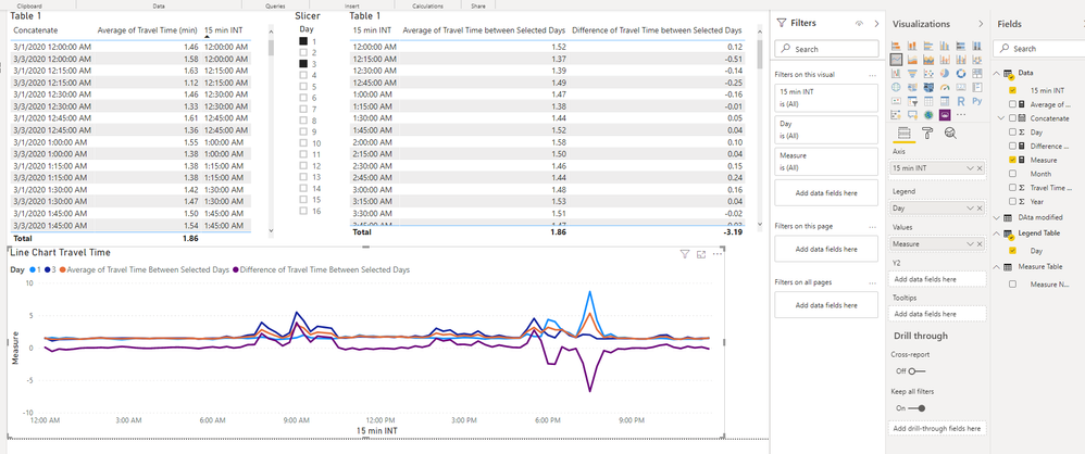
On the first page "what I have" you are going to see "table 1" top left corner that has a column " concatenate' that is a date-time column year/month/day/per 15 min interval and the average travel time column with the same intervals, the slicer that I use to add the days to the table and the graph (the axis of the graph are the 15 min intervals). I only added the first day and the third one for the example. all these visuals are based in the "Data" table.
I would like to find a way to have something similar to what appears on the next page "My Goal"
I built this page using the table " DAta modified " as best I could in excel I did it manually, just show them, so don't pay attention to the way the data is displayed. ( that data that I need to be modified is in table "Data" ) .
the goal is to create a line chart like the one that appears on this page in which I added a line that is the travel time average between the days that I added using the slicer.
You will be able to see in the graph a line of travel time that belongs to day 3, another that belongs to the day one and another line (calculated manually) that is the average of travel time between day 3 and day 1, that is, between the Max and the Min (days) that are added using the Slicer.
I need to find a way to transform de data ( Data table) to be able to do that. no only the average, maybe a percentage or a difference in average travel time between days.
in case of further clarification just let me know, and although if you cannot help me I would like to thank you in advance for your time and effort
thanks.
Helpful resources

Microsoft Fabric Learn Together
Covering the world! 9:00-10:30 AM Sydney, 4:00-5:30 PM CET (Paris/Berlin), 7:00-8:30 PM Mexico City

Power BI Monthly Update - April 2024
Check out the April 2024 Power BI update to learn about new features.

| User | Count |
|---|---|
| 111 | |
| 94 | |
| 80 | |
| 68 | |
| 59 |
| User | Count |
|---|---|
| 150 | |
| 119 | |
| 104 | |
| 87 | |
| 67 |
