- Power BI forums
- Updates
- News & Announcements
- Get Help with Power BI
- Desktop
- Service
- Report Server
- Power Query
- Mobile Apps
- Developer
- DAX Commands and Tips
- Custom Visuals Development Discussion
- Health and Life Sciences
- Power BI Spanish forums
- Translated Spanish Desktop
- Power Platform Integration - Better Together!
- Power Platform Integrations (Read-only)
- Power Platform and Dynamics 365 Integrations (Read-only)
- Training and Consulting
- Instructor Led Training
- Dashboard in a Day for Women, by Women
- Galleries
- Community Connections & How-To Videos
- COVID-19 Data Stories Gallery
- Themes Gallery
- Data Stories Gallery
- R Script Showcase
- Webinars and Video Gallery
- Quick Measures Gallery
- 2021 MSBizAppsSummit Gallery
- 2020 MSBizAppsSummit Gallery
- 2019 MSBizAppsSummit Gallery
- Events
- Ideas
- Custom Visuals Ideas
- Issues
- Issues
- Events
- Upcoming Events
- Community Blog
- Power BI Community Blog
- Custom Visuals Community Blog
- Community Support
- Community Accounts & Registration
- Using the Community
- Community Feedback
Register now to learn Fabric in free live sessions led by the best Microsoft experts. From Apr 16 to May 9, in English and Spanish.
- Power BI forums
- Forums
- Get Help with Power BI
- Desktop
- Business question with data problems
- Subscribe to RSS Feed
- Mark Topic as New
- Mark Topic as Read
- Float this Topic for Current User
- Bookmark
- Subscribe
- Printer Friendly Page
- Mark as New
- Bookmark
- Subscribe
- Mute
- Subscribe to RSS Feed
- Permalink
- Report Inappropriate Content
Business question with data problems
Hi Power BI gurus,
I am having an extreme difficult in showing the following visual. Let's start with the dataset.
| Team Name | Product 1 | Product 2 | Product 3 | Product 4 | Product 5 |
| Team 1 | 3 | 4 | 2 | 1 | 5 |
| Team 2 | 5 | 4 | 3 | 2 | 1 |
| Team 3 | 1 | 2 | 3 | 4 | 5 |
| Team 4 | 1 | 3 | 5 | 2 | 4 |
| Team 5 | 2 | 3 | 1 | 5 | 4 |
So basically, this is a survey done where the different teams were asked to order the Product they would be interested in. The lower the number, the higher the priority. So "1" means, first choice for the respective team. The business question I am trying to answer is - show which what teams have selected Product 1 as their choice, what teams have selected Product 2 as their choice and so on. Any good way to show this in a visual?
Solved! Go to Solution.
- Mark as New
- Bookmark
- Subscribe
- Mute
- Subscribe to RSS Feed
- Permalink
- Report Inappropriate Content
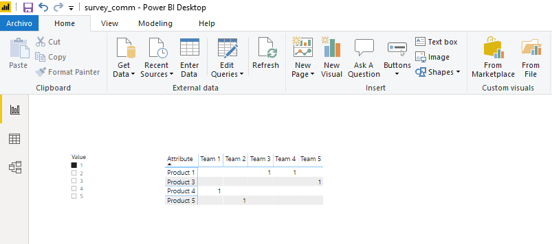
Hi @Anonymous ,
Does this work?
Just loaded the data table, cleaned it and showed the filtered results, pretty straight forward.
Here is the pbix file.
Regards,
Fernando
- Mark as New
- Bookmark
- Subscribe
- Mute
- Subscribe to RSS Feed
- Permalink
- Report Inappropriate Content
Okay, I'm no expert, but here's one way:
1. I copied your table into a blank query
2. Selected the Product 1, 2, 3, 4, and 5 columns
3. Unpivoted the selected columns
4. Renamed the new second column to "Product"
5. Renamed the last column to just "Quantity"
6. This gives you the records in three columns - Team Name, Product and Quantity. Closed and applied.
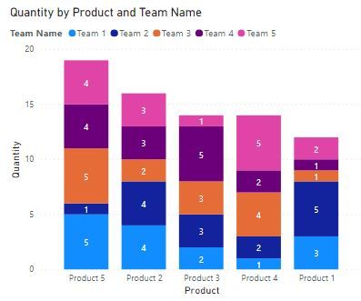
7. Added a Stacked Column Chart and put the Product as the axis, Team Name as the Legend and Quantity as the Value.
Here's what you get:
Using this chart you can tell which product sold the most and which team sold the most for each product. Of course you can sort by product so you quickly see the products in line by number, but I think this is better. Hope that helps.
Ahh, just read your post a little closer - thought you were looking at quantity sold - my bad
- Mark as New
- Bookmark
- Subscribe
- Mute
- Subscribe to RSS Feed
- Permalink
- Report Inappropriate Content
Hi @Anonymous ,
Does this work?
Just loaded the data table, cleaned it and showed the filtered results, pretty straight forward.
Here is the pbix file.
Regards,
Fernando
Helpful resources

Microsoft Fabric Learn Together
Covering the world! 9:00-10:30 AM Sydney, 4:00-5:30 PM CET (Paris/Berlin), 7:00-8:30 PM Mexico City

Power BI Monthly Update - April 2024
Check out the April 2024 Power BI update to learn about new features.

| User | Count |
|---|---|
| 109 | |
| 98 | |
| 77 | |
| 66 | |
| 54 |
| User | Count |
|---|---|
| 144 | |
| 104 | |
| 100 | |
| 86 | |
| 64 |


