- Power BI forums
- Updates
- News & Announcements
- Get Help with Power BI
- Desktop
- Service
- Report Server
- Power Query
- Mobile Apps
- Developer
- DAX Commands and Tips
- Custom Visuals Development Discussion
- Health and Life Sciences
- Power BI Spanish forums
- Translated Spanish Desktop
- Power Platform Integration - Better Together!
- Power Platform Integrations (Read-only)
- Power Platform and Dynamics 365 Integrations (Read-only)
- Training and Consulting
- Instructor Led Training
- Dashboard in a Day for Women, by Women
- Galleries
- Community Connections & How-To Videos
- COVID-19 Data Stories Gallery
- Themes Gallery
- Data Stories Gallery
- R Script Showcase
- Webinars and Video Gallery
- Quick Measures Gallery
- 2021 MSBizAppsSummit Gallery
- 2020 MSBizAppsSummit Gallery
- 2019 MSBizAppsSummit Gallery
- Events
- Ideas
- Custom Visuals Ideas
- Issues
- Issues
- Events
- Upcoming Events
- Community Blog
- Power BI Community Blog
- Custom Visuals Community Blog
- Community Support
- Community Accounts & Registration
- Using the Community
- Community Feedback
Register now to learn Fabric in free live sessions led by the best Microsoft experts. From Apr 16 to May 9, in English and Spanish.
- Power BI forums
- Forums
- Get Help with Power BI
- Desktop
- Re: Burndown chart using table data
- Subscribe to RSS Feed
- Mark Topic as New
- Mark Topic as Read
- Float this Topic for Current User
- Bookmark
- Subscribe
- Printer Friendly Page
- Mark as New
- Bookmark
- Subscribe
- Mute
- Subscribe to RSS Feed
- Permalink
- Report Inappropriate Content
Burndown chart using table data
Hello All,
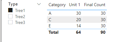
I want to build a burndown chart (separate chart for each item) for each of the 3 items in the slicer, i.e., Tree1, Tree2 and Tree3 for Unit 1 as shown below.
Sample data:
Filtered data for Tree1 for week 1 shows that a total of 44 items have been completed out of 90 leaving 46 incomplete items. This data gets refreshed every week.
Filtered Data (Example) – Week 1:
Below is the sample data for week 2. After week 2 there are 26 incomplete items.
As this data gets refreshed everyweek, I would like to add this data to the data used for building the burndown chart.
Data buildup for the burndown every week:
Date | Incomplete Items |
8/30/2021 | 46 |
9/6/2021 | 26 |
9/13/2021 | |
9/20/2021 | |
9/27/2021 | |
10/4/2021 | |
10/11/2021 | |
10/18/2021 | |
10/25/2021 | |
11/1/2021 | |
11/8/2021 | |
11/15/2021 | |
11/22/2021 | |
11/29/2021 | |
12/6/2021 |
How can I build a burn down chart using the examples above?
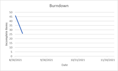
Example burndown chart for Tree 1:
To summarize:
- All processed data resides in the table
- Add this data automatically to the table to build burndown chart
- Build the burndown chart and update every week
Thanks in advance!
- Mark as New
- Bookmark
- Subscribe
- Mute
- Subscribe to RSS Feed
- Permalink
- Report Inappropriate Content
@rb161604888
You should have a date column linked with the calendar table in order to create a burn down chart. The above information is not enough. Please refer to the video and post below. You can add the tree type in the legend in your case.
Power BI - Burndown Chart (Fixed X-Axis) - YouTube
Solved: Burndown chart for data progress - Microsoft Power BI Community
Paul Zheng _ Community Support Team
If this post helps, please Accept it as the solution to help the other members find it more quickly.
- Mark as New
- Bookmark
- Subscribe
- Mute
- Subscribe to RSS Feed
- Permalink
- Report Inappropriate Content
@rb161604888
All visuals including charts are based on data table not on others visuals. Can you share the sample data table not a visual table, A sample pbix would be best. Also include the relationships, because it seems the date and incomplete item column are not in the same table with your fact table.
Paul Zheng _ Community Support Team
- Mark as New
- Bookmark
- Subscribe
- Mute
- Subscribe to RSS Feed
- Permalink
- Report Inappropriate Content
- Mark as New
- Bookmark
- Subscribe
- Mute
- Subscribe to RSS Feed
- Permalink
- Report Inappropriate Content
Helpful resources

Microsoft Fabric Learn Together
Covering the world! 9:00-10:30 AM Sydney, 4:00-5:30 PM CET (Paris/Berlin), 7:00-8:30 PM Mexico City

Power BI Monthly Update - April 2024
Check out the April 2024 Power BI update to learn about new features.

| User | Count |
|---|---|
| 113 | |
| 100 | |
| 78 | |
| 76 | |
| 52 |
| User | Count |
|---|---|
| 144 | |
| 109 | |
| 108 | |
| 88 | |
| 61 |


