- Power BI forums
- Updates
- News & Announcements
- Get Help with Power BI
- Desktop
- Service
- Report Server
- Power Query
- Mobile Apps
- Developer
- DAX Commands and Tips
- Custom Visuals Development Discussion
- Health and Life Sciences
- Power BI Spanish forums
- Translated Spanish Desktop
- Power Platform Integration - Better Together!
- Power Platform Integrations (Read-only)
- Power Platform and Dynamics 365 Integrations (Read-only)
- Training and Consulting
- Instructor Led Training
- Dashboard in a Day for Women, by Women
- Galleries
- Community Connections & How-To Videos
- COVID-19 Data Stories Gallery
- Themes Gallery
- Data Stories Gallery
- R Script Showcase
- Webinars and Video Gallery
- Quick Measures Gallery
- 2021 MSBizAppsSummit Gallery
- 2020 MSBizAppsSummit Gallery
- 2019 MSBizAppsSummit Gallery
- Events
- Ideas
- Custom Visuals Ideas
- Issues
- Issues
- Events
- Upcoming Events
- Community Blog
- Power BI Community Blog
- Custom Visuals Community Blog
- Community Support
- Community Accounts & Registration
- Using the Community
- Community Feedback
Register now to learn Fabric in free live sessions led by the best Microsoft experts. From Apr 16 to May 9, in English and Spanish.
- Power BI forums
- Forums
- Get Help with Power BI
- Desktop
- Bundesliga Team Performance
- Subscribe to RSS Feed
- Mark Topic as New
- Mark Topic as Read
- Float this Topic for Current User
- Bookmark
- Subscribe
- Printer Friendly Page
- Mark as New
- Bookmark
- Subscribe
- Mute
- Subscribe to RSS Feed
- Permalink
- Report Inappropriate Content
Bundesliga Team Performance
Hi all,
I'm currently working on building a soccer report, based on the German Bundesliga league that's due to start up again this weekend.
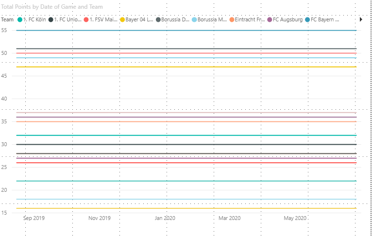
I'm struggling to get a visual that tracks a teams points as the months go on, it should be a simple line chart that goes up, however something is busted and I can't figure it out. The league table on the left is correct, which is built by a measure adding the points awarded by each team when they're away, to the points the same team scored when playing at home (both columns), however when trying to bring a date into the equation is doesn't calculate correctly.
^ See above, line graph should slowly increase to 55 points in the case of Bayern Munich, but it stops arouund 40 then declines?
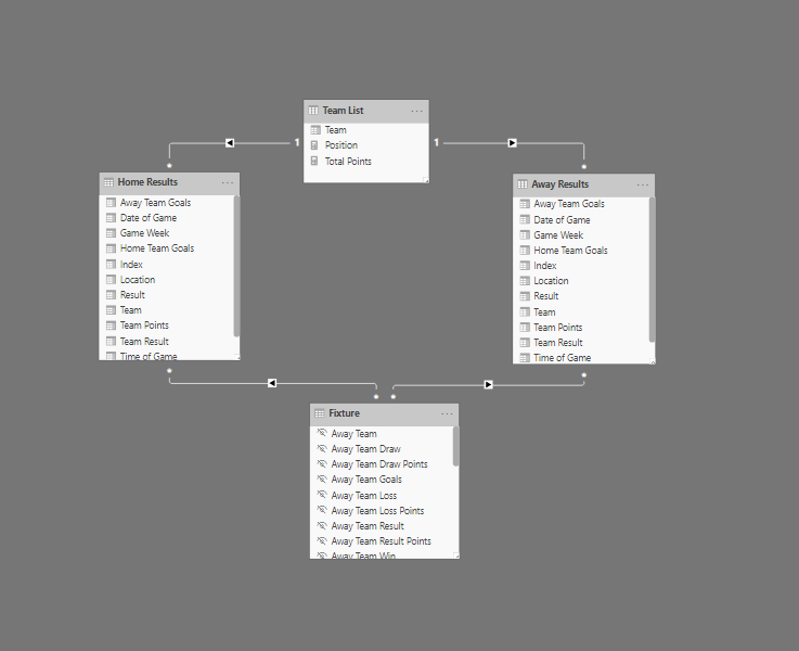
I'm assuming this is relationship based as I've seperated the Home Results and Away Results to allow me to calculate Home vs Away effectiveness, but I couldn't see another way to get proper home vs away stats. Would love some help on how to build this better!
The dataset I've used to create this is downloadable here, (I chose the XLS) - https://fixturedownload.com/results/bundesliga-2019
The PBIX file is here, please feel free to jump in, edit and send back - https://www.dropbox.com/s/m18spfm6qd3lsdu/Bundesliga%20Stats%20-%20Online%20Gateway%20Test.pbix?dl=0...
Kind regards,
Jordan
- Mark as New
- Bookmark
- Subscribe
- Mute
- Subscribe to RSS Feed
- Permalink
- Report Inappropriate Content
Hi all,
Thanks for providing solutions, I ended up using my Fixtures table as a bridge and date table to fix this issue.
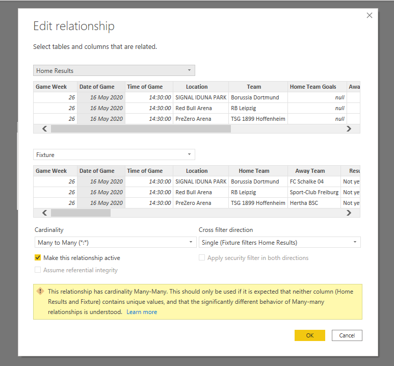
I set both the relationships as single, many to many, with the fixture list filtering the Home results table to avoid losing anything. I did the exact same with the Away Results column.
I'll leave the files links intact so anyone who finds this thread can view the problem and see how the solution fixes it.
Kind regards,
Jordan
- Mark as New
- Bookmark
- Subscribe
- Mute
- Subscribe to RSS Feed
- Permalink
- Report Inappropriate Content
Hi,
It is because your total team points were filtered by date.
The line chart showed commonly.
If you want to increase to 55, you can try to ingore the date filter.
Please try to create a seperate date as X axis:
Table = UNION(DISTINCT('Away Results'[Date of Game]),DISTINCT('Home Results'[Date of Game]))The result shows:
Best Regards,
Giotto
- Mark as New
- Bookmark
- Subscribe
- Mute
- Subscribe to RSS Feed
- Permalink
- Report Inappropriate Content
create one date table and link it to both of them using that date.
easy to create with
new table
date table = calendarauto()
If I took the time to answer your question and I came up with a solution, please mark my post as a solution and /or give kudos freely for the effort 🙂 Thank you!
Proud to be a Super User!
- Mark as New
- Bookmark
- Subscribe
- Mute
- Subscribe to RSS Feed
- Permalink
- Report Inappropriate Content
Helpful resources

Microsoft Fabric Learn Together
Covering the world! 9:00-10:30 AM Sydney, 4:00-5:30 PM CET (Paris/Berlin), 7:00-8:30 PM Mexico City

Power BI Monthly Update - April 2024
Check out the April 2024 Power BI update to learn about new features.

| User | Count |
|---|---|
| 114 | |
| 99 | |
| 83 | |
| 70 | |
| 60 |
| User | Count |
|---|---|
| 150 | |
| 115 | |
| 104 | |
| 89 | |
| 65 |


