- Power BI forums
- Updates
- News & Announcements
- Get Help with Power BI
- Desktop
- Service
- Report Server
- Power Query
- Mobile Apps
- Developer
- DAX Commands and Tips
- Custom Visuals Development Discussion
- Health and Life Sciences
- Power BI Spanish forums
- Translated Spanish Desktop
- Power Platform Integration - Better Together!
- Power Platform Integrations (Read-only)
- Power Platform and Dynamics 365 Integrations (Read-only)
- Training and Consulting
- Instructor Led Training
- Dashboard in a Day for Women, by Women
- Galleries
- Community Connections & How-To Videos
- COVID-19 Data Stories Gallery
- Themes Gallery
- Data Stories Gallery
- R Script Showcase
- Webinars and Video Gallery
- Quick Measures Gallery
- 2021 MSBizAppsSummit Gallery
- 2020 MSBizAppsSummit Gallery
- 2019 MSBizAppsSummit Gallery
- Events
- Ideas
- Custom Visuals Ideas
- Issues
- Issues
- Events
- Upcoming Events
- Community Blog
- Power BI Community Blog
- Custom Visuals Community Blog
- Community Support
- Community Accounts & Registration
- Using the Community
- Community Feedback
Register now to learn Fabric in free live sessions led by the best Microsoft experts. From Apr 16 to May 9, in English and Spanish.
- Power BI forums
- Forums
- Get Help with Power BI
- Desktop
- Building a custom stacked" or "clustered" column
- Subscribe to RSS Feed
- Mark Topic as New
- Mark Topic as Read
- Float this Topic for Current User
- Bookmark
- Subscribe
- Printer Friendly Page
- Mark as New
- Bookmark
- Subscribe
- Mute
- Subscribe to RSS Feed
- Permalink
- Report Inappropriate Content
Building a custom stacked" or "clustered" column
Greering Members .
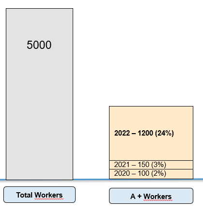
im trying to build a "stacked" or "clustered" column chart where i can add set different year in my Bar .
i made a little exemple of what im trying to acheive :
let's Say i have a total of 5000 Workers .
here is my table for my A+ workers :
and that's what im trying to acheive , the pink bar (Dunno if there is a custom visual that can help me build something similar ) :
Thanks all in advance .
Solved! Go to Solution.
- Mark as New
- Bookmark
- Subscribe
- Mute
- Subscribe to RSS Feed
- Permalink
- Report Inappropriate Content
@Anonymous You could check for third-party visuals.
Also, you could check if R visuals might suffice - https://community.powerbi.com/t5/R-Script-Showcase/bd-p/RVisuals
Also, there are Python visuals.
There are also SVG visuals you can create - https://community.powerbi.com/t5/forums/searchpage/tab/message?advanced=false&allow_punctuation=false&filter=location&location=forum-board:QuickMeasuresGallery&q=svg (scroll down on that page)
You could create your own custom visual - https://powerbi.microsoft.com/en-us/developers/custom-visualization/
Finally, last but not least you could try the Charticulator! - https://charticulator.com/
@ me in replies or I'll lose your thread!!!
Instead of a Kudo, please vote for this idea
Become an expert!: Enterprise DNA
External Tools: MSHGQM
YouTube Channel!: Microsoft Hates Greg
Latest book!: The Definitive Guide to Power Query (M)
DAX is easy, CALCULATE makes DAX hard...
- Mark as New
- Bookmark
- Subscribe
- Mute
- Subscribe to RSS Feed
- Permalink
- Report Inappropriate Content
HI @Anonymous,
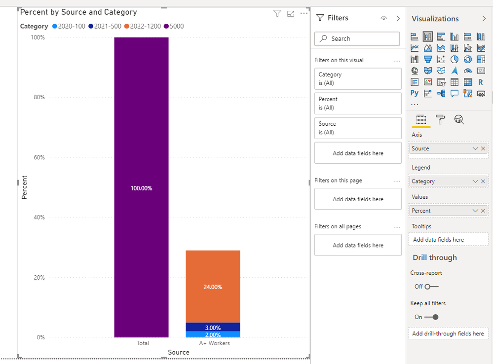
You can try to use the following calculate table formula to summary two table records but column power bi visuals seem not support to directly display the legend on the data label.
Summary =
UNION (
    SELECTCOLUMNS (
        'A+',
        "Category",
            [Year] & "-" & [A+ Worker],
        "Percent", [Percent],
        "Source", "A+ Workers"
    ),
    SUMMARIZE (
        Table,
        "Category", SUMX ( Table, [Workers] ),
        "Percent", 1,
        "Source", "Total"
    )
)
Perhaps you can try to create a R script to manly plot them on the data label.
Regards,
Xiaoxin Sheng
If this post helps, please consider accept as solution to help other members find it more quickly.
- Mark as New
- Bookmark
- Subscribe
- Mute
- Subscribe to RSS Feed
- Permalink
- Report Inappropriate Content
@Anonymous You could check for third-party visuals.
Also, you could check if R visuals might suffice - https://community.powerbi.com/t5/R-Script-Showcase/bd-p/RVisuals
Also, there are Python visuals.
There are also SVG visuals you can create - https://community.powerbi.com/t5/forums/searchpage/tab/message?advanced=false&allow_punctuation=false&filter=location&location=forum-board:QuickMeasuresGallery&q=svg (scroll down on that page)
You could create your own custom visual - https://powerbi.microsoft.com/en-us/developers/custom-visualization/
Finally, last but not least you could try the Charticulator! - https://charticulator.com/
@ me in replies or I'll lose your thread!!!
Instead of a Kudo, please vote for this idea
Become an expert!: Enterprise DNA
External Tools: MSHGQM
YouTube Channel!: Microsoft Hates Greg
Latest book!: The Definitive Guide to Power Query (M)
DAX is easy, CALCULATE makes DAX hard...
- Mark as New
- Bookmark
- Subscribe
- Mute
- Subscribe to RSS Feed
- Permalink
- Report Inappropriate Content
@Anonymous , I doubt a visual like that
Check custom visual -https://appsource.microsoft.com/en-us/marketplace/apps?product=power-bi-visuals
Microsoft Power BI Learning Resources, 2023 !!
Learn Power BI - Full Course with Dec-2022, with Window, Index, Offset, 100+ Topics !!
Did I answer your question? Mark my post as a solution! Appreciate your Kudos !! Proud to be a Super User! !!
Helpful resources

Microsoft Fabric Learn Together
Covering the world! 9:00-10:30 AM Sydney, 4:00-5:30 PM CET (Paris/Berlin), 7:00-8:30 PM Mexico City

Power BI Monthly Update - April 2024
Check out the April 2024 Power BI update to learn about new features.

| User | Count |
|---|---|
| 112 | |
| 97 | |
| 83 | |
| 67 | |
| 61 |
| User | Count |
|---|---|
| 150 | |
| 120 | |
| 99 | |
| 87 | |
| 68 |


