- Power BI forums
- Updates
- News & Announcements
- Get Help with Power BI
- Desktop
- Service
- Report Server
- Power Query
- Mobile Apps
- Developer
- DAX Commands and Tips
- Custom Visuals Development Discussion
- Health and Life Sciences
- Power BI Spanish forums
- Translated Spanish Desktop
- Power Platform Integration - Better Together!
- Power Platform Integrations (Read-only)
- Power Platform and Dynamics 365 Integrations (Read-only)
- Training and Consulting
- Instructor Led Training
- Dashboard in a Day for Women, by Women
- Galleries
- Community Connections & How-To Videos
- COVID-19 Data Stories Gallery
- Themes Gallery
- Data Stories Gallery
- R Script Showcase
- Webinars and Video Gallery
- Quick Measures Gallery
- 2021 MSBizAppsSummit Gallery
- 2020 MSBizAppsSummit Gallery
- 2019 MSBizAppsSummit Gallery
- Events
- Ideas
- Custom Visuals Ideas
- Issues
- Issues
- Events
- Upcoming Events
- Community Blog
- Power BI Community Blog
- Custom Visuals Community Blog
- Community Support
- Community Accounts & Registration
- Using the Community
- Community Feedback
Register now to learn Fabric in free live sessions led by the best Microsoft experts. From Apr 16 to May 9, in English and Spanish.
- Power BI forums
- Forums
- Get Help with Power BI
- Desktop
- Build histogram showing count of unique records ac...
- Subscribe to RSS Feed
- Mark Topic as New
- Mark Topic as Read
- Float this Topic for Current User
- Bookmark
- Subscribe
- Printer Friendly Page
- Mark as New
- Bookmark
- Subscribe
- Mute
- Subscribe to RSS Feed
- Permalink
- Report Inappropriate Content
Build histogram showing count of unique records across different sales buckets
Hello!
I've come close to solving this challenge but have yet to find a fully working solution. I'm hopeful someone else may have more luck than I have.
Goal: Build a histogram (column chart) where the values (on the y-axis) are the count of unique Product_IDs across buckets. The buckets, meanwhile, are defined based on the total sales for each Product_ID. This matters because there are more than one row for each Product_ID (since each record is a transaction). In addition, I need a solution that works in conjunction with the slicers -- which woudl be used to filter the records (transactions) that are included in the considered dataset.
Example data (simplified as there are other fields):
| Product_ID | Sales |
| 0001A | $20 |
| 0001B | $5 |
| 0002A | $15 |
| 0003A | $8 |
| 0004A | $12 |
| 0005A | ($2) |
| 0001B | $15 |
| 0002A | $10 |
Based on this, the distinct count of Product_ID would be 6.
Then you'd get the following histogram inputs based on these three buckets:
| Buckets (Sum of Sales $) | Distinct Count |
| <=5 | 2 |
| 5 < x <=20 | 3 |
| >20 | 1 |
How can I go about creating a measure that would calculate the values in the second column of the table above?
Thanks for your help!
Steven
- Mark as New
- Bookmark
- Subscribe
- Mute
- Subscribe to RSS Feed
- Permalink
- Report Inappropriate Content
Hi!
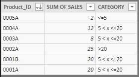
Well, for your case, i've created an aggregated table with SUMMARIZE DAX FUNCTION,
if you have the "table_data" with "product_ID" and "Sales" columns, the sintax for aggregated table is:
IF('table_data_AGGREGATED'[SUM OF SALES]<=20 , "5 < x <=20" , ">20"))


- Mark as New
- Bookmark
- Subscribe
- Mute
- Subscribe to RSS Feed
- Permalink
- Report Inappropriate Content
Thank you! Working with this now. Two follow-up questions:
1. Can I create the aggregated table as a Measure or is there another approach I need to do so?
2. Will using the calculated column method allow for the result to change as I filter the data? For instance, if my data set is for the past year, but I decide I only want to look at the past 30 days and use a slicer to limit the records, will the calculated column "re-calculate" or will it include data from the full year because that's what was used when the column was created?
Helpful resources

Microsoft Fabric Learn Together
Covering the world! 9:00-10:30 AM Sydney, 4:00-5:30 PM CET (Paris/Berlin), 7:00-8:30 PM Mexico City

Power BI Monthly Update - April 2024
Check out the April 2024 Power BI update to learn about new features.

| User | Count |
|---|---|
| 110 | |
| 99 | |
| 80 | |
| 64 | |
| 57 |
| User | Count |
|---|---|
| 145 | |
| 110 | |
| 91 | |
| 84 | |
| 66 |
