- Power BI forums
- Updates
- News & Announcements
- Get Help with Power BI
- Desktop
- Service
- Report Server
- Power Query
- Mobile Apps
- Developer
- DAX Commands and Tips
- Custom Visuals Development Discussion
- Health and Life Sciences
- Power BI Spanish forums
- Translated Spanish Desktop
- Power Platform Integration - Better Together!
- Power Platform Integrations (Read-only)
- Power Platform and Dynamics 365 Integrations (Read-only)
- Training and Consulting
- Instructor Led Training
- Dashboard in a Day for Women, by Women
- Galleries
- Community Connections & How-To Videos
- COVID-19 Data Stories Gallery
- Themes Gallery
- Data Stories Gallery
- R Script Showcase
- Webinars and Video Gallery
- Quick Measures Gallery
- 2021 MSBizAppsSummit Gallery
- 2020 MSBizAppsSummit Gallery
- 2019 MSBizAppsSummit Gallery
- Events
- Ideas
- Custom Visuals Ideas
- Issues
- Issues
- Events
- Upcoming Events
- Community Blog
- Power BI Community Blog
- Custom Visuals Community Blog
- Community Support
- Community Accounts & Registration
- Using the Community
- Community Feedback
Register now to learn Fabric in free live sessions led by the best Microsoft experts. From Apr 16 to May 9, in English and Spanish.
- Power BI forums
- Forums
- Get Help with Power BI
- Desktop
- Re: Budget vs Actual visual using only measures (e...
- Subscribe to RSS Feed
- Mark Topic as New
- Mark Topic as Read
- Float this Topic for Current User
- Bookmark
- Subscribe
- Printer Friendly Page
- Mark as New
- Bookmark
- Subscribe
- Mute
- Subscribe to RSS Feed
- Permalink
- Report Inappropriate Content
Budget vs Actual visual using only measures (e.g, variance chart, or tornado chart)
All of our budgets/targets are stored seperately to our source data in spreadsheets. In addition the budgets are at a higher level of granularity to source data (budgets by month, region, product).
I have a bunch of measures like this:
# Leads (Actual)
# Leads (Budget)
# Opportunities (Actual)
# Opportunities (Budget)
and so, for each stage of our sales pipeline...
Essentially, I want to be able to compare either variance between the 2, or skewness of the funnel (a skew to the right would show we are above budget, a skew to the left would mean we are below for example).
I have seen the tornado chart work well for this, except this requires a grouping variable (e.g, sales stage) and does not work for measures. I have also seen xViz has a variance chart which just shows + or - difference between the two figures, however this also relies on a grouping category.
The only solution I can think of is aggregating my source data up to the same level of granularity as the budgets, union the two datasets and creating a column called 'datasource' (with Budget and Actual as values), however, I want to avoid doing as it will require a lot of manipulation and becomes troublesome when users want to see the underlying data points for the actual figures.
Are there any custom visuals out there that I can just drag and drop my measures on and create a tornado chart, or variance chart?
Solved! Go to Solution.
- Mark as New
- Bookmark
- Subscribe
- Mute
- Subscribe to RSS Feed
- Permalink
- Report Inappropriate Content
Hi @omillzy -
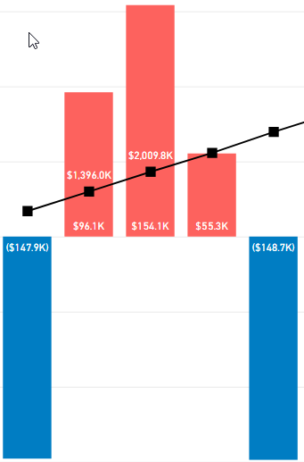
This is the standard bar chart. I've done what you're trying to do by creating Positive and Negative measures for each measure I want shown. Basically
BudgVarNeg = IF([AllSpend] <> 0, IF([BudgVar] > 0, [BudgVar]))

BudgVarPos = IF([AllSpend] <> 0, IF([BudgVar] <= 0, [BudgVar]))
Then used a stacked bar chart with both of those measures as values, assigning Neg to Red and Pos to Green (don't mind the line - it's not related to what you're asking, and I know this is a column chart but the principle should be the same for a horizontal bar chart).
Hope this helps
David
- Mark as New
- Bookmark
- Subscribe
- Mute
- Subscribe to RSS Feed
- Permalink
- Report Inappropriate Content
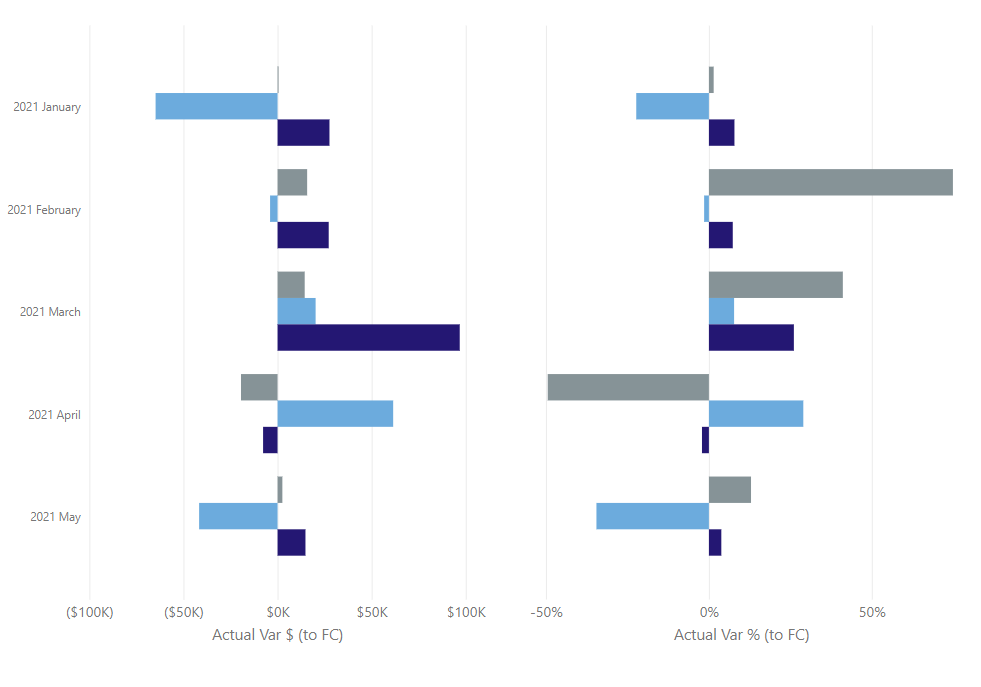
Hi @omillzy - is this the look you're going for? Simply a horizontal bar chart showing the variances (it's actually two chart, I just removed the Y-axis from the right-most chart)
Hope this helps
David
- Mark as New
- Bookmark
- Subscribe
- Mute
- Subscribe to RSS Feed
- Permalink
- Report Inappropriate Content
Basically, yes - I know the standard bar chart can do this but I couldn't figure out how to conditionally format the colours to neg was red and pos is green, is this a custom visual or standard bar chart?
- Mark as New
- Bookmark
- Subscribe
- Mute
- Subscribe to RSS Feed
- Permalink
- Report Inappropriate Content
Hi @omillzy -
This is the standard bar chart. I've done what you're trying to do by creating Positive and Negative measures for each measure I want shown. Basically
BudgVarNeg = IF([AllSpend] <> 0, IF([BudgVar] > 0, [BudgVar]))

BudgVarPos = IF([AllSpend] <> 0, IF([BudgVar] <= 0, [BudgVar]))
Then used a stacked bar chart with both of those measures as values, assigning Neg to Red and Pos to Green (don't mind the line - it's not related to what you're asking, and I know this is a column chart but the principle should be the same for a horizontal bar chart).
Hope this helps
David
Helpful resources

Microsoft Fabric Learn Together
Covering the world! 9:00-10:30 AM Sydney, 4:00-5:30 PM CET (Paris/Berlin), 7:00-8:30 PM Mexico City

Power BI Monthly Update - April 2024
Check out the April 2024 Power BI update to learn about new features.

| User | Count |
|---|---|
| 109 | |
| 96 | |
| 77 | |
| 66 | |
| 54 |
| User | Count |
|---|---|
| 144 | |
| 104 | |
| 102 | |
| 88 | |
| 63 |


