- Power BI forums
- Updates
- News & Announcements
- Get Help with Power BI
- Desktop
- Service
- Report Server
- Power Query
- Mobile Apps
- Developer
- DAX Commands and Tips
- Custom Visuals Development Discussion
- Health and Life Sciences
- Power BI Spanish forums
- Translated Spanish Desktop
- Power Platform Integration - Better Together!
- Power Platform Integrations (Read-only)
- Power Platform and Dynamics 365 Integrations (Read-only)
- Training and Consulting
- Instructor Led Training
- Dashboard in a Day for Women, by Women
- Galleries
- Community Connections & How-To Videos
- COVID-19 Data Stories Gallery
- Themes Gallery
- Data Stories Gallery
- R Script Showcase
- Webinars and Video Gallery
- Quick Measures Gallery
- 2021 MSBizAppsSummit Gallery
- 2020 MSBizAppsSummit Gallery
- 2019 MSBizAppsSummit Gallery
- Events
- Ideas
- Custom Visuals Ideas
- Issues
- Issues
- Events
- Upcoming Events
- Community Blog
- Power BI Community Blog
- Custom Visuals Community Blog
- Community Support
- Community Accounts & Registration
- Using the Community
- Community Feedback
Register now to learn Fabric in free live sessions led by the best Microsoft experts. From Apr 16 to May 9, in English and Spanish.
- Power BI forums
- Forums
- Get Help with Power BI
- Desktop
- Bridge/Waterfall chart with multiple values
- Subscribe to RSS Feed
- Mark Topic as New
- Mark Topic as Read
- Float this Topic for Current User
- Bookmark
- Subscribe
- Printer Friendly Page
- Mark as New
- Bookmark
- Subscribe
- Mute
- Subscribe to RSS Feed
- Permalink
- Report Inappropriate Content
Bridge/Waterfall chart with multiple values
Hello,
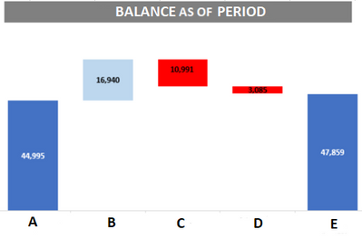
I've seen some similar posts but not one that exactly addresses this issue I have, I need to replicate this graph:
The graph shows some financial values (concepts) ordered by an ID (not by an alphabetical order of the concepts A, B, C, D or E) and I don't know how to replicate it. As you can see, B, C, D are smaller numbers than A or E, but those are shown over them.
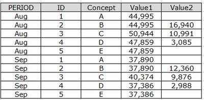
This is a sample of how the data they gave me looks like:
There are some formulas for the values, like Value1 in Concept C is the Value1 of B + Value 2 of B - Value 2 of C just so you know. My question is, how can I replicate that graph? Like I said, the bars are orders by the ID (not by the concept) and in the case of concepts B, C and D only the Value2 is showing but starting from the height of Value1. If needed we can change how is the data uploaded.
Also, I tried to a stacked bar chart but couldn't change the colors of B, C and D Value1 to White to avoid showing it.
TIA
Solved! Go to Solution.
- Mark as New
- Bookmark
- Subscribe
- Mute
- Subscribe to RSS Feed
- Permalink
- Report Inappropriate Content
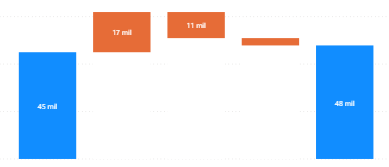
At the end I did this:
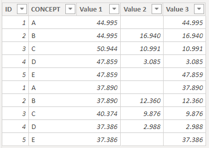
I used a stacked column chart, with 2 created columns and the value2 column, the first created column had value1 for Concept A and D and 0 for the rest and the second created column with Value 1 for concepts B, C and D and 0 for the rest.
What I did was, put the first created column (both blue bars in the image) and the others aren't shown because they have 0 as value, then the second created column with color white (so they aren't shown) and then the value2 column on top to replicate it exactly. Thanks to everyone who helped!
- Mark as New
- Bookmark
- Subscribe
- Mute
- Subscribe to RSS Feed
- Permalink
- Report Inappropriate Content
@Anonymous , First of all get the values in a single column using DAX such as:
Table1[ID] IN {1,5}, Table1[Value 1 ],
Table1[ID] IN {2,3,4}, Table1[Value 2]
)
Then use this column in the stacked bar chart/ waterfall chart / any chart of your choice.
- Mark as New
- Bookmark
- Subscribe
- Mute
- Subscribe to RSS Feed
- Permalink
- Report Inappropriate Content
@Anonymous Hello, what graph is that? Because whenever I use a waterfall chart there is a total column that shows automatically and I don't know how to hide it.
And I have to wonder, do you know how to make it appear exactly as the image I showed you? Because in this one the bars always start where the last bar finished, is there a way to make it like I showed?
TIA
- Mark as New
- Bookmark
- Subscribe
- Mute
- Subscribe to RSS Feed
- Permalink
- Report Inappropriate Content
We can't hide total bar in waterfall chart .
- Mark as New
- Bookmark
- Subscribe
- Mute
- Subscribe to RSS Feed
- Permalink
- Report Inappropriate Content
At the end I did this:
I used a stacked column chart, with 2 created columns and the value2 column, the first created column had value1 for Concept A and D and 0 for the rest and the second created column with Value 1 for concepts B, C and D and 0 for the rest.
What I did was, put the first created column (both blue bars in the image) and the others aren't shown because they have 0 as value, then the second created column with color white (so they aren't shown) and then the value2 column on top to replicate it exactly. Thanks to everyone who helped!
- Mark as New
- Bookmark
- Subscribe
- Mute
- Subscribe to RSS Feed
- Permalink
- Report Inappropriate Content
Create a mesure with logic : if value2 is 0 then show Value1 else Value2. use this measure in Waterfall chart.
- Mark as New
- Bookmark
- Subscribe
- Mute
- Subscribe to RSS Feed
- Permalink
- Report Inappropriate Content
Thanks, I did think about it before, but after I do that, there's the issue of having the concepts B, C, D starting at the height of concepts A and E, also, I don't know how to hide the total bar in the Waterfall chart. Any ideas?
- Mark as New
- Bookmark
- Subscribe
- Mute
- Subscribe to RSS Feed
- Permalink
- Report Inappropriate Content
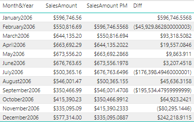
if it is difference comaprate to prevoius month , you can use above logic to build difference(salesamount -SalesAmountPM) and plot waterfall chart with Month and differnce.
Helpful resources

Microsoft Fabric Learn Together
Covering the world! 9:00-10:30 AM Sydney, 4:00-5:30 PM CET (Paris/Berlin), 7:00-8:30 PM Mexico City

Power BI Monthly Update - April 2024
Check out the April 2024 Power BI update to learn about new features.

| User | Count |
|---|---|
| 110 | |
| 99 | |
| 80 | |
| 64 | |
| 58 |
| User | Count |
|---|---|
| 148 | |
| 111 | |
| 93 | |
| 84 | |
| 66 |
