- Power BI forums
- Updates
- News & Announcements
- Get Help with Power BI
- Desktop
- Service
- Report Server
- Power Query
- Mobile Apps
- Developer
- DAX Commands and Tips
- Custom Visuals Development Discussion
- Health and Life Sciences
- Power BI Spanish forums
- Translated Spanish Desktop
- Power Platform Integration - Better Together!
- Power Platform Integrations (Read-only)
- Power Platform and Dynamics 365 Integrations (Read-only)
- Training and Consulting
- Instructor Led Training
- Dashboard in a Day for Women, by Women
- Galleries
- Community Connections & How-To Videos
- COVID-19 Data Stories Gallery
- Themes Gallery
- Data Stories Gallery
- R Script Showcase
- Webinars and Video Gallery
- Quick Measures Gallery
- 2021 MSBizAppsSummit Gallery
- 2020 MSBizAppsSummit Gallery
- 2019 MSBizAppsSummit Gallery
- Events
- Ideas
- Custom Visuals Ideas
- Issues
- Issues
- Events
- Upcoming Events
- Community Blog
- Power BI Community Blog
- Custom Visuals Community Blog
- Community Support
- Community Accounts & Registration
- Using the Community
- Community Feedback
Register now to learn Fabric in free live sessions led by the best Microsoft experts. From Apr 16 to May 9, in English and Spanish.
- Power BI forums
- Forums
- Get Help with Power BI
- Desktop
- (Bing) Map vs Icon map inadequacies for particular...
- Subscribe to RSS Feed
- Mark Topic as New
- Mark Topic as Read
- Float this Topic for Current User
- Bookmark
- Subscribe
- Printer Friendly Page
- Mark as New
- Bookmark
- Subscribe
- Mute
- Subscribe to RSS Feed
- Permalink
- Report Inappropriate Content
(Bing) Map vs Icon map inadequacies for particular use case
hi all,
I would like to present a use case where neither the default (Bing) Map nor the alternative Icon map custom visual (cc @jamesdales) appears able to present a solution that is satisfactory to me. I hope that as a result, either someone will provide a solution given current functionality that I didn't realise or this will lead to (much desired) improvement to the default Map / Icon map visuals.
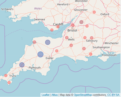
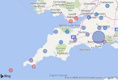
To describe the use case: I would like my report to include a map (of the UK) with locations coloured based on the proportion of time that (forecast) air temperature is below a particular temp. threshold: red if the proportion is high (max = 1) diverging to blue if it is low (min = 0). In addition, I would like to distinguish between two types of locations, either by using a slightly bigger bubble size or by using a different icon. The default (Bing) Map gets me a long way, the only frustration being that I can't control the size of the location bubble; I find the discrepancy in bubble size too large, particularly if the map is zoomed out to whole of UK.
In contrast, the Icon Map handles bubble size much better because the Max. and Min. size of Data Points can be set in the Format pane. However, when I tested, the Icon Map will only render locations with desired colour scheme if the Measure (+ Aggregation) put on Colour Saturation is exactly the same as the Measure (+ Aggregation) put on Size. This means the Size field, even though set up perfectly for this task, is not available to distinguish between the types of locations.
In addition, two other functionalities - one generic, the other specific to this use case - are currently better handled in (Bing) Map:
- When hovering over a location on the Icon map that is close to the edge, the map will move to accommodate the entire tooltip within the space of the Icon Map visual. This may result in another location on the map becoming hidden (this has happened to the location on Scilly Isles in screengrab above)
- When the proportion of time that (forecast) air temperature is below a particular temp. threshold is 0 for ALL locations, the Icon Map does not allocate the 'Circle Colour - Start' to these locations but instead renders them all a different colour:
So unless I've missed something, the added functionality required for the (Bing) Map visual to achieve my use case would be to add Bubble size control (I think this has been a long-time request now!). For the Icon Map to achieve what I set out, the Colour Saturation and Size fields should be able to work independently and if the Measure put on Colour Saturation is zero for all locations, the Circle Colour - Start should still be applied.
Any solutions I have missed?
Thanks, Bastiaan
Update 1: I can't attach the workbook in .pbix, presumably because I'm a new member. I will try to upload it via other service and post link here.
Update 2: Power BI report available here: https://send.firefox.com/download/d79ccac2cf/#nf4t8V3OUWGJ_6O3setaBw
- Mark as New
- Bookmark
- Subscribe
- Mute
- Subscribe to RSS Feed
- Permalink
- Report Inappropriate Content
Hi @BastiaanBrak,
#1, map visual data label size are based on size filed. So if you not drag numeric column to size files. it will display same size data labels.
#2, conditional formatting feature still not works on map visuals, I think it is impossible to achieve dynamic data label color based on conditions.
Maybe you can submit ideas for your requirement.
Regards,
Xiaoxin Sheng
If this post helps, please consider accept as solution to help other members find it more quickly.
- Mark as New
- Bookmark
- Subscribe
- Mute
- Subscribe to RSS Feed
- Permalink
- Report Inappropriate Content
hi @v-shex-msft, I'm a bit confused to be honest; not sure if I'm misunderstanding you or if you misunderstood my question. You mention 'data label size' and 'data label colour' but the issues I'm describing with both map visuals do not relate to Labels but to (Bubble) Size and (Bubble) Colour saturation.
re #1 I know that Bubble size in the (Bing) map visual works on a numeric field. How otherwise would I have a been able to create this (Bing) map?

re #2 If by 'conditional formatting' you mean applying Colour saturation of the bubbles on the map based on a Measure, well this works just fine for me in the (Bing) map visual:
The problem is that whatever numeric field you add to the Size field (see the two SymbolSize variables in Location data table in attached workbook), the (Bing) map visual will create bubbles that are too different in size. I would like to be able to control Bubble size but the (Bing) map visual still does not allow this. This issue was raised already over two years ago (https://community.powerbi.com/t5/Desktop/Map-point-sizes-almost-all-the-same/td-p/50332) and since then it has been put forward as an idea at least 3 times so I don't think I ought to put it forward again.
https://ideas.powerbi.com/forums/265200-power-bi-ideas/suggestions/18903565-map-dot-bubble-sizes-sho...
https://ideas.powerbi.com/forums/265200-power-bi-ideas/suggestions/18787435-map-bubble-size
https://ideas.powerbi.com/forums/265200-power-bi-ideas/suggestions/33616594-decrease-bubble-size-in-...
I just wanted to draw attention to the fact that the Bubble size issue with the (Bing) map visual has not necessarily become irrelevant because of the availability of the Icon map custom visual.
- Mark as New
- Bookmark
- Subscribe
- Mute
- Subscribe to RSS Feed
- Permalink
- Report Inappropriate Content
HI @BastiaanBrak,
#1, You can try to drag detail location(city) information of location fields, category(state, region) to legend and amount to size fields. Then it will display your data points who has same category with same color.
#2, Below is the conditional formatting I mentioned, it is a powerfully feature but currently only available on table and matrix visual:
Conditional formatting in tables
I also not found an effective solution to accurate control data point size in bing map visual, maybe you can consider to submit this idea to bing map related forum.
Regards,
Xiaoxin Sheng
If this post helps, please consider accept as solution to help other members find it more quickly.
- Mark as New
- Bookmark
- Subscribe
- Mute
- Subscribe to RSS Feed
- Permalink
- Report Inappropriate Content
hi @v-shex-msft, thanks for your reply.
#1 and #2 As indicated in original post, I know what measures to put on what fields and the 'Color saturation' field in the (Bing) map visual is not the issue, it works just fine. It's the lack of Bubble size control that is the single issue.
I'm going to repeat myself but bubble size control for the (Bing) Map visual has been put forward as an Idea at least three times already and I've voted for each of them. Just hoping it will finally be included in an update soon I guess ...
Helpful resources

Microsoft Fabric Learn Together
Covering the world! 9:00-10:30 AM Sydney, 4:00-5:30 PM CET (Paris/Berlin), 7:00-8:30 PM Mexico City

Power BI Monthly Update - April 2024
Check out the April 2024 Power BI update to learn about new features.

| User | Count |
|---|---|
| 109 | |
| 98 | |
| 77 | |
| 66 | |
| 54 |
| User | Count |
|---|---|
| 144 | |
| 104 | |
| 102 | |
| 88 | |
| 63 |


