- Power BI forums
- Updates
- News & Announcements
- Get Help with Power BI
- Desktop
- Service
- Report Server
- Power Query
- Mobile Apps
- Developer
- DAX Commands and Tips
- Custom Visuals Development Discussion
- Health and Life Sciences
- Power BI Spanish forums
- Translated Spanish Desktop
- Power Platform Integration - Better Together!
- Power Platform Integrations (Read-only)
- Power Platform and Dynamics 365 Integrations (Read-only)
- Training and Consulting
- Instructor Led Training
- Dashboard in a Day for Women, by Women
- Galleries
- Community Connections & How-To Videos
- COVID-19 Data Stories Gallery
- Themes Gallery
- Data Stories Gallery
- R Script Showcase
- Webinars and Video Gallery
- Quick Measures Gallery
- 2021 MSBizAppsSummit Gallery
- 2020 MSBizAppsSummit Gallery
- 2019 MSBizAppsSummit Gallery
- Events
- Ideas
- Custom Visuals Ideas
- Issues
- Issues
- Events
- Upcoming Events
- Community Blog
- Power BI Community Blog
- Custom Visuals Community Blog
- Community Support
- Community Accounts & Registration
- Using the Community
- Community Feedback
Register now to learn Fabric in free live sessions led by the best Microsoft experts. From Apr 16 to May 9, in English and Spanish.
- Power BI forums
- Forums
- Get Help with Power BI
- Desktop
- Re: Best way to split a single table into 2 views
- Subscribe to RSS Feed
- Mark Topic as New
- Mark Topic as Read
- Float this Topic for Current User
- Bookmark
- Subscribe
- Printer Friendly Page
- Mark as New
- Bookmark
- Subscribe
- Mute
- Subscribe to RSS Feed
- Permalink
- Report Inappropriate Content
Best way to split a single table into 2 views
Hi all,
I have a "student" table and a "test results" table. The test table contains results 2 types of tests - a math test (MTest) and an English test (RTest). The tests are undertaken once per year. I need to plot the annual results in a single dot plot with the Rtest as the X and the MTest as Y (ie one dot per student) [a fuiture enhancement. The tables are joined via a simple StudentID.
What would be the best practice approach to split & plot the data? A set of virtual tables represening each of the tests? Or is there a more elegant/efficient way to achieve the above?
I am still a baby in the woods as far as Power BI is concerned - but would like to learn and adopt best practice as I progress. Just a pointer/opnion would be greatly appreciated.
Thanks in advance,
Lex
Solved! Go to Solution.
- Mark as New
- Bookmark
- Subscribe
- Mute
- Subscribe to RSS Feed
- Permalink
- Report Inappropriate Content
Hi, @lutho
According to your description, I guess that you want to split your single table into the 2 dimensions and show the data in the scatter chart, you can follow my steps:
This is the test data I created based on your picture:
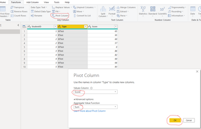
- I click “Transform data” to go to the Power query editor, select the table, and click “Piovit column” then set like this:
- And I get the data you want to get, like this:
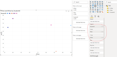
- Then I click “Apply and close” and go to the report view to create a scatter chart then place columns like this:
And you can get what you want.
You can download my test pbix file here
Best Regards,
Community Support Team _Robert Qin
If this post helps, then please consider Accept it as the solution to help the other members find it more quickly.
- Mark as New
- Bookmark
- Subscribe
- Mute
- Subscribe to RSS Feed
- Permalink
- Report Inappropriate Content
Hi everyone, I'm new to power bi. Please help me separate the data from the virtual table into the corresponding tables as follows:
I want to separate the data lines and from the arrow to fill the data before the arrow in the columns in the respective tables, please help me, thanks a lot
- Mark as New
- Bookmark
- Subscribe
- Mute
- Subscribe to RSS Feed
- Permalink
- Report Inappropriate Content
Well - I asked for the right and elegant solution and I got it. I had been playing with the "duplicate" option, however the pivot column option is just right and works a treat. Thanks Robert!
- Mark as New
- Bookmark
- Subscribe
- Mute
- Subscribe to RSS Feed
- Permalink
- Report Inappropriate Content
Hi, @lutho
According to your description, I guess that you want to split your single table into the 2 dimensions and show the data in the scatter chart, you can follow my steps:
This is the test data I created based on your picture:
- I click “Transform data” to go to the Power query editor, select the table, and click “Piovit column” then set like this:
- And I get the data you want to get, like this:
- Then I click “Apply and close” and go to the report view to create a scatter chart then place columns like this:
And you can get what you want.
You can download my test pbix file here
Best Regards,
Community Support Team _Robert Qin
If this post helps, then please consider Accept it as the solution to help the other members find it more quickly.
- Mark as New
- Bookmark
- Subscribe
- Mute
- Subscribe to RSS Feed
- Permalink
- Report Inappropriate Content
Hi, @lutho
According to your description, I think the scatter chart in Power BI can perfectly fit your requirement. Below is my test data and my steps to achieve this chart, you can take a look and find if it’s useful to you:
- I created some data and create a relationship based on your description:
Then I created a scatter chart and place columns like this:
And I guess this is similar to the chart that you want to get.
You can download my test pbix file here
More info about scatter chart in Power BI
If this result is not what you want, you can post some sample data(without sensitive data) and your expected result.
How to Get Your Question Answered Quickly
Best Regards,
Community Support Team _Robert Qin
If this post helps, then please consider Accept it as the solution to help the other members find it more quickly.
- Mark as New
- Bookmark
- Subscribe
- Mute
- Subscribe to RSS Feed
- Permalink
- Report Inappropriate Content
Thanks Robert, the scatter chart is the right visual. My issue relates to the approach/method of how my single table with test results can be split into the 2 dimensions required. My apologies and I should have been more clear and provided a data set. The issue is it is a single table that holds both data sets and the question is for the best approach to split the data into both dimensions?
Thanks for responding!
- Mark as New
- Bookmark
- Subscribe
- Mute
- Subscribe to RSS Feed
- Permalink
- Report Inappropriate Content
Hi @lutho
Download example PBIX file with the following visuals and tables.
A scatter plot will show you how two variable relate to each other, in tis case the two test results, but then you can't relate those to the students.
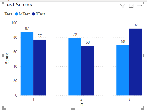
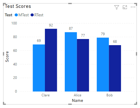
If you want to plot multiple test scores and be able to see what each student scored, I'd use a Clustered Column chart.
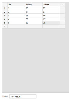
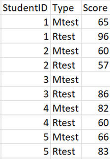
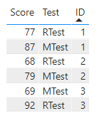
Starting with a sample table like this
You'd get a visual like this
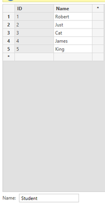
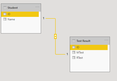
If later you add a table containing Student Names and ID's like this
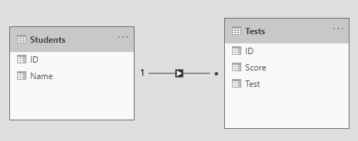
you can link the two tables with a 1-to-many relationship
Allowing you to create a visual with the student names on the x-axis
Regards
Phil
If I answered your question please mark my post as the solution.
If my answer helped solve your problem, give it a kudos by clicking on the Thumbs Up.
Did I answer your question? Then please mark my post as the solution.
If I helped you, click on the Thumbs Up to give Kudos.
Blog :: YouTube Channel :: Connect on Linkedin
Proud to be a Super User!
- Mark as New
- Bookmark
- Subscribe
- Mute
- Subscribe to RSS Feed
- Permalink
- Report Inappropriate Content
Thanks Phil for taking the time for the ellaborate answer and you point regarding the need for the variables to relate to each other is valid. In this case there is actually a relationship - the test are an ability type of test where the ability of the numeric side is plotted against the verbal/linguistic side. The plot help staff identify and use appropriate learning methods depending where the student sits on the plot. They are definitely related! I hope that makes sense?
- Mark as New
- Bookmark
- Subscribe
- Mute
- Subscribe to RSS Feed
- Permalink
- Report Inappropriate Content
Hey @lutho ,
Regarding your question, I have to admit that I have my problems understanding your requirement.
Please consider to create a pbix file that contains sample data, but still reflects the data model (https://docs.microsoft.com/en-us/learn/modules/design-model-power-bi/).
You can use this to enter data directly in Power BI Desktop: https://docs.microsoft.com/en-us/power-bi/connect-data/desktop-enter-data-directly-into-desktop. Upload the pbix file to onedrive or dropbox and share the link. If you are using Excel to create the sample data, share the xlsx as well.
Regards,
Tom
Did I answer your question? Mark my post as a solution, this will help others!
Proud to be a Super User!
I accept Kudos 😉
Hamburg, Germany
Helpful resources

Microsoft Fabric Learn Together
Covering the world! 9:00-10:30 AM Sydney, 4:00-5:30 PM CET (Paris/Berlin), 7:00-8:30 PM Mexico City

Power BI Monthly Update - April 2024
Check out the April 2024 Power BI update to learn about new features.

| User | Count |
|---|---|
| 109 | |
| 99 | |
| 77 | |
| 66 | |
| 54 |
| User | Count |
|---|---|
| 144 | |
| 104 | |
| 102 | |
| 87 | |
| 64 |

