- Power BI forums
- Updates
- News & Announcements
- Get Help with Power BI
- Desktop
- Service
- Report Server
- Power Query
- Mobile Apps
- Developer
- DAX Commands and Tips
- Custom Visuals Development Discussion
- Health and Life Sciences
- Power BI Spanish forums
- Translated Spanish Desktop
- Power Platform Integration - Better Together!
- Power Platform Integrations (Read-only)
- Power Platform and Dynamics 365 Integrations (Read-only)
- Training and Consulting
- Instructor Led Training
- Dashboard in a Day for Women, by Women
- Galleries
- Community Connections & How-To Videos
- COVID-19 Data Stories Gallery
- Themes Gallery
- Data Stories Gallery
- R Script Showcase
- Webinars and Video Gallery
- Quick Measures Gallery
- 2021 MSBizAppsSummit Gallery
- 2020 MSBizAppsSummit Gallery
- 2019 MSBizAppsSummit Gallery
- Events
- Ideas
- Custom Visuals Ideas
- Issues
- Issues
- Events
- Upcoming Events
- Community Blog
- Power BI Community Blog
- Custom Visuals Community Blog
- Community Support
- Community Accounts & Registration
- Using the Community
- Community Feedback
Register now to learn Fabric in free live sessions led by the best Microsoft experts. From Apr 16 to May 9, in English and Spanish.
- Power BI forums
- Forums
- Get Help with Power BI
- Desktop
- Re: Best way to present %age data
- Subscribe to RSS Feed
- Mark Topic as New
- Mark Topic as Read
- Float this Topic for Current User
- Bookmark
- Subscribe
- Printer Friendly Page
- Mark as New
- Bookmark
- Subscribe
- Mute
- Subscribe to RSS Feed
- Permalink
- Report Inappropriate Content
Best way to present %age data
Please suggest me to best way to aggregate percentage data around a category.
Data sample is here
| Year | % of Players | Ethnicity | % of WAR |
| 1947 | 98.30% | White | 99.90% |
| 1948 | 98.50% | White | 97.60% |
| 1949 | 96.60% | White | 93.90% |
| 1950 | 95.30% | White | 91.00% |
| 1951 | 94.30% | White | 86.70% |
| 1952 | 94.40% | White | 88.30% |
| 1953 | 93.30% | White | 87.30% |
| 1954 | 90.70% | White | 85.20% |
| 1955 | 89.80% | White | 82.20% |
| 1956 | 88.20% | White | 81.80% |
| 1957 | 88.10% | White | 82.80% |
| 1958 | 86.70% | White | 79.90% |
| 1959 | 84.80% | White | 78.00% |
| 1960 | 82.30% | White | 79.50% |
| 1961 | 82.60% | White | 74.60% |
| 1962 | 81.90% | White | 71.30% |
| 1963 | 80.10% | White | 70.40% |
| 1964 | 79.30% | White | 68.60% |
| 1965 | 78.30% | White | 64.40% |
| 1966 | 76.90% | White | 63.60% |
| 1967 | 75.60% | White | 67.40% |
| 1968 | 73.80% | White | 64.50% |
| 1969 | 74.40% | White | 63.20% |
| 1970 | 73.70% | White | 66.80% |
| 1971 | 73.90% | White | 66.00% |
| 1972 | 72.90% | White | 64.90% |
| 1973 | 71.60% | White | 66.00% |
| 1974 | 71.10% | White | 66.80% |
| 1975 | 71.30% | White | 65.00% |
| 1976 | 70.50% | White | 66.10% |
| 1977 | 70.70% | White | 62.30% |
| 1978 | 71.30% | White | 67.80% |
| 1979 | 71.40% | White | 67.90% |
| 1980 | 71.10% | White | 66.70% |
| 1981 | 70.10% | White | 66.70% |
| 1982 | 70.40% | White | 66.60% |
| 1983 | 70.30% | White | 65.00% |
| 1984 | 69.60% | White | 66.80% |
| 1985 | 70.30% | White | 66.90% |
| 1986 | 70.00% | White | 69.50% |
| 1987 | 69.90% | White | 67.80% |
| 1988 | 68.20% | White | 68.70% |
Solved! Go to Solution.
- Mark as New
- Bookmark
- Subscribe
- Mute
- Subscribe to RSS Feed
- Permalink
- Report Inappropriate Content
Hi deepak91g,
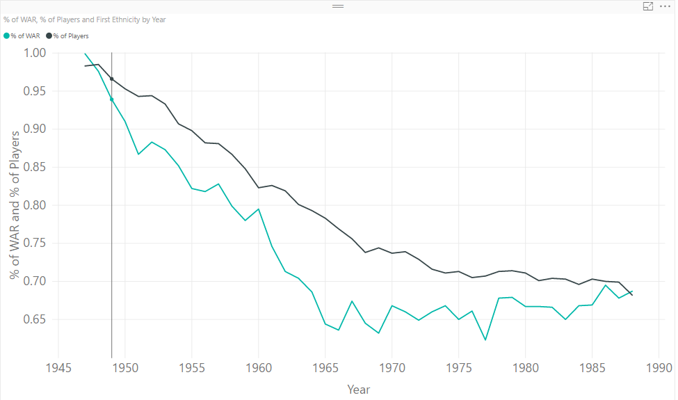
To present your report, you can use line chart which can express relationship between “% of players” and “% of wars” easily like below:
If you want to use aggregation, I recommend you to use DAX formula like countx().
To make aggregation meaningful, one option is calculating count values. For example, we can count how many % of Players values greater than 95% within each Ethnicity group.
If you want to achieve different requirements, could you please provide more details about your requirements?
Best Regards,
Jimmy Tao
- Mark as New
- Bookmark
- Subscribe
- Mute
- Subscribe to RSS Feed
- Permalink
- Report Inappropriate Content
- Mark as New
- Bookmark
- Subscribe
- Mute
- Subscribe to RSS Feed
- Permalink
- Report Inappropriate Content
Hi deepak91g,
To present your report, you can use line chart which can express relationship between “% of players” and “% of wars” easily like below:
If you want to use aggregation, I recommend you to use DAX formula like countx().
To make aggregation meaningful, one option is calculating count values. For example, we can count how many % of Players values greater than 95% within each Ethnicity group.
If you want to achieve different requirements, could you please provide more details about your requirements?
Best Regards,
Jimmy Tao
- Mark as New
- Bookmark
- Subscribe
- Mute
- Subscribe to RSS Feed
- Permalink
- Report Inappropriate Content
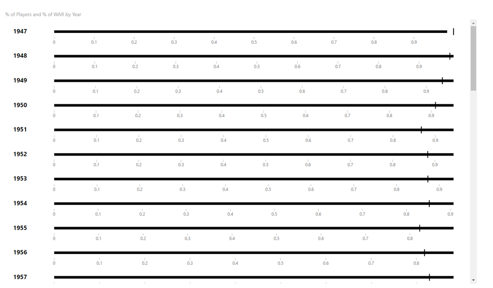
Hi : With the help of bullet chart, i was able to figure out the correct usage of percentage data in my viz . Thanks a lot for your answer, it gave me an idea to get started.
wrote:Hi deepak91g,
To present your report, you can use line chart which can express relationship between “% of players” and “% of wars” easily like below:
If you want to use aggregation, I recommend you to use DAX formula like countx().
To make aggregation meaningful, one option is calculating count values. For example, we can count how many % of Players values greater than 95% within each Ethnicity group.
If you want to achieve different requirements, could you please provide more details about your requirements?
Best Regards,
Jimmy Tao
- Mark as New
- Bookmark
- Subscribe
- Mute
- Subscribe to RSS Feed
- Permalink
- Report Inappropriate Content
Helpful resources

Microsoft Fabric Learn Together
Covering the world! 9:00-10:30 AM Sydney, 4:00-5:30 PM CET (Paris/Berlin), 7:00-8:30 PM Mexico City

Power BI Monthly Update - April 2024
Check out the April 2024 Power BI update to learn about new features.

| User | Count |
|---|---|
| 107 | |
| 97 | |
| 75 | |
| 63 | |
| 53 |
| User | Count |
|---|---|
| 144 | |
| 103 | |
| 98 | |
| 85 | |
| 64 |


