- Power BI forums
- Updates
- News & Announcements
- Get Help with Power BI
- Desktop
- Service
- Report Server
- Power Query
- Mobile Apps
- Developer
- DAX Commands and Tips
- Custom Visuals Development Discussion
- Health and Life Sciences
- Power BI Spanish forums
- Translated Spanish Desktop
- Power Platform Integration - Better Together!
- Power Platform Integrations (Read-only)
- Power Platform and Dynamics 365 Integrations (Read-only)
- Training and Consulting
- Instructor Led Training
- Dashboard in a Day for Women, by Women
- Galleries
- Community Connections & How-To Videos
- COVID-19 Data Stories Gallery
- Themes Gallery
- Data Stories Gallery
- R Script Showcase
- Webinars and Video Gallery
- Quick Measures Gallery
- 2021 MSBizAppsSummit Gallery
- 2020 MSBizAppsSummit Gallery
- 2019 MSBizAppsSummit Gallery
- Events
- Ideas
- Custom Visuals Ideas
- Issues
- Issues
- Events
- Upcoming Events
- Community Blog
- Power BI Community Blog
- Custom Visuals Community Blog
- Community Support
- Community Accounts & Registration
- Using the Community
- Community Feedback
Register now to learn Fabric in free live sessions led by the best Microsoft experts. From Apr 16 to May 9, in English and Spanish.
- Power BI forums
- Forums
- Get Help with Power BI
- Desktop
- Based on User Selection the Previous Data is Displ...
- Subscribe to RSS Feed
- Mark Topic as New
- Mark Topic as Read
- Float this Topic for Current User
- Bookmark
- Subscribe
- Printer Friendly Page
- Mark as New
- Bookmark
- Subscribe
- Mute
- Subscribe to RSS Feed
- Permalink
- Report Inappropriate Content
Based on User Selection the Previous Data is Displayed as Line Chart - From P1 to Px
Hi,
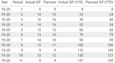
I have the following data:
I am able to filter out by each year and period and the correct YTD figure displays thanks to help from Power BI Superusers. I now want to display a line chart which will display the previous figures depending on the user selection:
However, whenever I select Period 5 for example it only displays Period 5 and doesn't display Periods 1-5 which is what I want it to do. So the data for the line chart should display Period 1 to Period X, and X being the user selection.
Please note that the Year and Period slicers are already related to the Period and YTD tables, that's how I've managed to get the right figures for Period and YTD.
Any help is greatly appreciated.
- Mark as New
- Bookmark
- Subscribe
- Mute
- Subscribe to RSS Feed
- Permalink
- Report Inappropriate Content
Many thanks to Greg_Deckler who has provided the following solution:
SIP Actual Line Chart =
    VAR __Year = MAX('SIP_Activities'[Year])
    VAR __Period = MAX('SIP_Activities'[Period]) + 0
    VAR __LinePeriod = MAX('Periods'[Period]) + 0
    VAR __Table = FILTER(ALL(SIP_Activities),[Year] = __Year && [Period]+0 <= __Period)
    VAR __Table1 = FILTER(__Table,[Period]+0 = __LinePeriod)
RETURN
    SUMX(__Table1,[Actual-LD]) + SUMX(__Table1,[Late Delivery])
If you want to apply it to other tables, columns, etc. then he advised with the following:
The variable names can stay the same, the overall name of the measure needs to be unique
SIP Actual Line Chart =
VAR __Year = MAX('SIP_Activities'[Year])
VAR __Period = MAX('SIP_Activities'[Period]) + 0
VAR __LinePeriod = MAX('Periods'[Period]) + 0
VAR __Table = FILTER(ALL(SIP_Activities),[Year] = __Year && [Period]+0 <= __Period)
VAR __Table1 = FILTER(__Table,[Period]+0 = __LinePeriod)
RETURN
SUMX(__Table1,[Actual-LD]) + SUMX(__Table1,[Late Delivery])
Red is the measure name, has to be unique. Green are table names that you would update. Blue is column names that you would update. You could leave the measure names the same although the names may not make total sense depending on your tables/periods, etc. that you are switching things to.
- Mark as New
- Bookmark
- Subscribe
- Mute
- Subscribe to RSS Feed
- Permalink
- Report Inappropriate Content
Hi @PowerBI-Newbie ,
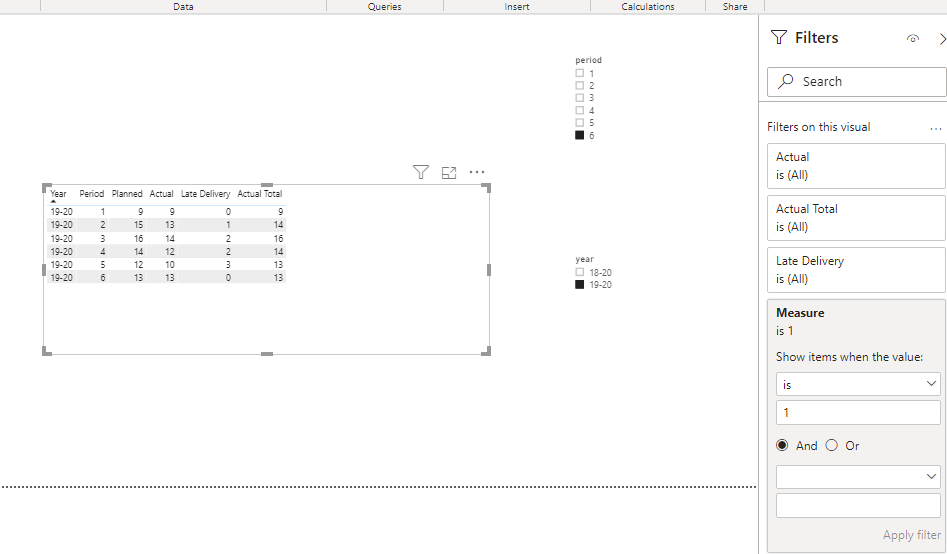
What you need is an unrelated slicer.
Create an unrelated table and use it as slicers.
Table 2 = SELECTCOLUMNS('Table',"year",'Table'[Year],"period",'Table'[Period])Then create a measure to apply to the visual level filter.
Measure = IF(MAX('Table'[Year])=SELECTEDVALUE('Table 2'[year])&&MAX('Table'[Period])<=SELECTEDVALUE('Table 2'[period])&&MAX('Table'[Period])>=1,1)
Best Regards,
Liang
If this post helps, then please consider Accept it as the solution to help the other members find it more quickly.
- Mark as New
- Bookmark
- Subscribe
- Mute
- Subscribe to RSS Feed
- Permalink
- Report Inappropriate Content
Hi @V-lianl-msft , thank you for your reply.
I've already got slicers related to data tables that calculate other figures for me, how would it work if I create the same slicers again, it'll confuse my users. Any advise on this.
Helpful resources

Microsoft Fabric Learn Together
Covering the world! 9:00-10:30 AM Sydney, 4:00-5:30 PM CET (Paris/Berlin), 7:00-8:30 PM Mexico City

Power BI Monthly Update - April 2024
Check out the April 2024 Power BI update to learn about new features.

| User | Count |
|---|---|
| 114 | |
| 99 | |
| 83 | |
| 70 | |
| 61 |
| User | Count |
|---|---|
| 149 | |
| 114 | |
| 107 | |
| 89 | |
| 67 |


