- Power BI forums
- Updates
- News & Announcements
- Get Help with Power BI
- Desktop
- Service
- Report Server
- Power Query
- Mobile Apps
- Developer
- DAX Commands and Tips
- Custom Visuals Development Discussion
- Health and Life Sciences
- Power BI Spanish forums
- Translated Spanish Desktop
- Power Platform Integration - Better Together!
- Power Platform Integrations (Read-only)
- Power Platform and Dynamics 365 Integrations (Read-only)
- Training and Consulting
- Instructor Led Training
- Dashboard in a Day for Women, by Women
- Galleries
- Community Connections & How-To Videos
- COVID-19 Data Stories Gallery
- Themes Gallery
- Data Stories Gallery
- R Script Showcase
- Webinars and Video Gallery
- Quick Measures Gallery
- 2021 MSBizAppsSummit Gallery
- 2020 MSBizAppsSummit Gallery
- 2019 MSBizAppsSummit Gallery
- Events
- Ideas
- Custom Visuals Ideas
- Issues
- Issues
- Events
- Upcoming Events
- Community Blog
- Power BI Community Blog
- Custom Visuals Community Blog
- Community Support
- Community Accounts & Registration
- Using the Community
- Community Feedback
Register now to learn Fabric in free live sessions led by the best Microsoft experts. From Apr 16 to May 9, in English and Spanish.
- Power BI forums
- Forums
- Get Help with Power BI
- Desktop
- Re: Bars&line chart without displaying the line (b...
- Subscribe to RSS Feed
- Mark Topic as New
- Mark Topic as Read
- Float this Topic for Current User
- Bookmark
- Subscribe
- Printer Friendly Page
- Mark as New
- Bookmark
- Subscribe
- Mute
- Subscribe to RSS Feed
- Permalink
- Report Inappropriate Content
Bars&line chart without displaying the line (but still need the data labels)
Dear fellows,
I am working with a bars&line chart but I would need to NOT show the line itself - since it gives the impression of a trend, which is not my case.
I would like to keep the related data labels though, and have them showing up next to each of the bars (they represent a % growth of each of the bars which exress an absolute growth).
In an excel chart, I would just use the 'no line' option in the format options to achieve this.
Is it possible to do the same here, with this or maybe another visual?
It looks like no to me, but would be glad to hear otherwise.
Thank you!
Solved! Go to Solution.
- Mark as New
- Bookmark
- Subscribe
- Mute
- Subscribe to RSS Feed
- Permalink
- Report Inappropriate Content
The only solution to position the labels would be change chart type, whether that helps you will depend on your needs on visual design of the chart.
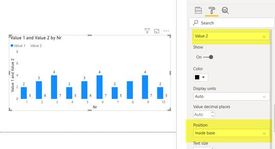
If you create a clustered bar chart, with the data you used on the line previously, set as second bar series, you can:
- Set the color of that second bar to the color of the background (Data colors -> 2nd value)
- Set the data labels voor the second bar to the right position, with the right color (Data labels -> Customize series -> Value 2 -> Postion: = inside base.
- You may want to hide the legend to prevent confusion about the missing line
This would give something like this:
Hope that helps!
- Mark as New
- Bookmark
- Subscribe
- Mute
- Subscribe to RSS Feed
- Permalink
- Report Inappropriate Content
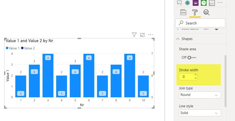
It is kind of a cheat, but if I understand your question correctly, then yes it is possible.
Just make sure to set the line width (stroke) to 0 in the shapes section when you have the bar/line chart selected! That way you will still see the labels visible
- Mark as New
- Bookmark
- Subscribe
- Mute
- Subscribe to RSS Feed
- Permalink
- Report Inappropriate Content
Thanks,
that helps indeed !![]()
The only thing is that it's not possible to move data labels around - they still follow the 'pattern' of the (now invisible) line, therefore can be confusing. But I think this is as closest as I would get to what I need...
Thanks
- Mark as New
- Bookmark
- Subscribe
- Mute
- Subscribe to RSS Feed
- Permalink
- Report Inappropriate Content
The only solution to position the labels would be change chart type, whether that helps you will depend on your needs on visual design of the chart.
If you create a clustered bar chart, with the data you used on the line previously, set as second bar series, you can:
- Set the color of that second bar to the color of the background (Data colors -> 2nd value)
- Set the data labels voor the second bar to the right position, with the right color (Data labels -> Customize series -> Value 2 -> Postion: = inside base.
- You may want to hide the legend to prevent confusion about the missing line
This would give something like this:
Hope that helps!
- Mark as New
- Bookmark
- Subscribe
- Mute
- Subscribe to RSS Feed
- Permalink
- Report Inappropriate Content
Hello, Is it possible to show several barcharts in a single powerbi custom visual?
I've a requirement that must show several bar graphs in the same visual custom, they are metrics connected to each other.
For example:
Chart A --> Chart B
|
Chart D --> Chart E --> Chart Z
Please let me know your comments. Thank You.
Helpful resources

Microsoft Fabric Learn Together
Covering the world! 9:00-10:30 AM Sydney, 4:00-5:30 PM CET (Paris/Berlin), 7:00-8:30 PM Mexico City

Power BI Monthly Update - April 2024
Check out the April 2024 Power BI update to learn about new features.

| User | Count |
|---|---|
| 111 | |
| 97 | |
| 80 | |
| 69 | |
| 59 |
| User | Count |
|---|---|
| 150 | |
| 119 | |
| 104 | |
| 87 | |
| 67 |


