- Power BI forums
- Updates
- News & Announcements
- Get Help with Power BI
- Desktop
- Service
- Report Server
- Power Query
- Mobile Apps
- Developer
- DAX Commands and Tips
- Custom Visuals Development Discussion
- Health and Life Sciences
- Power BI Spanish forums
- Translated Spanish Desktop
- Power Platform Integration - Better Together!
- Power Platform Integrations (Read-only)
- Power Platform and Dynamics 365 Integrations (Read-only)
- Training and Consulting
- Instructor Led Training
- Dashboard in a Day for Women, by Women
- Galleries
- Community Connections & How-To Videos
- COVID-19 Data Stories Gallery
- Themes Gallery
- Data Stories Gallery
- R Script Showcase
- Webinars and Video Gallery
- Quick Measures Gallery
- 2021 MSBizAppsSummit Gallery
- 2020 MSBizAppsSummit Gallery
- 2019 MSBizAppsSummit Gallery
- Events
- Ideas
- Custom Visuals Ideas
- Issues
- Issues
- Events
- Upcoming Events
- Community Blog
- Power BI Community Blog
- Custom Visuals Community Blog
- Community Support
- Community Accounts & Registration
- Using the Community
- Community Feedback
Register now to learn Fabric in free live sessions led by the best Microsoft experts. From Apr 16 to May 9, in English and Spanish.
- Power BI forums
- Forums
- Get Help with Power BI
- Desktop
- Bar chart with true/false ratio
- Subscribe to RSS Feed
- Mark Topic as New
- Mark Topic as Read
- Float this Topic for Current User
- Bookmark
- Subscribe
- Printer Friendly Page
- Mark as New
- Bookmark
- Subscribe
- Mute
- Subscribe to RSS Feed
- Permalink
- Report Inappropriate Content
Bar chart with true/false ratio
Hi
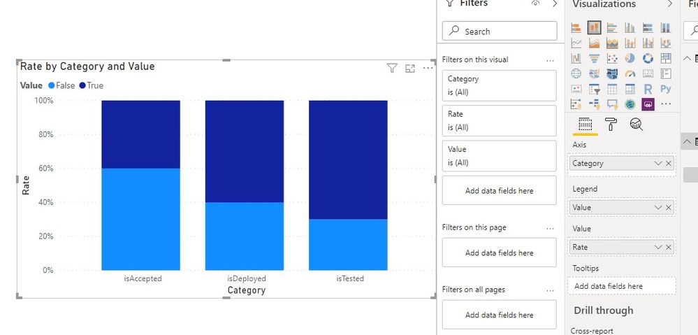
I have a table with three true/false columns, let’s call them isTested, isDeployed and isAccepted. From these columns I need to create a bar chart that shows each of these columns in two colors representing the true/false ratio. This proves to be a much more challenging than I expected, and any help would be greatly appreciated!
Thank you
Stefaan
- Mark as New
- Bookmark
- Subscribe
- Mute
- Subscribe to RSS Feed
- Permalink
- Report Inappropriate Content
Hi @Stefaan-4365 ,
How about the result after you follow the suggestions mentioned in my original post?Could you please provide more details about it If it doesn't meet your requirement?
Best regards,
If this post helps, then please consider Accept it as the solution to help the other members find it more quickly.
- Mark as New
- Bookmark
- Subscribe
- Mute
- Subscribe to RSS Feed
- Permalink
- Report Inappropriate Content
Hi @Stefaan-4365 ,
We can try to create a calculated table and a measure to meet your requirement:
calculated table:
Table 2 =
CROSSJOIN (
    DATATABLE (
        "Category", STRING,
        {
            { "isTested" },
            { "isDeployed" },
            { "isAccepted" }
        }
    ),
    { TRUE (), FALSE () }
)
measure:
Rate =
DIVIDE (
    SWITCH (
        SELECTEDVALUE ( 'Table 2'[Category], BLANK () ),
        "isTested", CALCULATE (
            COUNTROWS ( 'Table' ),
            'Table'[isTested] IN DISTINCT ( 'Table 2'[Value] )
        ),
        "isDeployed", CALCULATE (
            COUNTROWS ( 'Table' ),
            'Table'[isDeployed] IN DISTINCT ( 'Table 2'[Value] )
        ),
        "isAccepted", CALCULATE (
            COUNTROWS ( 'Table' ),
            'Table'[isAccepted] IN DISTINCT ( 'Table 2'[Value] )
        ),
        COUNTROWS ( 'Table' )
    ),
    COUNTROWS ( 'Table' ),
    0
)
If it doesn't meet your requirement, Could you please show the exact expected result based on the tables that we have shared?
By the way, PBIX file as attached.
Best regards,
If this post helps, then please consider Accept it as the solution to help the other members find it more quickly.
- Mark as New
- Bookmark
- Subscribe
- Mute
- Subscribe to RSS Feed
- Permalink
- Report Inappropriate Content
@Stefaan-4365 , Create a common dimension with the values true and false. Join them with all three columns. One will active and two will be inactive. Use userelation to make others active
How to use userelation : https://community.powerbi.com/t5/Community-Blog/HR-Analytics-Active-Employee-Hire-and-Termination-tr...
Create a color column like this
Color Date = if(FIRSTNONBLANK(Table[Value],"true") ="true","green","red")
In coditnal fomatting use it after choosing the "Field"
refer
https://docs.microsoft.com/en-us/power-bi/desktop-conditional-table-formatting#color-by-color-values
Microsoft Power BI Learning Resources, 2023 !!
Learn Power BI - Full Course with Dec-2022, with Window, Index, Offset, 100+ Topics !!
Did I answer your question? Mark my post as a solution! Appreciate your Kudos !! Proud to be a Super User! !!
Helpful resources

Microsoft Fabric Learn Together
Covering the world! 9:00-10:30 AM Sydney, 4:00-5:30 PM CET (Paris/Berlin), 7:00-8:30 PM Mexico City

Power BI Monthly Update - April 2024
Check out the April 2024 Power BI update to learn about new features.

| User | Count |
|---|---|
| 111 | |
| 95 | |
| 80 | |
| 68 | |
| 59 |
| User | Count |
|---|---|
| 150 | |
| 119 | |
| 104 | |
| 87 | |
| 67 |

