- Power BI forums
- Updates
- News & Announcements
- Get Help with Power BI
- Desktop
- Service
- Report Server
- Power Query
- Mobile Apps
- Developer
- DAX Commands and Tips
- Custom Visuals Development Discussion
- Health and Life Sciences
- Power BI Spanish forums
- Translated Spanish Desktop
- Power Platform Integration - Better Together!
- Power Platform Integrations (Read-only)
- Power Platform and Dynamics 365 Integrations (Read-only)
- Training and Consulting
- Instructor Led Training
- Dashboard in a Day for Women, by Women
- Galleries
- Community Connections & How-To Videos
- COVID-19 Data Stories Gallery
- Themes Gallery
- Data Stories Gallery
- R Script Showcase
- Webinars and Video Gallery
- Quick Measures Gallery
- 2021 MSBizAppsSummit Gallery
- 2020 MSBizAppsSummit Gallery
- 2019 MSBizAppsSummit Gallery
- Events
- Ideas
- Custom Visuals Ideas
- Issues
- Issues
- Events
- Upcoming Events
- Community Blog
- Power BI Community Blog
- Custom Visuals Community Blog
- Community Support
- Community Accounts & Registration
- Using the Community
- Community Feedback
Register now to learn Fabric in free live sessions led by the best Microsoft experts. From Apr 16 to May 9, in English and Spanish.
- Power BI forums
- Forums
- Get Help with Power BI
- Desktop
- Re: Bar chart scroll till the end
- Subscribe to RSS Feed
- Mark Topic as New
- Mark Topic as Read
- Float this Topic for Current User
- Bookmark
- Subscribe
- Printer Friendly Page
- Mark as New
- Bookmark
- Subscribe
- Mute
- Subscribe to RSS Feed
- Permalink
- Report Inappropriate Content
Bar chart scroll till the end
Hello,
it sounds like a simple thing, but I really didn't find anything about it.
Is it possible that a bar chart by default always starts at the end of the date dimension and not the beginning?
Its a little bit annoying for the user to always need to scroll until the end to see whats up today. Using a "fixed" filter on the filter panel on the otherhand will automatically filter everything out which still needs to be seen.
Thank you in advance.
Best.
Solved! Go to Solution.
- Mark as New
- Bookmark
- Subscribe
- Mute
- Subscribe to RSS Feed
- Permalink
- Report Inappropriate Content
Hi, @Applicable88
Sorry, PowerBI currently does not support setting the default scroll position.
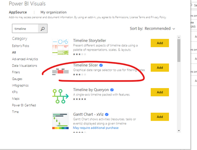
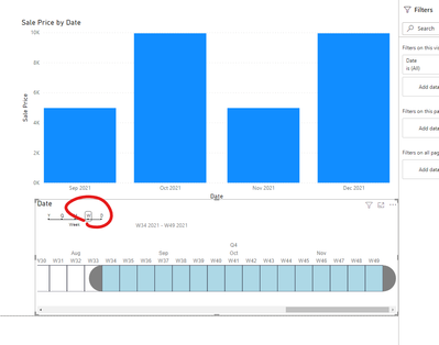
If the time range covered on the x-axis is very long, you can consider adding a slicer for manual filtering. The custom visual "Timeline 2.4.0" would be a good choice.You can filter data for a period of time through this slicer (based on year/month/week/day)
Best Regards,
Community Support Team _ Eason
If this post helps, then please consider Accept it as the solution to help the other members find it more quickly.
- Mark as New
- Bookmark
- Subscribe
- Mute
- Subscribe to RSS Feed
- Permalink
- Report Inappropriate Content
You can sort the bar chart in descending order. For more details - https://docs.microsoft.com/en-us/power-bi/consumer/end-user-change-sort
- Mark as New
- Bookmark
- Subscribe
- Mute
- Subscribe to RSS Feed
- Permalink
- Report Inappropriate Content
@SivaMani , thats very unfortunate to solve it like that. For othere dimension it might be okay, but for Date dimensions its an unsual view.
- Mark as New
- Bookmark
- Subscribe
- Mute
- Subscribe to RSS Feed
- Permalink
- Report Inappropriate Content
@Applicable88, Okay. Can you share your current visual and how you wanted to change it?
- Mark as New
- Bookmark
- Subscribe
- Mute
- Subscribe to RSS Feed
- Permalink
- Report Inappropriate Content
Hello @SivaMani thanks for your effort.
Here an example of data that reach back to 2017/2018:
Year and calendar week you can see here. And at the bottom you can see scrolled to the end until todays european calendarweek of 2021/25.
When the user is opening the chart/report it always starts at the very beginning. The only thing I could do so far is to limit it with the fixed "filter panel" where I limit the length of data using relativ time of "last 6 months":
For instance when the user wants to see older than last 6 month its not possible anymore. So I would prefer to have all time range in there, but the chart starts at the newest dat on the right side. Using a workaround to make the order descending from left is really unsual for the eyes, since no report in the cooperate business would do so, with time dimension.
Best.
- Mark as New
- Bookmark
- Subscribe
- Mute
- Subscribe to RSS Feed
- Permalink
- Report Inappropriate Content
Hi, @Applicable88
Sorry, PowerBI currently does not support setting the default scroll position.
If the time range covered on the x-axis is very long, you can consider adding a slicer for manual filtering. The custom visual "Timeline 2.4.0" would be a good choice.You can filter data for a period of time through this slicer (based on year/month/week/day)
Best Regards,
Community Support Team _ Eason
If this post helps, then please consider Accept it as the solution to help the other members find it more quickly.
Helpful resources

Microsoft Fabric Learn Together
Covering the world! 9:00-10:30 AM Sydney, 4:00-5:30 PM CET (Paris/Berlin), 7:00-8:30 PM Mexico City

Power BI Monthly Update - April 2024
Check out the April 2024 Power BI update to learn about new features.

| User | Count |
|---|---|
| 111 | |
| 95 | |
| 80 | |
| 68 | |
| 59 |
| User | Count |
|---|---|
| 150 | |
| 119 | |
| 104 | |
| 87 | |
| 67 |


