- Power BI forums
- Updates
- News & Announcements
- Get Help with Power BI
- Desktop
- Service
- Report Server
- Power Query
- Mobile Apps
- Developer
- DAX Commands and Tips
- Custom Visuals Development Discussion
- Health and Life Sciences
- Power BI Spanish forums
- Translated Spanish Desktop
- Power Platform Integration - Better Together!
- Power Platform Integrations (Read-only)
- Power Platform and Dynamics 365 Integrations (Read-only)
- Training and Consulting
- Instructor Led Training
- Dashboard in a Day for Women, by Women
- Galleries
- Community Connections & How-To Videos
- COVID-19 Data Stories Gallery
- Themes Gallery
- Data Stories Gallery
- R Script Showcase
- Webinars and Video Gallery
- Quick Measures Gallery
- 2021 MSBizAppsSummit Gallery
- 2020 MSBizAppsSummit Gallery
- 2019 MSBizAppsSummit Gallery
- Events
- Ideas
- Custom Visuals Ideas
- Issues
- Issues
- Events
- Upcoming Events
- Community Blog
- Power BI Community Blog
- Custom Visuals Community Blog
- Community Support
- Community Accounts & Registration
- Using the Community
- Community Feedback
Register now to learn Fabric in free live sessions led by the best Microsoft experts. From Apr 16 to May 9, in English and Spanish.
- Power BI forums
- Forums
- Get Help with Power BI
- Desktop
- Re: Bar chart challenge - set color for bars based...
- Subscribe to RSS Feed
- Mark Topic as New
- Mark Topic as Read
- Float this Topic for Current User
- Bookmark
- Subscribe
- Printer Friendly Page
- Mark as New
- Bookmark
- Subscribe
- Mute
- Subscribe to RSS Feed
- Permalink
- Report Inappropriate Content
Bar chart challenge - set color for bars based on sum of the bars
Hi,
I have an interesting problem that I could not find an easy way to accomplish and I wonder if there is an easy (or a complex) way to acheive it.
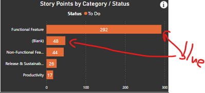
Let's assume that I have the below simple bar chart.
I would like to color the bars that sums up to a value with one color while the rest will have another color.
For example, assuming that my target value is 350, I would like to color the first 2 bars in blue as they sum together to 340 and the rest will be in orange. If the target value will be 400, then I will color in blue the 3rd bar as well.
If you know of a way to achieve that it will be great.
Many thanks,
Yaron
Solved! Go to Solution.
- Mark as New
- Bookmark
- Subscribe
- Mute
- Subscribe to RSS Feed
- Permalink
- Report Inappropriate Content
@yaronklein Thanks for the explanation.
Here is the solution. Hope this meets your requirement.
Running Total New = IF([Points Total] > 0,

CALCULATE (
   SUM ( Issues[Points] ),
   FILTER (
       ALLSELECTED ( EpicMaster ),
       ISONORAFTER ( EpicMaster[Rank], MAX ( EpicMaster[Rank] ), DESC )
 )
),
BLANK())
Color Code =
VAR rt = Issues[Running Total New]
VAR threshold = 100
Return
   IF(rt <= threshold, "Blue", "Red")

** If you liked my solution, please give it a thumbs up. And if I did answer your question, please mark this post as a solution, so that it comes in top of the search and help others. Thank you ! Good Luck 👍 |
- Mark as New
- Bookmark
- Subscribe
- Mute
- Subscribe to RSS Feed
- Permalink
- Report Inappropriate Content
Thank you very much ghoshabhijeet, your help is much appriciated!
This seems promising, however i cannot make it work. I tried to use your exact sample ,so I created the exact table and copied the DAX code however I have many issues that I cannot solve.
I assume that when you wrote 'DataTable'[Total Val]' you meant ''DataTable'[Val]'.
On top of that I don't get some of the fields in the various context, for example:
Will it be too much to ask you create a sample report and attach it.
Thanks again,
Yaron
- Mark as New
- Bookmark
- Subscribe
- Mute
- Subscribe to RSS Feed
- Permalink
- Report Inappropriate Content
@yaronklein Please find the google drive link for my solution pbix file.
https://drive.google.com/file/d/1RU0Dix5q3Rf7ZIxaOLlJoStxrAp6vFsn/view?usp=sharing
** If you liked my solution, please give it a thumbs up. And if I did answer your question, please mark this post as a solution, so that it comes in top of the search and help others. Thank you ! Good Luck 👍 |
- Mark as New
- Bookmark
- Subscribe
- Mute
- Subscribe to RSS Feed
- Permalink
- Report Inappropriate Content
Thanks ghoshabhijeet.
I looked carefully into your example and it works 😊. Unfortunately, it is still not working in my use case and I am not sure why. Still trying to figure it out.
Regardless, I have few follow-up questions if you will be able to help me with.
- Can you explain why you need the ‘Total VAL’?
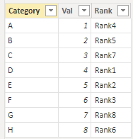
- In my case I have another column ‘Rank’ which define the order of the categories. Rank is a string field and it using to sort alphabetically. I added such a field for your example, but it seems that I don’t have access to it from the RANKX function.
- I always have filters on that affect the list of categories.
If I am filtering out categories in your example, the bars are not being affected. For example if I filter out categories G and H, I see still only F in blue while I expect to see everything in blue.
I assume that this is because you use ALL in various places in the measure.
I tried to remove the ALL or to use KEEPFILTERS instead, but then the measure has errors or the computation is wrong.
Do you know how to make it work with filters?
I hope that figuring this things will help me sort this in my report.
I cannot thank you enough for your help.
Thanks,
Yaron
- Mark as New
- Bookmark
- Subscribe
- Mute
- Subscribe to RSS Feed
- Permalink
- Report Inappropriate Content
@yaronklein If possible, please share your pbix file. Will try to fix the issue in your file. Hope this helps!
- Mark as New
- Bookmark
- Subscribe
- Mute
- Subscribe to RSS Feed
- Permalink
- Report Inappropriate Content
Hi again,
You will find a simplified version of the report in the following link.
https://drive.google.com/file/d/1R5jr_9EJMlB4UdYyXPLDnvxac7XVuC40/view?usp=sharing
Thanks!
- Mark as New
- Bookmark
- Subscribe
- Mute
- Subscribe to RSS Feed
- Permalink
- Report Inappropriate Content
@yaronklein Thanks for sharing the PBIX file. Here is the updated file with the solution.
Link : https://drive.google.com/file/d/1hQIk6t_oBYtNJGUw4WZqX1Dy_FJiu_-B/view?usp=sharing
** If you liked my solution, please give it a thumbs up. And if I did answer your question, please mark this post as a solution, so that it comes in top of the search and help others. Thank you ! Good Luck 👍 |
- Mark as New
- Bookmark
- Subscribe
- Mute
- Subscribe to RSS Feed
- Permalink
- Report Inappropriate Content
@yaronklein Did the solution worked for you ?
** If you liked my solution, please give it a thumbs up. And if I did answer your question, please mark this post as a solution, so that it comes in top of the search and help others. Thank you ! Good Luck 👍 |
- Mark as New
- Bookmark
- Subscribe
- Mute
- Subscribe to RSS Feed
- Permalink
- Report Inappropriate Content
Hi,
Sorry it took me some time.
It still doesn’t work as expected ☹
I’m still trying to work with your example to solve the following problems:
- It seems that the code colors all the epics (i.e. bars) if the sum points all of them together is below or above threshold.
For example, when you select only WMS, you will see the bars as red as the sum of them is below 100 – this is good.
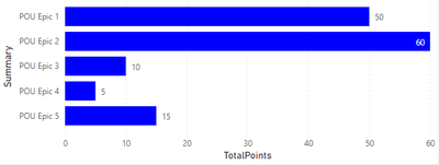
However, when you select only POU, all the bars will be colored in blue as the sum of all of them is above 100, while I need to color only up to the threshold of 100.
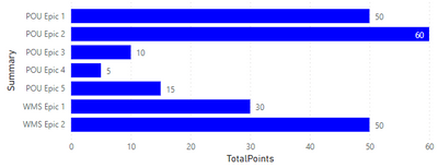
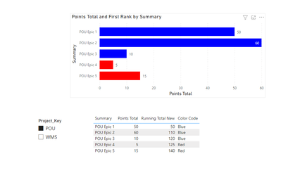
This means that in the below bar, assuming that the epic order is correct (see bullet 2 below) and the threshold is 100, it should color only epic 1 as epic 1 + 2 is 110 points.
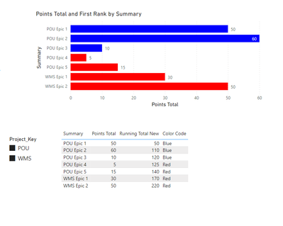
The same will happen if I chose all projects (both WMS and POU): - The rank is very important as it define the order in which the total sum should be summed, however it doesn’t seem to be taken into account.
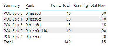
The below table is sorted by the rank and by the order the epics should be summed, which means that if the threshold is 100, epic 3 + 1+ 5 should be colored in red (their combine values is below 100) and the rest should be in in blue.
The running total seems to be based on the name.
Thank you again VERY MUCH for your help.
I see that this is a tough problem to solve...
Yaron
- Mark as New
- Bookmark
- Subscribe
- Mute
- Subscribe to RSS Feed
- Permalink
- Report Inappropriate Content
@yaronklein Thanks for your reply. I am afraid, you didn't mentioned earlier about the order of summation as mentioned in Point 2.
Also, the summation is based on Key and not on names. Will see if I can work on the problem with newly given conditions. Will let you know if I come across any solution. Thanks !
- Mark as New
- Bookmark
- Subscribe
- Mute
- Subscribe to RSS Feed
- Permalink
- Report Inappropriate Content
ghoshabhijeet I applogize if I was not clear enough.
I am also continue to find a solution based on your inputs.
For the 10th time...thank you for the work that you already put in this challanging problem.
- Mark as New
- Bookmark
- Subscribe
- Mute
- Subscribe to RSS Feed
- Permalink
- Report Inappropriate Content
@yaronklein No issues. Thanks for sharing this interesting problem. 😊 Will keep trying to find a solution to this. Thanks !
- Mark as New
- Bookmark
- Subscribe
- Mute
- Subscribe to RSS Feed
- Permalink
- Report Inappropriate Content
@yaronklein I believe you need to have two threshold (Min & Max), else it would be difficuilt to determine the Min and Max value the color should be blue.
For example: If the top 3 bars accumulated total is 120 (1st - 60, 2nd - 50, 3rd - 10) and your threshold is 100. In this case it won't be possible to determine till which data value it should sum.
So, if you have a Min and Max threshold, it will be easier for you to write DAX to determine the total values and color them accordingly.
Thoughts ?
- Mark as New
- Bookmark
- Subscribe
- Mute
- Subscribe to RSS Feed
- Permalink
- Report Inappropriate Content
Thank ghoshabhijeet,
I don't think it really matters as there is a need only for one threshold (in your exmaple it will be 100), the min can be 0 and the max can be a very big number.
So, 0 to 100 it will be blue and 100 to 1000 will be red.
Or as an example:
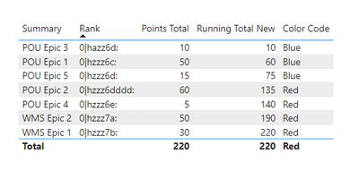
Epic 3 - 60, Rank 1 - sum 60 < 100 -> blue
Epic 1 - 50, Rank 2 - sum 110 > 100 -> red
Epic 2 - 10, Rank 3 - sum 120 > 100 -> red
- Mark as New
- Bookmark
- Subscribe
- Mute
- Subscribe to RSS Feed
- Permalink
- Report Inappropriate Content
- Mark as New
- Bookmark
- Subscribe
- Mute
- Subscribe to RSS Feed
- Permalink
- Report Inappropriate Content
Hi ghoshabhijeet,
Did you have a chance to look at this after my last message (message 18)?
Thanks,
Yaron
- Mark as New
- Bookmark
- Subscribe
- Mute
- Subscribe to RSS Feed
- Permalink
- Report Inappropriate Content
ghoshabhijeet
So we are almost there...
I changed few things and now everyhting works well, but the sort is by the key and not by the rank. Here is what I changed:
- In measure Running Total New, I changed the ASC to DESC
ISONORAFTER ( Issues[Key], MAX ( Issues[Key] ), DESC ) - In measure Color code I changed:VAR rt = MAXX(ALLSELECTED(Issues),[Running Total New])
To:
VAR rt = Issues[Running Total New]
I cannot figure out how to sort by the rank and not the key.
I tried to play with the function ISONORAFTER ( Issues[Key], MAX ( Issues[Key] ), DESC ), but if I change anyhting to the Rank field it keeps giving me the total of everything.
I didn't figure out exactly how the ISONORAFTER function works and if the solution is indeed in it. Any thoughts?
Thanks,
Yaron
- Mark as New
- Bookmark
- Subscribe
- Mute
- Subscribe to RSS Feed
- Permalink
- Report Inappropriate Content
@yaronklein Sorry, for late reply.
Sorting by Rank column in the dataset would not be of any help because there are missing values for Rank and missing Point column data for the available rank. Whereas the Key column in Issues table has unique set of data for individual row.
So, I was trying make use of Running Total value to rank the values to use in the chart and table. I am still trying to get the desired result from this problem. Will let you know if I could achieve something.
- Mark as New
- Bookmark
- Subscribe
- Mute
- Subscribe to RSS Feed
- Permalink
- Report Inappropriate Content
@yaronklein I believe this solution should work for your requirement.
1. Create a measure for points summation:
Points Total = SUM(Issues[Points])
2. Create a measure for Running Total:
Running Total New =
IF (
    [Points Total] > 0,
    CALCULATE (
              [Points Total],
              FILTER (
                  ALLSELECTED ( Issues ),
                  ISONORAFTER ( Issues[Key], MAX ( Issues[Key] ), DESC )
              )
           ),
BLANK ()
)
3. Create a measure for coloring the bars of the chart basis your defined threshold and use it for conditional formatting:
Color Code =
VAR rt = [Running Total New]
VAR threshold = 120
RETURN
    IF ( rt <= threshold, "Blue", "Red" )
Output 1:
Output 2:
** If you liked my solution, please give it a thumbs up. And if I did answer your question, please mark this post as a solution, so that it comes in top of the search and help others. Thank you ! Good Luck 👍 |
- Mark as New
- Bookmark
- Subscribe
- Mute
- Subscribe to RSS Feed
- Permalink
- Report Inappropriate Content
Hi ghoshabhijeet,
This works well with the epic order, but not with the epic rank order.
The epic name of key has no specific order between them.
The rank of the issues don't really important, only the rank of the epics is important and then the sum of the points in each epic.
I uploaded the latest report with your suggestions here:
https://drive.google.com/file/d/16tLYWR1kHdG4CtTqBuTlYcyDIYkCpAHr/view?usp=sharing
I used measure'Running Total New 2' as to keep what we already have there before.
I tired to change the line in measure'Running Total New 2' from:
If we can figure out the rank then it is mission accomplished.
Sorry for the back and forth...
Yaron
- Mark as New
- Bookmark
- Subscribe
- Mute
- Subscribe to RSS Feed
- Permalink
- Report Inappropriate Content
@yaronklein Can you please provide you expected result (in graph and in table format) with the data available in your shared file. The requirement is still not clear for me since the order of summation is critical for you. Thanks !
Helpful resources

Microsoft Fabric Learn Together
Covering the world! 9:00-10:30 AM Sydney, 4:00-5:30 PM CET (Paris/Berlin), 7:00-8:30 PM Mexico City

Power BI Monthly Update - April 2024
Check out the April 2024 Power BI update to learn about new features.

| User | Count |
|---|---|
| 112 | |
| 97 | |
| 84 | |
| 67 | |
| 59 |
| User | Count |
|---|---|
| 150 | |
| 120 | |
| 99 | |
| 87 | |
| 68 |
