- Power BI forums
- Updates
- News & Announcements
- Get Help with Power BI
- Desktop
- Service
- Report Server
- Power Query
- Mobile Apps
- Developer
- DAX Commands and Tips
- Custom Visuals Development Discussion
- Health and Life Sciences
- Power BI Spanish forums
- Translated Spanish Desktop
- Power Platform Integration - Better Together!
- Power Platform Integrations (Read-only)
- Power Platform and Dynamics 365 Integrations (Read-only)
- Training and Consulting
- Instructor Led Training
- Dashboard in a Day for Women, by Women
- Galleries
- Community Connections & How-To Videos
- COVID-19 Data Stories Gallery
- Themes Gallery
- Data Stories Gallery
- R Script Showcase
- Webinars and Video Gallery
- Quick Measures Gallery
- 2021 MSBizAppsSummit Gallery
- 2020 MSBizAppsSummit Gallery
- 2019 MSBizAppsSummit Gallery
- Events
- Ideas
- Custom Visuals Ideas
- Issues
- Issues
- Events
- Upcoming Events
- Community Blog
- Power BI Community Blog
- Custom Visuals Community Blog
- Community Support
- Community Accounts & Registration
- Using the Community
- Community Feedback
Register now to learn Fabric in free live sessions led by the best Microsoft experts. From Apr 16 to May 9, in English and Spanish.
- Power BI forums
- Forums
- Get Help with Power BI
- Desktop
- Re: Bar chart / Stacked bar chart / pie chart colo...
- Subscribe to RSS Feed
- Mark Topic as New
- Mark Topic as Read
- Float this Topic for Current User
- Bookmark
- Subscribe
- Printer Friendly Page
- Mark as New
- Bookmark
- Subscribe
- Mute
- Subscribe to RSS Feed
- Permalink
- Report Inappropriate Content
Bar chart / Stacked bar chart / pie chart color based on database field?
Hi all,
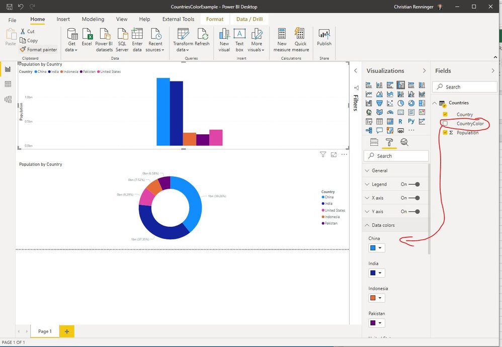
I would like to control the bar and pie chart colors based on a attribute in my dimension tables.
I created "color" field in the dimension for my categories and now I want to use the color value from the database to be used in my chart.
I've looked at the condition formating but it's not allowing me to achieve what I am trying to.
in the "Data colors" I want to provide the color for each category from a field in the database.
I have many report and many charts in the reports using the same categories and I want to control the colors for each category across all reports/pages/graphs.
Any advice on how to achieve this would be great. Maybe I am missing something obvious here.
thank you!
Solved! Go to Solution.
- Mark as New
- Bookmark
- Subscribe
- Mute
- Subscribe to RSS Feed
- Permalink
- Report Inappropriate Content
Hi @crenninger
I have a test and I found the result like yours:
We can't use fx in stack visual if we add legend , and we can't use fx in donut and pie visual.
You may vote up an idea for this function: Condition formatting for measure
Best Regards,
Rico Zhou
If this post helps, then please consider Accept it as the solution to help the other members find it more quickly.
- Mark as New
- Bookmark
- Subscribe
- Mute
- Subscribe to RSS Feed
- Permalink
- Report Inappropriate Content
Hi @crenninger
Could you tell me if your problem has been solved? If it is, kindly Accept it as the solution. More people will benefit from it. And please vote up the function you want in Idea.
Best Regards,
Rico Zhou
- Mark as New
- Bookmark
- Subscribe
- Mute
- Subscribe to RSS Feed
- Permalink
- Report Inappropriate Content
Hello
You tried conditional formatting and relied on the number column as such evaluate it and select the color?.
I share the following links:
https://docs.microsoft.com/en-us/power-bi/create-reports/desktop-conditional-table-formatting
Ss
- Mark as New
- Bookmark
- Subscribe
- Mute
- Subscribe to RSS Feed
- Permalink
- Report Inappropriate Content
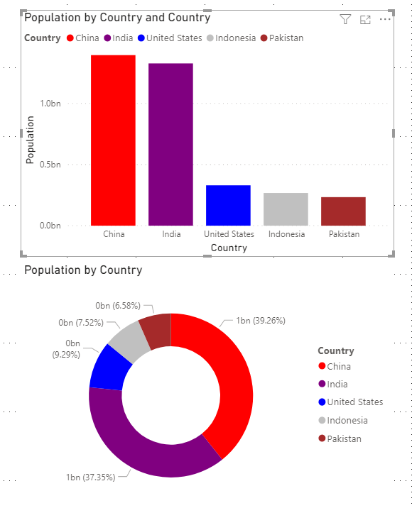
This is not exactly what I am trying to do, remember I am looking for Bar char, Stacked Bar chart and Pie chart.
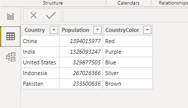
Based on a simple table in PBI see screen shot on what I am trying to do.
I can't find how to attach a PBIx file to this post unfortunately
Here is the table
I hope this helps explain.
- Mark as New
- Bookmark
- Subscribe
- Mute
- Subscribe to RSS Feed
- Permalink
- Report Inappropriate Content
Anyone had an idea or is this just not possible?
- Mark as New
- Bookmark
- Subscribe
- Mute
- Subscribe to RSS Feed
- Permalink
- Report Inappropriate Content
Hi @crenninger
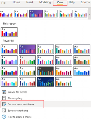
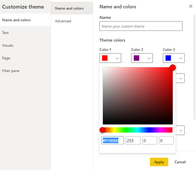
You can try customize theme, and change the color code in Themes colors.
Result is as below.
You can download the pbix file from this link: Bar chart / Stacked bar chart / pie chart color based on field
Best Regards,
Rico Zhou
If this post helps, then please consider Accept it as the solution to help the other members find it more quickly.
- Mark as New
- Bookmark
- Subscribe
- Mute
- Subscribe to RSS Feed
- Permalink
- Report Inappropriate Content
thanks for the insights but this doesn't help driving the colors from the database as far as I can see.
It's only picking the colors by the "indexed" value which unforntunately can change depending on the filters selected.
I made some progress using conditional formating but that only works when the "legend" is not entered in the graph.
When you don't specify a legend, in the "Data colors" you can choose "fx" and in conditional formating select "Field Value" then "First country color" And "First"
this works on "single" Bar charts without legend but for example on a stacked chart where I'd like to control the colors within each bar the "fx" option disapear.
The "fx" function is not available at all in pie or donut charts either.
- Mark as New
- Bookmark
- Subscribe
- Mute
- Subscribe to RSS Feed
- Permalink
- Report Inappropriate Content
Hi @crenninger
I have a test and I found the result like yours:
We can't use fx in stack visual if we add legend , and we can't use fx in donut and pie visual.
You may vote up an idea for this function: Condition formatting for measure
Best Regards,
Rico Zhou
If this post helps, then please consider Accept it as the solution to help the other members find it more quickly.
- Mark as New
- Bookmark
- Subscribe
- Mute
- Subscribe to RSS Feed
- Permalink
- Report Inappropriate Content
Hi @crenninger
Please send sample data or file. It will be easier to help you solve the problem.
Generally speaking, your thinking is good. Ideally, you would create a measure that checks what category is currently selected and automatically assigns a color from the column that lists the colors.
_______________
If I helped, please accept the solution and give kudos! 😀
Helpful resources

Microsoft Fabric Learn Together
Covering the world! 9:00-10:30 AM Sydney, 4:00-5:30 PM CET (Paris/Berlin), 7:00-8:30 PM Mexico City

Power BI Monthly Update - April 2024
Check out the April 2024 Power BI update to learn about new features.

| User | Count |
|---|---|
| 113 | |
| 100 | |
| 78 | |
| 76 | |
| 52 |
| User | Count |
|---|---|
| 146 | |
| 109 | |
| 106 | |
| 88 | |
| 61 |
