- Power BI forums
- Updates
- News & Announcements
- Get Help with Power BI
- Desktop
- Service
- Report Server
- Power Query
- Mobile Apps
- Developer
- DAX Commands and Tips
- Custom Visuals Development Discussion
- Health and Life Sciences
- Power BI Spanish forums
- Translated Spanish Desktop
- Power Platform Integration - Better Together!
- Power Platform Integrations (Read-only)
- Power Platform and Dynamics 365 Integrations (Read-only)
- Training and Consulting
- Instructor Led Training
- Dashboard in a Day for Women, by Women
- Galleries
- Community Connections & How-To Videos
- COVID-19 Data Stories Gallery
- Themes Gallery
- Data Stories Gallery
- R Script Showcase
- Webinars and Video Gallery
- Quick Measures Gallery
- 2021 MSBizAppsSummit Gallery
- 2020 MSBizAppsSummit Gallery
- 2019 MSBizAppsSummit Gallery
- Events
- Ideas
- Custom Visuals Ideas
- Issues
- Issues
- Events
- Upcoming Events
- Community Blog
- Power BI Community Blog
- Custom Visuals Community Blog
- Community Support
- Community Accounts & Registration
- Using the Community
- Community Feedback
Register now to learn Fabric in free live sessions led by the best Microsoft experts. From Apr 16 to May 9, in English and Spanish.
- Power BI forums
- Forums
- Get Help with Power BI
- Desktop
- Bar Chart not Representing Full Source Data Set
- Subscribe to RSS Feed
- Mark Topic as New
- Mark Topic as Read
- Float this Topic for Current User
- Bookmark
- Subscribe
- Printer Friendly Page
- Mark as New
- Bookmark
- Subscribe
- Mute
- Subscribe to RSS Feed
- Permalink
- Report Inappropriate Content
Bar Chart not Representing Full Source Data Set
Hi All,
I'm a very new user to Power BI and just getting to grips with it recently. I have completed a survey through work with some customers and wish to use Power BI to analyse the results. One of the questions in the survey pertains to which project types that customers have been involved in with us and is a multiple choice question (more than one answer allowed). Whether a surveyee ticks 1, 2, 3 or 4 boxes, Microsoft Forms inserts all answers into one Excel cell, with each of the options separated by a semi colon.
As expected, different people have different answers with some customers only being involved in one project and some involved in up to 4. Within Power BI I want to plot total quantities of customers involved in every project type on a bar or pie chart. I have tried to manipulate the data in Power BI to split the single column of answers into a max of 4 columns per surveyee (depending on the quantity of project types they clicked) and then plotting all of these columns in the Values field on a bar chart using the first column of project types as the Axis value. If I plot only the first column in the Value field, the data is correct when I compare what's represented on the bar chart to the raw data table. However when I add the second column for customers who have been involved in 2 project types, additional data is shown on the bar chart but it does not seem to show all of the new values, only a subset (I have set the columns to Count).
I can't see any logic to why certain values are shown or omitted and can't understand why the bar chart works with one column but then doesn't show the correct data when expanded even though the columns are of the same data type. Any help would be appreciated. Thanks.
Solved! Go to Solution.
- Mark as New
- Bookmark
- Subscribe
- Mute
- Subscribe to RSS Feed
- Permalink
- Report Inappropriate Content
Hi @Anonymous
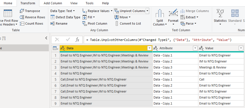
If you want to show the count of answers, you can try split columns and unpivot columns.
My Sample:
Duplicate Data column as Data-Copy, and split column by ";".
Select three new columns and use unpivot column.
Finally remove Attribute column and build your bar chart.
If this reply still couldn't help you solve your problem, please provide me with your sample by Onedrive for Business. You can show me a screenshot of the result you want as well.
Best Regards,
Rico Zhou
If this post helps, then please consider Accept it as the solution to help the other members find it more quickly.
- Mark as New
- Bookmark
- Subscribe
- Mute
- Subscribe to RSS Feed
- Permalink
- Report Inappropriate Content
Hi @Anonymous
Could you tell me if your problem has been solved? If it is, kindly Accept it as the solution. More people will benefit from it. Or you are still confused about it, please provide me with more details about your table and your problem or share me with your pbix file from your Onedrive for Business.
Best Regards,
Rico Zhou
- Mark as New
- Bookmark
- Subscribe
- Mute
- Subscribe to RSS Feed
- Permalink
- Report Inappropriate Content
@Anonymous can you put sample data in a pbix file and share it, will be much easier to work with, just make some fake data.
Subscribe to the @PowerBIHowTo YT channel for an upcoming video on List and Record functions in Power Query!!
Learn Power BI and Fabric - subscribe to our YT channel - Click here: @PowerBIHowTo
If my solution proved useful, I'd be delighted to receive Kudos. When you put effort into asking a question, it's equally thoughtful to acknowledge and give Kudos to the individual who helped you solve the problem. It's a small gesture that shows appreciation and encouragement! ❤
Did I answer your question? Mark my post as a solution. Proud to be a Super User! Appreciate your Kudos 🙂
Feel free to email me with any of your BI needs.
- Mark as New
- Bookmark
- Subscribe
- Mute
- Subscribe to RSS Feed
- Permalink
- Report Inappropriate Content
Thanks. I have generated a sample data set but I don't see an option for me to attach a file to cmy response. I am able to attach photos and videos but no option fore standard files. Maybe it's because my account is new.
- Mark as New
- Bookmark
- Subscribe
- Mute
- Subscribe to RSS Feed
- Permalink
- Report Inappropriate Content
Hi @Anonymous
If you want to show the count of answers, you can try split columns and unpivot columns.
My Sample:
Duplicate Data column as Data-Copy, and split column by ";".
Select three new columns and use unpivot column.
Finally remove Attribute column and build your bar chart.
If this reply still couldn't help you solve your problem, please provide me with your sample by Onedrive for Business. You can show me a screenshot of the result you want as well.
Best Regards,
Rico Zhou
If this post helps, then please consider Accept it as the solution to help the other members find it more quickly.
- Mark as New
- Bookmark
- Subscribe
- Mute
- Subscribe to RSS Feed
- Permalink
- Report Inappropriate Content
Sorry for the delayed response. This looks like it will work. I'll try it with my current data set. Thanks again.
- Mark as New
- Bookmark
- Subscribe
- Mute
- Subscribe to RSS Feed
- Permalink
- Report Inappropriate Content
@Anonymous you provided great details but it will be easier if you put some sample data/screenshots and tell what is not working and what you are expecting.
Subscribe to the @PowerBIHowTo YT channel for an upcoming video on List and Record functions in Power Query!!
Learn Power BI and Fabric - subscribe to our YT channel - Click here: @PowerBIHowTo
If my solution proved useful, I'd be delighted to receive Kudos. When you put effort into asking a question, it's equally thoughtful to acknowledge and give Kudos to the individual who helped you solve the problem. It's a small gesture that shows appreciation and encouragement! ❤
Did I answer your question? Mark my post as a solution. Proud to be a Super User! Appreciate your Kudos 🙂
Feel free to email me with any of your BI needs.
- Mark as New
- Bookmark
- Subscribe
- Mute
- Subscribe to RSS Feed
- Permalink
- Report Inappropriate Content
Hi there,
Below is a snip of some of the data I'd like to plot.
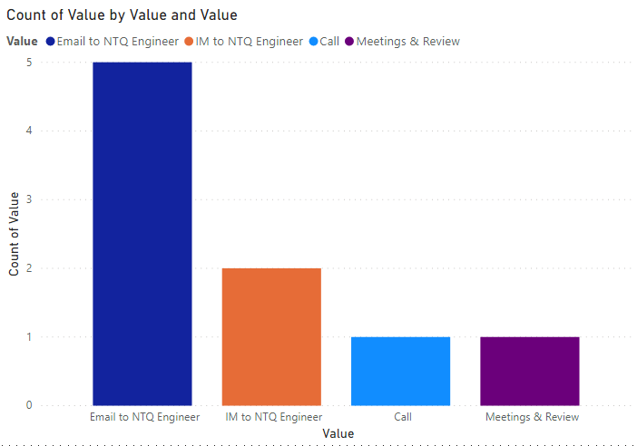
As you can see, the breakdown of answers is as per below:
Email to NTQ Engineer - 5
IM to NTQ Engineer - 2
Meetings & Review - 1
JIRA/Confluence Issue Tracker - 1
Call - 1
However, when I try to plot this data on a bar chart as is, effectively there are 4 rows with unique sets of data in them. I have tried splitting the column into as many columns as is needed to accomodate multiple answers and then plotted all of these resulting columns with single entries onto a stacked bar chart.
Below is an example of this using a different question from the survey but having the same scenario. Surveyees input up to 4 answers to the question so I've split the answer column into 4 distinct columns. I then plotted all 4 columns as the Values in the bar chart but the accumulated totals in the raw data table don't match the actual number of entries when I manually add up the entries of a certain answer across the 4 columns. For example, the first column according to the bar chart shows a total of 40 but the raw data adds up to only 31 entries with 24 in column 1, 7 in column 2 and none in column 3 and 4. I'm very confused by the whole thing
(Apologies I had to censor the text as it is confidential.)
Helpful resources

Microsoft Fabric Learn Together
Covering the world! 9:00-10:30 AM Sydney, 4:00-5:30 PM CET (Paris/Berlin), 7:00-8:30 PM Mexico City

Power BI Monthly Update - April 2024
Check out the April 2024 Power BI update to learn about new features.

| User | Count |
|---|---|
| 110 | |
| 97 | |
| 77 | |
| 63 | |
| 55 |
| User | Count |
|---|---|
| 143 | |
| 109 | |
| 89 | |
| 84 | |
| 66 |


